Park / Six Flags Santa Fe
-
 26-May 11
- Views 37,582
- Downloads 2,999
- Fans 20
- Comments 60
-

-
 90.00%(required: 80%)
 Spotlight

inVersed 100% yes Kumba 100% yes geewhzz 95% yes Maverix 95% yes Steve 95% yes 5dave 90% yes BelgianGuy 90% yes Liampie 90% yes Metropole 90% yes Roomie 90% yes Milo 85% yes RMM 85% yes turbin3 85% yes Louis! 80% yes Levis 70% no 90.00% 93.33% -
20 fans
 Fans of this park
-
 Full-Size Map
-
 Download Park
2,999
-
 Objects
443
-
 Tags
Tags
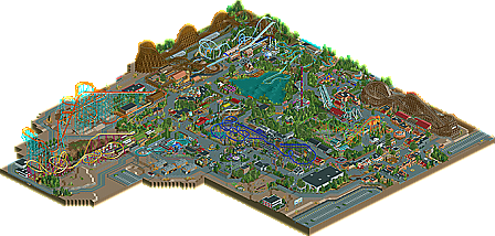

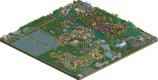
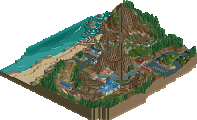
The believability of the park:
This to me was the strongest point of the park. While the primary location may not be able to support the amount of coasters in the park, the southwest really does need some kind of theme park. But besides the location, you really took in six flags' tidbit to really out do advertisements anywhere there is potential retail expansion, and this was lacking in the latter parks built with this demographic of a park in mind. The abandoned spin out was really a nice touch, which again made this park look like we as a viewer were a visitor that day, much like the Chaos being just an empty lot. It's a nice, deliberate, touch.
The Coasters:
All of them seemed fantastic, though, Batman, while great Atmospherically, seemed off to me, but no worries, my only issue with it was the flat spins need to be closer, and after the first flat spin, there is an abrupt dip after the turn around into the second one, so I felt this replica missed out just a tad, but no worries, it's still great looking! Loved the Viper, the wooden Intamin, it was so cute, and "Inty-mini" to it's cousin El toro.
Themes:
This park has a Six flags Great Adventure meets Six flags Over Georgia look to it, and I think the two parks compliment each other well. The "Golden Kingdom" area was really well done. It really has a good inspiration from not just it's name sake, but also the queue line for Goliath at Six flags Magic mountain. I also loved how the foliage for the most part acted as the dense theming of that area, and in most areas, in fact. The Gotham Area is fantastic in some areas, but then it seems to lack just a bit in others.
I could go on and on, but I feel that everyone else has mentioned my other affinities for the park. Robbie, Congratulations on a superb park that exemplifies the idea of realism.
This reminded me much of Great Adventure because of not only some obvious aspects like the Golden Kingdom theme area or Intamin woodie, but the overall package of the park. High quality atmosphere, great coaster designs, and most important of all - not a second rate park full of clone rides and no landscaping which some Six Flags parks became during the Premier Parks era. Funny how Viper, obviously based off El Toro, has the same name as the coaster which was demolished and replaced by El Toro. This one was most definitely my favorite in the park. Second would be Leviathan. You really took on some ambitious support work for this, and I'm glad we finally saw something new as opposed to taking the easy way out with something like a B&M.
Realism was another key part in this. It's hard to create a park with perfectly correct and believable atmosphere when based off a chain like Six Flags, but you got everything here. From basics like ride layouts and names, to more subtle details like advertisements around the park and in queues, games areas all over, the SBNO rotor ride cheaply hidden by a fence (and the smoking area in front of it), Chaos' infield with the hole filled in and queue/op area still intact many years after the ride was removed. There are many other little realism details, but I don't need to mention them all since many would go overlooked and seen as just another part of a ride or something without understanding why it's there. And of course, thanks for using my knowledge about this to better your park. As much as I would like to take credit for it, you were the one who built it all and made it better than I could ever imagine.
To be fair about this, I have to point out some things which I don't want to call "negatives", but more things which could be improved. One thing it was lacking was group catering pavilions. This is an essential in realistic parks since with the availability of these areas, large groups can be attracted to the park for more business and pay more for special treatment or whatever. Also, the empty Chaos pad could have been used for something whether it be another smoking area (much like how Chaos' spot at Great Adventure was turned into one after that was removed), or storage, or something other than empty space.
One more thing I had originally considered a negative, but after giving it more thought turned out to be a positive for your park, is the lack of a rapids ride. As far as I know, yours would be the only Six Flags park without one. Sure, they are popular rides, but they are dangerous and very expensive to operate and maintain. Besides, you have two other great quality water rides to make up for that. Maybe the park once had a rapids ride, but was removed for those reasons and to make room for something else. Everything here in SFSF is high quality, so it's fine that this park lacks a rapids ride, whatever the circumstances may be.
It's been great watching this park progress along and I know we're both glad to see it released! And for the record, this is my new favorite park on the site...sorry CP6.
I loved all the little details you took the time to put into the park, like the boneyard, ads, abandoned Rotor, and even the Thomas the Tank Engine Miniature Railroad with custom locomotive!
Though it had its cons, there are far less than the pros. Like the lack of proper patrol areas for a couple mechanics (the Crane ride, the Enterprise by the shoot-the-chutes) and where is that M&M ride? It keeps saying it still hasn't been fixed?
And also, what was the Wildcat? Was it ever in the park as a complete ride?
It seems like every ride in the park reminded me of its Magic Mountain counterpart. Like Tempest is very similar to Revolution, even close to the same build year, and Leviathan was basically a (pardon the term) ripoff of Goliath/Titan. And Medusa reminds me of Georgia Scorcher, since they have near the same color scheme and build year. Though I don't know if any Six Flags park has any Spinning Wild Mouses, it's a really cool coaster.
Also the "Bugs Bunny Camper Coaster" is supposed to be under construction? Also, the peep's pathfinder seems to never visit the ride? Since it has had 0 riders in 3 game years.
This park has that incredible realism that are, as Louis said, really hard to pull off.
And you know, the more I look at it, the more I like it.
Super-In-Depth Score:
Leviathan: 60% You know what, this is the only ride I really dislike. The supports are wonky in some areas, it's just bad.
Tempest: 85% I love how it looks and how it ties in with Viper in a couple spots. Does remind me of Revolution, except this has two loops. The station even looks like it's from the 70s!
Texas Cyclone: 80% Somehow reminds me of the Crystal Beach Cyclone, that's a good thing
Gotham City: 75% The giant Topspin, Batmobile, and the detailed shops are all just great
Batman-The Ride: 85% Oh, so THAT'S what invert supports are supposed to look like! I'm doing it all wrong then
Medusa: 75% Reminds me of that stand-up B&M in SF Georgia, just with actual theming instead of flat concrete (Six Flags burn!
Viper: 80% As fast as Colossus in such a small, tightly woven package! I think it's just fantastic how it goes-excuse me-slinks over the road and through the woods. Looks like it'd be such a blast to ride.
Thomas Town: 80% Really nice how it had the Thomas the tank engine custom locomotive, and the rides were well themed.
Flaws in Mechanic Patrol areas: Just a couple slipups, nothing worth deducting score from.
Only if it were a consistent problem with all your parks, which it isn't.
Pandemonium: 85% Never seen a Spinning Mouse this well executed!
Zoomerang: 80% It looks so incredibly realistic! The catwalks, station, supports, everything
Everything else: 95% it's all just fantastic. Congrats robbie, and hope to see lots more work from you.
Overall: 80%
Spotlight Vote: DEFINITELY
Good show, Sir Rob, good show!
Also, why the low (and NO) vote Levis?
Every part of this park is beautiful, so I will do what I do for all spotlights: highlight the best bits that I encountered on my first run through (and I'm not gonna compare this to sfc, they are two very different and great parks). the best bit is, I know I will love this park even more the more I view it and really register all the details.
Heading clockwise:
-the santa fe architecture was all brilliant. beautiful atmosphere, especially that little show after the entrance really livened up the area.
-the spinner had such an entertaining layout, really felt like one of the most realistic rides I have ever seen.
-I didn't even notice the abandoned ride bit until I zoomed out more, that is a perfect touch!
-I loved the way you entertwined the layouts of the schwartzkopf and the el toro woodie (sorry I can't remember names
-the asian architecture was awesome. beautiful foliage, shops, etc.
-leviathan had a brilliant layout. truly a perfect rendering of this ride.
-batman the ride was brilliant, especially the colors really made it stand out.
-the entrance to the theatre was stunning, seriously.
I think maybe I would have liked some more out of bounds stuff, especially near the entrance, and some more backlot detailing, but I wouldn't do any of that so who am I to critize you on it?
and now for something that really just sums up this park:
Jizz In My Pants
Just incredible, best sign I've ever seen.
-JDP
What kept me back to vote it higher were some of the layouts: I wasnt a big fan of Viper and Goliath. They were good, but not as good as the rest.
Congrats on winning spotlight, well done and definately deserved!
brb.
Colorado-Fan Offline
I think the parks slight L shape made it feel a bit awkward and the park would have benefited from having that section filled in, however I don't know how many objects you had left to do that.
-------------------
PS: Love the write up but this part is wrong
This was the last Six Flags park to win an accolade before SFC.
http://www.nedesigns...arine-world-fl/
inVersed Offline
The entrance area was really nice looking. It gave off the typical Six-Flags atmosphere. The architecture was very good looking here. The only thing that I disliked in this area were the sides of the flowerbeds. The HP/LOTR fences were really ugly imo. The theater entrance was just pure brilliance, just like the trampolines. I also really enjoyed the little details here like the advertising.
The Batman area is the best executed Batman area in RCT ever. The coaster's station was brilliant, just like the whole backstage stuff here. The realistic touches here were also lovely. The custom topspin was executed very nice, just as the two other flat-rides. THe coaster itself was imo one of the best in the park; the lay-out was perfect, the supporting sick and the pacing was also really good.
The water ride next to the Batman area I did not really like. It is really Six-Flags like though. In my opinion this ride was a bit too simple compared to other rides.
Medusa was also a very good coaster. Nice looking lay-out, good supporting, good pacing, a nice queue. Perhaps the only straw was that the station was a bit too simple, but I liked it anyway. Leviathian was the only coaster I didn't like, the lay-out itself, queue and station were nice. The supporting ruined the coaster for me. I felt it was a bit overdone. Foliage in this area was really nice.
The Intamin woody next to it looked promising. I was a bit disappointed because in my eyes the pacing was a bit too fast in some places. I loved the interaction with the looping coaster. The station of both coasters looked really great. The looping coaster itself had a nice lay-out. The only straw here was that the first drop went too slow. The architecture and foliage near the looping coaster were really sick.
The water ride next to the looping coaster was very good. The kiddy area was cute, with a perfect coaster for this little area. The arcade next to this area was just pure awesomeness, really liked this one, just like the boomerang. One of the most sext Boomerang coasters I have seen in RCT so far.
The woody near the entrance area was great. Great lay-out, perfect pacing, good looking station and a nice queue. The best coaster in the park for me was the spinning coaster. For some reason I really liked this one. RCT sex for me.
So a great park and a well deserved spotlight. Congrats.
The 90% you got was a little low imo, because this really was an all-around amazing park. The detail was staggering and on a level I think we have only really seen from Xcoaster. That and the great rides you made allowed me to give a 20. I had said id never give a SF park a 20, but you convinced me.
My favorite part had to be the details you find everywhere. One of my favs was of something I happen to hate, the smoking area. The billboard Pierrot posted was awesome to as were the ads placed all around the park. As far as the coasters go both woodies were top notch and Leviathan... just damn...
Ever if this is not a rec I think it kinda passes Kumba in terms of realism in RCT. Sure your making it up, but what your pulling from real parks and using in RCT really is fantastic.
Congrats on the spotlight and I can't wait to see what you do next
- Concept/Theme
- Landscaping & Foliage
- Ride Design
- Architecture
- Park layout/Composition
- Detail and Innovation
- Atmosphere
Concept/Theme:
The concept is not exactly a new one of course, Six Flags Parks have been done a million times before. That and the fact that originality isn't really something that Six Flags is good at make the concept of this park not really groundbreaking. We've had Six Flags Carolina last year raising the bar even higher... The backstory of this particular Six Flags park was well done as stand-alone, but I'm slightly disappointed that the park itself didn't really tell that story. Without the readme I wouldn't have known it. It was done really well in Six Flags Carolina, by just looking at the park layout and the location of the rides I could figure out the timeline, it made more sense. Speaking of Six Flags Carolina, it's interesting how different your and CP6's parks are style-wise. Your park was much more detailed and imperfect, SFC was straightforward and clean. I have to say that CP6 captured the Six Flags atmosphere better, although not every park is the same of course and my knowledge of SF is limited having only visited Six Flags Holland four times and Parque Warner Madrid once. Overall you've done a pretty good job.
Landscaping & Foliage:
There's something about the landscaping I don't like... too much relying on grasses maybe, I don't know. I can't deny that it was very well done otherwise, great job. There was no real landscaping so I can't really say anything about that. yeah, maybe the central lake should've been lowered a tile. The outside of the park (desert) was good, but I think you needed more context to make it less look like its unfinished... The small patches with cacti and stuff were cool. I would've replaced all the blacktiles by some interesting landscaping (more cacti, ditches, maybe an expansion of the parking lot), but it's your park and you didn't.
Ride Design:
I didn't like each coaster equally, but some of them were really good. Leviathan has such a bad layout and it's so ridiculously ugly, I don't think anyone could've pulled it off as well as you did. It's sick. An award-candidate probably. The rides in Thomas Town were great, you turned some shitty flatrides into interesting, unique and funny themed rides. Harold the Helicopter is so fucking badass, another award-candidate if you ask me!
Architecture:
Architecturally the park wasn't too interesting of course, unless you're a fan of sheds and tiny clay buildings. Everything was well designed, but relatively boring as well knowing what you can do. I hated the glitches that unfortunately aren't rare in your work. That's the only thing you REALLY need to improve and can improve, in my opinion. But then there was that little corner building with the small tower in the Golden Kingdom! That's the first thing that blew me away in your park, ironically. It's so well done, the colours are complex but they work. The building across the path there was also very nice. I hope you'll release a theme park (semi-realism, preferably) next because you're so much better at that! I want more of that shit!
Park layout/Composition:
Not bad at all! The only places were the park didn't flow were between Batman and the entrance and the colonial area. The latter just didn't work at all for me, the flume looked too dull and the sky screamer just didn't look good there. It didn't come together as it should've done. Transitions between areas could've been smoother, especially around the Golden Kingdom. Maybe it would've been better if you spread that kiddy area a little more out, along the lake perhaps. No big deal though. Another thing you should watch is the use of fences, there were too many different ones in too little space. I think Gotham City was the most well designed area in the park. I didn't feel a villain vibe, but there was a strong vibe anyway. Everything here was great.
Detail and Innovation:
Lots of great details, just a shame I'd seen most of them before in either advertising screens or older savegames. I wish there were more surprises. That doesn't make it bad of course, the details remain great. I love the smoking staff. The sail over the log flume's entrance was cool too. I don't think there was much innovation in this park, except for Thomas Town and Leviathan. The wheels/reels/shit (I can't think of the right word in either Dutch or English, sorry) that were scattered throughout the Gotham City area were new and cool. At least I haven't seen them before. OH SHIT almost forgot the billboards! Those were SICK.
Atmosphere:
The atmosphere was good. I'm really glad that you made the park peepable as it really adds a lot of life. By the way, you pulled off the single-path method much better than Six Frags did in EPWS. I didn't even notice at first! It's a shame that a lot of areas were so messy, because that held the atmosphere from being great instead of good. But that's just a general SF problem I guess.
________+
90% (barely, could've been 85% as well)
For a higher score I wanted more surprises and groundbreaking ride designs/architecture. 90% is an incredible score nonetheless, and there's no doubt that this park is a justified spotlight winner. Great job, congratulations on finishing, congratulations on winning spotlight, thanks for sharing and I won the spotlight race by nine months.