Park / Icarus

29 Comments

  • Fizzix%s's Photo
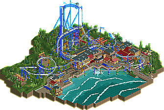
    I definitely think this looks close to Liampie's. However, I feel with the originality of the coaster-type you made up for it. The colors were very fresh and bright, but also similar to Knossos. I would like to see you tackle something completely original and hit it out of the park, because you were so close with this one. Congrats dude!
  • GameWorldLeader%s's Photo
    awesome looking, reminds me of Great Bear!
  • zburns999%s's Photo
    Awesome, Belgian Guy. To me, this is a near 10/10 design. Just like Inyoni, it's so cool to see new things being done with the same old design types we always see. I'm sure that creativity and willingness to deviate from the norm will take you far in this game. Yeah, the architecture wasn't really too interesting, but as others have mentioned, the way the ride really dominated the sky-line was worth the design accolade by itself. Honestly, my favorite part of the ride was that last little flare turn before entering the brakes. As GameWorldLeader said, it's very reminiscent of Great Bear, which was cool.

    When it comes down to it, though, my main problem with this is that it almost doesn't make sense. what you've built is essentially an inverted dive machine. The fun of a dive machine is undoubtedly being out in the open, having a great view of the vertical descent. Here, the rider's view would be of the back of the seats in front of them. Nonetheless, it was once again great to see something new. Excellent job man.
  • BelgianGuy%s's Photo
    TO respond to why the archy looks like liampîe's a little is because it's the saùe theme and I think it's actually extremely difficult to do this theme differently in terms of colours and such, and for the horns on the buildings I actually took the time to search for the reason behind these as I've stated before I did take a course of archeology on crete history... I mean Liam pulled this off greatly in legacies and I see the resemblance aswell but that's simply because it's the same theme and we used pretty much the same documentation as there is little else to base this theme off..
  • Roomie%s's Photo
    I loved this. It's a near perfect view of what I imagine B&M would do with an Inverted Dive Machine. The whole design was executed and although perhaps a little lacking in size and scope, what was there was very nicely done.

    Loved the waves too :)
  • Luigi%s's Photo
    I will start off with a compliment to Verti; That logo is really awesome! One of the best I have seen in a while.

    Now to the actual design:
    The lay-out itself was nice. The flow and pacing were perfect. I also really like the fact that it is an original and fresh concept. The way you supported the coaster was good as well, but nothing really special. The colors were nice as well. As someone above me said; I liked how intimidating the coaster looks compared to it's surroudnings.

    The surroundings were not very special though. Due to the fact you built this in a week, I'm really impressed by this. I think there aren't many people who can pull this off within a week.

    I liked the waves too, for some reason. The only thing I did not really like was the foliage.

    That said I can only conclude this is a solid and well deserved design.
  • Metropole%s's Photo
    Congratulations on another design BeliganGuy! It was really great to see a different type of coaster used, whilst keeping it very believable. The choice of theme for the coaster is also really good, an inverted dive machine is truly representative of Icarus' plunge from the skies. Great idea. As for the design itself, it was very well done, but there just wasn't enough to look at for me to score this one higher. The architecture was good and it was nice to see you stay true to the myth, but I would just liked to have seen a bit more to the entry. I do understand that it is only a design though, so with that said, it easily deserved the design accolade and it looks like you are not stopping there with your new solo in the works. Great to see such a productive member around here, and keep up the good work!

    And Verti, that logo is absolutely fantastic!
  • posix%s's Photo
    I looked at this yesterday. To be honest it didn't excite me much. It seems too uninspired and "standard". The layout was kind of fun to watch. I don't really remember many inverts with vertical drops in either of the games.
  • RCTMASTA%s's Photo
    The one BG did in Thrill Point? :p
  • K0NG%s's Photo
    I keep hoping that everyone will remember the miniscule timeframe that BG built this in because of the DM deadline. You can't get to everything in just a few days time. I'm still blown away by how this turned out in just a matter of days.

Similar Parks

Members Reading