Park / Icarus
-
 06-June 11
- Views 7,989
- Downloads 1,099
- Fans 1
- Comments 29
-

-
 67.31%(required: 65%)
 Design

Maverix 95% inVersed 75% K0NG 75% Louis! 75% CedarPoint6 70% Liampie 70% Metropole 70% Milo 70% turbin3 65% Wicksteed 65% 5dave 60% Casimir 60% Levis 60% prodigy 60% geewhzz 55% 67.31% -
1 fan
 Fans of this park
-
 Full-Size Map
-
 Download Park
1,099
-
 Objects
245
-
 Tags
Tags
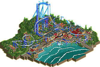
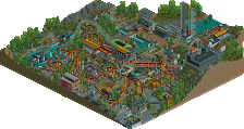
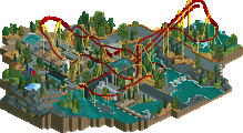
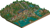
I did however like how the coaster entirely dominated everything, looking so much taller than the buildings/surroundings, but that also reminded me of how you don't often let your buildings grow.
Also, great job verti on the logo. Definitely my favorite of the year so far.
Nice design anyway.
well done bg, my favourite work from you. good show.
In Legacies, the architecture did tell a part of the story as well. There was the palace and the labyrinth for example. There were details like a wooden bull and chopped wood and birds that Ikaros and Daidalos used to make the wings. Also, the coaster actually fell into the sea. Your coaster had the climax at the beginning. I'm not saying that you should've done this all in your design too, it's an example of storytelling that your work needs to bring it to the next level in my opinion. Everything looks nice but it doesn't make sense yet! I probably sound arrogant, but the comparison was inevitable.
@proest: I don't think copied details. There's not that much known about Minoan architecture and the most notable elements are black-red-black columns and these bull horns. The architecture is similar because we did the same (restricted) theme.
@Sammy: yes, this coaster is much better! Although I like my final inversion.
My 70% could've been 60% as well, looking back, but I voted 70 and you won, so congratulations. It was not bad at all. What made me vote so (relatively) high is probably the vibrant atmosphere. The colours are great!
I agree with Proest.
Anyway, I liked this design and I hope to see more from BG
The layout actually told the story of Icarus flying pretty well I think.
The theming could've done a bit better but he shouldn't have overdone it.
I love the water, those waves and relief water-effect is done really well.
Overall a well deserved design.
I also want to congratulate you for having anything to do with 3 designs IN A ROW !
(he did the write-up on windsweep)
@liam: the scattered ruins kinda makes sense as I've followed a year of archeology and there I learned that the island of Crete is actually packed with these kind of small remains of buildings, and this being in the area of the "palace" I made the ruins in that particular style...
If I would compare the two, I say this design is better.
(no offense SSSammy but I could actually see this ride at an amusement/theme park than yours)
One big thing I love about this, is the scaling, you did it perfect, for me when I visit a park and ride a decent/tall roller coaster, I'm usually above the tree tops and buildings look like polly pocket size houses. Very well executed in my eyes. Theme isn't overwhelming, I couldn't see this ride at Universals but I could see it at a former Paramount Park.
Only thing that bothered me was the color of the coaster track/supports versus the surrounding foliage and buildings color, maybe a darker color would suit it?
-JDP
I loved the layout of this BG, congrats on the design.
my main problem was that it felt way too much like liampie's icarus and a bit like fisch's nautilus. the grey sticky uppy bits on the rooves were clearly taken from liam (I've never seen those anywhere else, or even imagined that they were actually an architectural feature
overall though, nice work, especially with how close together these designs were!