Park / Inyoni
-
 31-May 11
- Views 9,050
- Downloads 1,211
- Fans 2
- Comments 36
-

-
 75.77%(required: 65%)
 Design

Maverix 90% Kumba 85% inVersed 80% Louis! 80% Metropole 80% turbin3 80% 5dave 75% Casimir 75% CedarPoint6 75% geewhzz 75% Levis 75% Liampie 70% Milo 70% prodigy 65% Wicksteed 55% 75.77% -
2 fans
 Fans of this park
-
 Full-Size Map
-
 Download Park
1,211
-
 Objects
324
-
 Tags
Tags
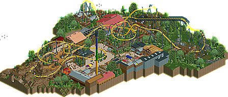
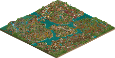
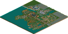
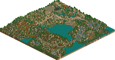
I really enjoyed this. I like that you made a lay-down, definitely don't see many of those these days. Nice work. Also, I love the logo for this lol
BG, I really, really like this, and when I get the game back in September, I'll definitely wanna see this in-game!
The architecture was nice in some places, but some places I did not like it. Especially the archy around the Roto-drop was dissapointing. You overused the Kumba-roof here and in my opinion some of the buildings were too low in this area. Also the fact that this attraction was not opened yet was a disappointment for me.
The foliage on the right side of the overview is very nice. The landscaping was also a strong point in this release.
As other people already pointed out, I missed an entrance to the area/park as well. I enjoyed this design quite much, but some things just felt a bit sloppy/rushed. Anyway, congrats on winning a design.
Oh and:
Suggestions: stretch things out a bit more. I felt it was all too condensed.
I really liked the coaster here (kinda crucial considering it's a design). It was really unique whilst still being believable. The colour scheme fit perfectly here, yet it wasn't an obvious choice. I really liked how the initial drop was an inversion in itself. The coaster had some great path interaction, a personal like of mine, though some of it was a little forced, such as the area where the path circled round a tunnel that the coaster comes out of, yet going round the circle leads to nowhere.
The support work was really good, though i did notice one part where you hadn't got rid of the original ride support (the first half inline twist). I also felt that the area where the coaster swoops just above the path in a turn could have done with a netting or something considering it was so close to the guests (you had some netting in other areas). I liked the part of the queue line that circled around the second half loop, very cool interaction.
The architecture was pretty good. I wasn't a great fan of the station, and I felt as you were using the same rooves for the station and the transfer shed, they should have been the same colour. Having the red roof on the station and the peach roof on the storage clashed for me. Apart from that, the rest was fine, albeit not exactly inspirational.
The landscaping and foliage here was very very good. It set a lovely atmosphere throughout the park. The only part I didn't like was the 1/4 block dirt landscaping around the final turn. It was very close to looking awesome, but not close enough, it just came off as a bit messy, and inconsistant with the rest of the design.
The drop tower was cool. Wasn't convinced by the architecture around the queue, and it was set to test mode which was a bit of an oversigh I guess. It served it's purpose though and I enjoyed it.
Overall, excellent work guys. The coaster really made this, and it's great to see a different coaster type to the norm used, especially when it's done in such an original, yet flowing way.
The only fault I found with this were the surroundings: just a little bare and uninspired. They were definitely not detracting from the design; they just didn't really do anything to add to it atmospherically. But as Todd Lee said, path interaction was top notch. Congrats on the design man!
Congrats
James