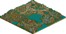
Park / Inyoni

36 Comments

  • Comment System%s's Photo
  • EXeL}ErAT0R%s's Photo
    Awsome. But simple
  • djbrcace1234%s's Photo
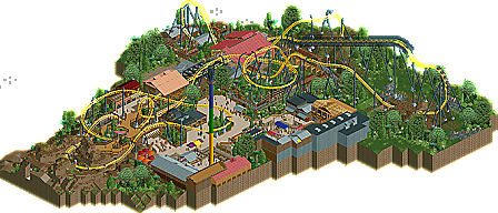
    This was actually very cool! It's always hard to see what Vekoma would really do with it's Flying Dutchman model, and this layout seems very believable. Some pacing was a tad fast, and my only issue with the ride itself was after the first dive, you left the 4d track for the roll over, when you still could have gone back to lay-down track. Also, I thought the fast chain was unneeded, because Vekoma flyers practically crawl on the lift.

    And for what's there in the surroundings--I actually liked the landscaping more than the buildings for some reason, but all in all, this is so far enjoyable to be watching.

    Congrats to both of you--well done!
  • RCTMASTA%s's Photo
    First drop reminds me of X, and the coaster looks scary but fun to ride.
    Though there were a couple iffy bits, this is a nice Design. Hope to see more. Lots more.

    Dang verti, what program do you use to make those logos? Definitely not the kind of thing you can do in Paint :p
  • Cocoa%s's Photo
    this design was OK, I guess. I think for me I can think of a lot of criticism and less positives, but don't get down, overall it was pretty good.

    Pros:
    -Great layout. Some very exciting elements and it seemed very realistic (apart from the final bunny hop)
    -Nice atmosphere
    -Great station/transfer shed, and the buildings around the drop tower were good too

    Cons:
    -Theme confusion. I'm guessing you were going for a rural African theme? the main problem with this was the architecture. while in some places the haphazard style works well, mostly the strange choices of windows and textures make it not resemble anything I'd see in real life, or look pleasing in game. The bits that were good seemed imo to be very similair to Kumba, Ilmenite, and even Cheetaka to an extent.
    -path layout. seriously, there is no entrance to this park? am I missing it?
    -landscaping. the foliage throughout this is very good, but the ground type that is so drastically different in one side of the park (dirt and then grass) just seems confusing. it feels to me like on the dirt part you wanted to emulate real african landscaping, and on the other parts you wanted it to fit into a realistic american park.
    -it needed finished around the border, especially behind those buildings in the front of the overview screen.

    I always feel bad when I give lots of a negatives in a reply, so if you want to ignore me just take my congratulations, and get back to work on something great. i know you can :D
  • Metropole%s's Photo
    I very much enjoyed this. Congratulations on the design guys. I'll give my in depth comments when I get the time, still gotta do my six flags santa fe review first though.
  • Dimi%s's Photo
    This is a decent design. The best part is the layout, really well done. I always like to see a more rare coaster type. Parts of the landscaping and foliage were excellent (for example behind the red and orange parasols), other parts were horrible (the brown quarterblocks, the plain grey texture under the lifthill). The architecture was quite original and technically very well done, but none of the buildings could really catch my attention. They created a certain atmosphere, but it didn't resemble very African to me. I also think you're definitely overusing Kumba's roofs. Finally, I disliked the fencing and the path choices, and I would have liked it more if you used custom queues and stairs. I still think it's a very nice design though, displaying your very distinct building style and atmosphere.
  • musicman%s's Photo
    As said above, the layout was excellent. The problem I had with it was that you built such complex realistic facilities immediately surrounding the coaster (transfer, backstage, chain return...) but then put in a path layout that made no sense whatsoever in my eyes. not only is there no entrance to the map, but the entire thing seems designed to cram as many path-coaster interactions as humanly possible with little regards to the actual logistics of it.
  • pierrot%s's Photo
    Sorry BG, I think you are bad at doing some architecture (except station).
    but please don't get me wrong, I hope you overcome this quickly.
  • BelgianGuy%s's Photo
    ^seriously? what was wrong with it, I think if the archy was really bad I think this wouldn't have won 75% or even design in my own defense maybe?
  • Kumba%s's Photo
    Awesome design BG. I really liked the layout, Q and station. The use of my objects was nice too, great to see how well people like you can use them :)
  • Luigi%s's Photo
    From the overview it seems good. I will give a bigger review tomorrow after I have seen it in-game.
  • chorkiel%s's Photo
    I'll skip the asslicking of Sammy for the write-up.
    and give my comments in the form of pros and cons.

    + Awesome layout, I'd love it really much except for the twist after the loop, I'd make it the other way.
    + foliage + landscaping, I liked it pretty much
    + the station, it was just amazing
    + the catwalk was really cool too

    - the overuse of the same roof
    - the complete lack of details at the back of buildings
    - the entrance, I'm not sure if that's actually meant to be the entrance or if they're supposed to be stuck in the world of inyoni but it was pretty poor integrated in the rocks.
    - the overkill of people in the waiting line, and their hats. (not a big problem but it was the first thing that I noticed)
  • rK_%s's Photo
    the scenery interaction is beautifully placed and the coaster by itself looks extremely pleasing to ride then you add in the atmosphere and overall great execution of everything that surrounds this coaster... This is one of my favorite designs ever, its unique and very unrestrained by any norm usually put into designs, very nice work BelgianGuy! Congratualtions!
  • Roomie%s's Photo
    Overall this is a lovely crisp design with a brilliant layout that would make an awesome real life ride. The main things that annoyed me were minor. The Lack of an entrance or even a faux gateway to the rest of a park was I assume intentional?
    Also the Gyro tower was set to testing instead of open.

    Other than that I think 70-75% is about what I would give it :)
  • JDP%s's Photo

    It's always hard to see what Vekoma would really do with it's Flying Dutchman model, and this layout seems very believable.

    Fail.

    ^seriously? what was wrong with it, I think if the archy was really bad I think this wouldn't have won 75% or even design in my own defense maybe?

    are you dumb? you had an innovative layout that had decent pacing, thats what won you design. other then that i agree with pierrot. all the surrounding buildings had no identity along random pieces of scenery to make it look as if the building was interesting. your design pulled together for you due to the bright colors of the coaster, and its dark surroundings. i think foliage is your strongest point of the game and the way everything was shoved in together gave you lots of moments to supply interaction for the coaster. as an "overall" view of the design, its good. however if your shooting spotlight on your next park, you're gonna need a lot more inspiration when it comes to your architecture.

    congrats on the design
    -JDP
  • K0NG%s's Photo
    ^ What the fuck is your malfunction, man? If someone doesn't agree with your opinion (even before you've offered it) they must be dumb. If someone eats a burger from Carl's Jr., they must be fat. If they're from a city that (because of your own ignorance) you've never heard of, they must be a hick. I swear...you're becoming an American version of Cena with just marginally better English. I'm surprised you don't get your ass beat on a daily basis.
  • posix%s's Photo
    My opinion is that from the overview and the screens it looks rather epic, and I have this bookmarked to actually download and open it when I have time. The intense and delicious atmosphere I get from this has me pre-excited.
  • JDP%s's Photo
    ^^just stop. i only said that shit to you because we were facing each other in a death match and i had every right to make fun of you. sorry my comments may not be as cleaver as yours. funny how you've been cool with all my post until this release that features 15% of your work. you're very insecure and i dont get my ass kicked on a daily basis because i back my shit up.

    either way its not my opinion. architecture doesnt win designs, look at Diablo
    -JDP
  • BelgianGuy%s's Photo
    Plz guys don't turn this topic into a fight, just say what you enjoyed and what you didn't I'm all ears and JDP FYI, I am stepping up for my solo, trust me that this is shit compared to what I'm currently doing...