Park / The Missile Crisis
-
 23-May 11
- Views 8,996
- Downloads 1,258
- Fans 2
- Comments 35
-

-
 64.23%(required: 60%)
 Silver

nin 80% Louis! 75% Metropole 75% Maverix 70% Milo 70% Wicksteed 70% inVersed 65% 5dave 60% geewhzz 60% Levis 60% Liampie 60% turbin3 60% BelgianGuy 55% CedarPoint6 55% prodigy 55% 64.23% -
2 fans
 Fans of this park
-
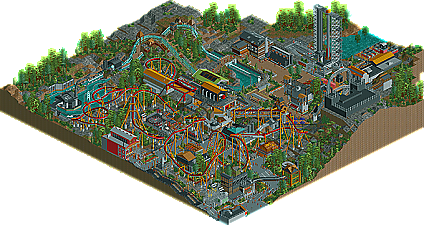
 Full-Size Map
-
 Download Park
1,258
-
 Objects
363
-
 Tags
Tags


metro- lovely feed back, thanks. as i said above, i know colors are something i have to work on and hopefully i can get better with my next release. as for the intamin giant wheel, i got the idea here. I combined the models of the "spokeless wheel" and "giant wheel on building" to get my version. and with the path on the edge, ill admit that was rushed and i ran out of ideas. this park was intended to be a design but after k0ng suggested we shoot for solos i had to expand beyond the design so that slice of the map was forced in a way. Thanks for the feedback man, looking forward to your next release as well.
EDIT: Yeah, roomie, that was my main inspiration. Thanks for posting that, and thanks for the feedback.
-JDP
To be honest I wasn't a big fan. Your general ideas and the layout were pretty good, although the layout was a bit slow-paced. Some things of the theming were superb (e.g. the restrooms near the pretzel-loop), but other parts were really poor, I'm sorry.
Looking forward to your next submission.
However the most interesting part for me was the custom splash boats. The choice of track was perfect, the layout was amazing and the theming was superb. I beleive that the foilage could have been slightly better. The only dislike i had was the architecture, not the overall structure of buildings but the colours. I know its the theme, industrial like, but it made the buildings quite dull. Other than this though it was a pleasure viewing Missile Crisis.
2. For me I would of voted in the bronze area, Only because when I look at this, I don't get the park feeling, Its more of a really really well thought out design. Another thing, I didn't see a park entrance. Its really a downer when there;s no well themed park entrance for your park. Its like the first thing guest see when they come up to your park!(also one of the things I look for when I open a park)
3. Another negative is that near the fliers 2nd element drop, you have jungle wooden fences keeping foliage in, the fences just didn't go along with the atmosphere.
You have an excellent design here, but for me this isn't a silver park. When I think of a silver park, I think of a well executed Theme/Amusement park with a variety of eye catching coasters/attractions and multiple area's
Overall, good job! hope to see more!
the Ferris wheel was great as was the flyer. good pacing on the pretzel as phatage said. the train is supposed to look like it "falls" into the pretzel at very low speeds.
keep up the good work
I'd vote 70%-but just a Design vote.
highroller- thanks dude. funny because i hate doing water rides yet that seems to be the park favorite.
CC- as I said above, the park is meant to be a section of a theme park rather then a park itself. thanks for the feedback
gw- thanks gee, and i got a nsco park going now. so far it's going great
dirt- thanks brah!
dimi- thanks for the feedback man. that seems to be the biggest compliant about my work for years now. ill get it sooner then later
rctmasta- i originally wanted this to be a design but after k0ng challenged me to make an actual park, it turned into my smallest silver to date
special thanks to sammy for the logo and jusmith for the write up, both were great. Thanks again for all the comments everyone. i will say this silver thing is getting old so im hoping this to be my last one.
-JDP
This was one of the most inspirational, fun releases in a good while. JDP, I didn't think this would ever happen, but I'm now constantly looking forward to everything you make. It's finally become fun to view your work, as it seems you've grasped the concept of immersive theming.
Now, I do think this deserved design rather than Silver, but regardless, congrats on the accolade.
The coaster is indeed the star of the show but would expect nothing less from you.
I will say I prefer your cso work of your ncso work.
Well done and I look forward to see whats next on your plate.
James
I really hope you have more up your sleeve, because I'm a big fan.
-JDP
JDP come back