Park / The Missile Crisis
-
 23-May 11
- Views 8,994
- Downloads 1,258
- Fans 2
- Comments 35
-

-
 64.23%(required: 60%)
 Silver

nin 80% Louis! 75% Metropole 75% Maverix 70% Milo 70% Wicksteed 70% inVersed 65% 5dave 60% geewhzz 60% Levis 60% Liampie 60% turbin3 60% BelgianGuy 55% CedarPoint6 55% prodigy 55% 64.23% -
2 fans
 Fans of this park
-
 Full-Size Map
-
 Download Park
1,258
-
 Objects
363
-
 Tags
Tags


in other terms it is a step up in theming for you JDP and I applaud you for actually stepping away from your previous safe zone that was generic amusement park styles.
Try to work on a bigger scale, it'll work out for you for sure.
This is really nice and I loved it very much!
congratz, does this make you the person with the most silvers?
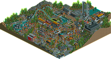
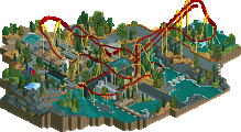
Funny thing for me while viewing this, was that I didn't really like the coaster haha. Go figure. Part of me thinks that maybe you've let yourself get too tied down by the "Coaster Master" title. While this particular layout feels realistic, it just lacked the life your older creations used to have. Some of the inversions were taken painfully slow. Like, don't get me wrong--I've been on a B&M flyer and I know they drag ass through parts of the course, but with the physics of the game, it just looks weird to see the trains barreling down a hill, and then practically come to a stand-still in the next element. Also, I kind of felt like the whole thing meandered around a bit too much without doing a lot. I don't know, just my opinion. Not a bad coaster by any stretch of the imagination, but certainly not my favorite from you.
Now, why I say this is your best work, is of course due to the great creativity and ingenuity displayed on the remainder of the map. While in the past I feel like you've stuck to some really generic themes and concepts, you really went out on a ledge here, and its obvious. It was a tough overall theme to conquer, but I think you did it justice, honestly. Loved the ferris wheel, and the water ride was very well-done, as well. Nice to see one that didn't break everyone's necks around the turns like most people tend to do anymore. I thought the station was really fantastic for the flyer--probably my favorite touch on the whole map, actually. Great landscaping and path layout/interaction as well. The only thing I wish you'd stop doing is using those damn multi-colored carnival-ish fences for your queues. They looked so out of place in this instance. But overall, it was great to see you really nail a theme. Makes me excited to see what you can come up with when you really start to refine your architecture and foliage. Congrats man!
rrp- always nice to hear comments from experienced players, thanks
bg- as phatage said, the pacing was intentional since most flyers have slower pacing. i also took into consideration that it was a turn leading up to the pretzel loop, so i felt this was the safest pacing for the ride. thanks for the imput
mardy- thanks
metro- thanks. im still trying to perfect my skills and colors is a problem i still have... one day. and looking forward to your review
pc- glad you liked it. the intamin wheel was an idea i had back when creating hidden valley. i couldnt do hacks on my widows 7 pc but after that i got an older xp pc up and running and was able to get it done.
rk- thanks dude, happy you enjoy my work... keeps me motivated
chorikel- thanks and im not sure who has the most silvers, but i plan to change my silver streak in the future.
k0ng- glad you liked it. when i was building (regardless if you sent something in or not) i knew i had to be innovative and make this good. i wasnt sure if you were fucking with me or not so i didnt want to gloat around the site about me winning, only to have you send something in better. but now that its over i dont really care, and all i can say is thanks for giving me motivation to add to my ne resume... and for bringing out some of my best work. also, thanks for the comment on the water ride, it turned out a lot better then i
thought
burns- thanks man (nice feedback by the way). the theme was originally going to be a shuttle base but after thinking an intamin launch coaster wasnt interesting enough to make a park out of i went with the b&m flyer.i had the pretzel loop idea form my tussauds park, but that fell through so i used it here. i wanted that to be the main focus and as long the rest of the coaster had interaction with rides, path, etc, i was good. nice to read you liked my themeing as well, thanks
phatage- dude, thanks for making my life easy by posting that comment. i was in happy to read that you can tell the pretzel loops pacing it was intentional. i went to sf:gadv pretty many times and thats the only flyer reference i have along with watching off ride videos of flyers so i felt that was good. as mentioned above, i didnt like the train going faster then what it did through the element due to the turn leading into the pretzel so i figured this speed was accurate. the mcbr was intended for this to be a high capacity coaster. this was only meant to be a section of an actual theme park rather then a park itself. glad you noticed that the ride had two faces split between the mcbd. i loved how that came together for the ride. and to answer you last comment, here is tatsu's storage track and that also features 3 trains (Here). overall thanks for the comment man and ive recently been looking at sf:woe. thats still one of my favorite parks of all time has given me motivation for my next park
kumba- thanks bro
-JDP
Anyways, this was really good. I'll start with Missile. The layout was quite good. I understand the intentional slowness and the realism of it all, but it didn't make it that fun to watch. I did'nt like the really shallow, elongated drops. Pretty hard to avoid, I know. On the upside, that pretzel loop looked amazing, the supports were really well done (I particularly liked that one on the MCBR) and the station was fantastic. Missile's station was definately the stand out aspect of the park for me. I loved it. The way it built into and around the landscape was awesome. The way that it had different tiers (I loved the queue going under it) gave it great depth and the way that you had parts of it that were very open meant that I could look at it and imagine exactly how it would look inside. Well done on that.
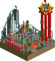
The Ferris Wheel. Sorry, it is lost on me, you'll have to give me a pic or something of what it is referring to. My park/ride knowledge isn't what it used to be.
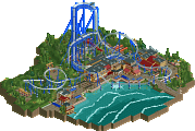
Crisis: Now this was a water ride. Important realistic details and great theming lead to a really elegant water ride that was very believable, great job on that.
Other general comments: This thing that this fell down on, for me, was the colours. There were some horrible clashes of colours here, and the choice just seemed random in places. At one angle, I can see the station of Crisis with a sickly green roof, station of Missile which has a dark yellow roof, and then a building above which has an aqua roof and accents. It just didn't work, and I think there were a lot of examples where the park just completely missed on colour, in my opinion.
There were some cool details I picked up on that I really liked, the standout one being the electricity generator and cable poles spitting out sparks. Nice touch.
I don't like it when paths are right next to the map edge...what would be there if we could see it? Just seems lazy (granted, you were very limited on time for this)
Anyways, great work JDP, congrats on the silver, make sure your next accolade pushes you up to gold or spotlight!
I assume it is a take on the Intamin Ferris wheel at Yebisu Tower in Japan
Personally I liked much of this park but I didn't Love it. Crisis was an excellent take on the Intamin Style water ride and the B&M layout was nice. but I agree with Metropole on the colour choices, they just didnt do it for me..
For me the Watch Tower was a nice Idea and the ride itself worked well, but the surrounding blackness and the little brown wall area next to it was lost on me