Park / Voyager
-
 19-May 11
- Views 10,264
- Downloads 1,312
- Fans 5
- Comments 31
-

-
 79.62%(required: 65%)
 Design

Maverix 95% Steve 95% geewhzz 90% 5dave 85% Metropole 85% prodigy 85% Casimir 80% CedarPoint6 80% Milo 80% inVersed 75% turbin3 75% Louis! 70% Wicksteed 70% BelgianGuy 65% Levis 65% 79.62% -
 Description
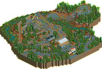
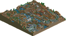
RRP made the coaster, 99% of the supports, and 75% of the station and the transfer area. I made 99% of the landscaping (though heavilty inspired by RRP) and everything else.
-
5 fans
 Fans of this park
-
 Full-Size Map
-
 Download Park
1,312
-
 Objects
206
-
 Tags
Tags
![park_3324 [H2H7 R1] Circus Circus & Adventuredome Atlantic City](https://www.nedesigns.com/uploads/parks/3324/aerialt2970.png)

Liam, don't think I'm trying to ignore your contributions, but I just feel that in a design, the person who, you know, actually made the "design" part should get more credit.
Dont worry about it.We already nudged my contribution up from 30-35% (something like that). Either way i dont really care.
As for the style clash debate...I don't see a real style clash here at all. Obviously it's not the direction RRP had intended, but these are 2 different minds. Liampie took it in a direction that he saw fit, and that was one of many directions it could have gone. I think it happened to blend rather nicely. So good job.
Honestly, I think there should have been more credit for RRP. As rob said, I feel that without RRP's coaster and station/supports, what is the design? Just a couple buildings and a ton of concrete in a forest near a dried up river. 50 or even 55 I think would have been a more appropriate share, in my opinion.
The coaster was bloody brilliant. The supports, everything was just fantastic. Though some of the turns look a bit awkward, I still like this a lot. Especially the mechanic changing the lightbulb, it was a nice detail. Reminds me of my dad, being an electrician and all.
I have to agree, that white roof stands out too much.
I'd vote 70%, because I feel that it needs a few more buildings, it think that would make it perfect. I'd still only vote 80% though
I agree. My work is nice, but still it's just adornments for a brilliant coaster. RRP's work is dominant here.
I agree that the ride should be the focus, but with that last sentence you do ignore everything else. A coaster is just a coaster. A design is a coaster in a context. I think the creator shares should reflect how much of the factual content was contributed by each player, and not subjectively how important each contribution was. At first I gave RRP 30% (Calculated by map surface; In terms of map surface, I actually did 70% (estimated of course
I have no problem with changing the shares to 50-50 under pressure, but honestly wHaT tHa FuCk aRe We TalK!ng aBoUt!? Regardless of who made what and how, let's eat cake and celebrate our hobby.
No offense to you robbie, I respect you and your opinion. NOW CELEBRATE!
Anyway, looks fantastic, I couldn't imagine doing this supports by hand, will certainly be taking a look at this design sometime today I think. That turnaround looks incredibly awesome as does the rest of the layout.
download
Awesome job to RRP on the concept and the LAYOUT. JESUS RAPTURE CHRIST THE LAYOUT! And Liam on whatever else.
I actually remember downloading the original (unfinished) design and having the above orgasm when I saw the lovely layout. Not sure if I envisioned the surroundings Liampie gave the coaster when I first saw it, but hey! That's what makes the game an art-form I guess.. It's all 'bout perspective. Awesome job guys.
btw i found the entrance, lol 'pretend this isn't here'