Park / Cyder Hill Theme Park
-
 13-May 11
- Views 8,611
- Downloads 1,456
- Fans 1
- Comments 25
-

-
 65.38%(required: 60%)
 Silver

Kumba 80% Louis! 80% BelgianGuy 70% Milo 70% turbin3 70% Casimir 65% inVersed 65% Levis 65% Maverix 65% 5dave 60% CedarPoint6 60% Liampie 60% Metropole 60% prodigy 60% Steve 60% 65.38% -
1 fan
 Fans of this park
-
 Full-Size Map
-
 Download Park
1,456
-
 Objects
530
-
 Tags
Tags
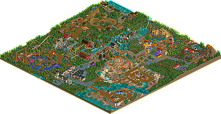
I'm also a fan of some of your custom rides, like Barn Raid.
Overall I think it is a well deserved silver.
A very well done job.
My only big flaw is that it seems that you had more ideas than would be able to fit into the map and therefore it looks a bit crammed together. You could've executed some ideas better, imo.
Gratz.
Also, so it's SSSammy who snatched up the last two logo's. Thief.
The park was pretty good and well worthy of Silver. Some areas were shit, but some areas were great as well.
I suggest you'll make your next park a lot smaller (70x70? 80x80?), so you can improve enough to not make the horrible mistakes I'll explain in another post later.
(to not be an asshole: nice park dude. some solid archy and a nice improvement from your old work.)
first off, the layout of the park was terrible. it was riddled with dead ends, and with random things like that empty island and the alpine street leading off the edge of the map.
the sand area was really a problem for me, because of the sand surrounding the area, then a fence and then forest. why would a park go out of their way to put empty sand around an area when the forest is still clearly visible just a few metres beyond? I would have put more buildings. it feels really weird having the foliage of a park randomly change from one area to another, and you can still pull of an african theme with trees around it- see busch gardens. another similair problem is behind the strange colored buildings, you just put gray metal walls, which are clearly visible to anyone going behind them, which is a lot of people because there were rides and paths there. theme the back of your buildings!
on top of that, I felt that a lot of the areas were just bad ripoffs of other areas. the area to the left of the entrance was clearly a ripoff of 5dave's kids area in his pro tour park. the aquatrax felt the same as the one in mysterium adventures, but not done as well.
the architecture was also a problem for me. what I say were strangely shaped buildings of varying colors with windows and art deco pieces randomly thrown on. nothing resembled real buildings (the alpine/europe area aside, which was excellent). the castle was an excellent example of this imo. possibly the worst example was in the wild west area, where the buildings resembled no theme whatsoever. i was left relying on the coasters and the color of the ground to determine the theme, which should never happen.
i hate to go off on your park so much, but these are just things I want you to improve for next time. overall it was fairly good, and your ride layouts were top notch. as I already said, the europe/alpine area was excellent.
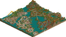
The park looks great from the overview, but when I zoomed in, I had troubles understanding how each area works off each other--nothing seemed cohesive.
Cocoa makes a good point about the transitions in the park. They're abrupt, and nearly force you in, rather than almost making it an exploration. The layout of the park was weird, but hey, It takes a lot of skill to make one I think, and this works, but peep problems will arise in the park for sure.
In my honest view, it seems more like an experimental park, rather then one that would seem plausible, fantasy or not. It's hard for me to understand where this was going, but I must admit, you're getting somewhere if you take one of these themes, and focus on only one. It had a lot of promise, but it just had my head scratching most of the time.
Again, congrats!
EDIT: Just spent a little longer watching the whole park.... It's starting to grow on me.
It's just the farm theme with the yellow inty i couldn't get.
It's just the farm theme with the yellow inty i couldn't get.
gonna go watch SNL now.
Keep on rollin'
To everyone else thanks for the criticism, especially Cocococococa thanks brosef.
Im happy it won silver, sure gold would of been awesome, but hey im glad its done and people can finally see what i consider my best work. I agree there is some fixing up required but what's done is done.
i also found it hilarious how you put the predrop on the flyer and not the invert, when it should actually be the other way around.
either way congrats
-JDP
I've seen comments to this ilk a number of times on the forum, and I just cannot agree. Look at Islands of Adventure for example, Lost Continent is next to Seuss Landing, and Jurassic Park is next to Toon Lagoon. It's just not a viable criticism in my opinion. In fact, I like each area to have a stand alone theme and stark contrast from the areas around it, makes guests feel like you're entering a completely different world every time.
Goliath, congrats on the Silver, more in depth comments to come.
Your foliage was fantastic throughout, although in some places I got the feeling that you were just filling tiles, and some actual theming would have fit the areas better, and made for a better atmosphere. The themes looked good, but not really defined enough... more actual "theming" would have helped this. By this I don't just mean architecture, but specific things... more farm stuff in the barn area, more interesting landscaping in the desert area etc.
Coasters were good enough, but none of them actually kept my attention, apart from the water coaster, which I thought was a nifty way to do it. Nice diagonal lift! The only other ride that brought something new and interesting was the volcano one, but it looked as if you built this awesome volcano for the lift and some of the ride, and then just didn't bother theming the rest of it, or the station.
Overall, you had the beginnings of some really nice themes, and you obviously have the ability to make really nice rides too.. I see no reason why with some more in depth atmosphere, you couldn't grab a spotlight someday soon! Good work.