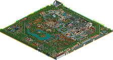
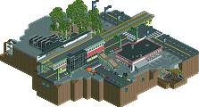
Park / DisneySea

55 Comments

  • zodiac%s's Photo
    i loved this park. what it may lack in detail, it makes up for in size, atmosphere, and ideas. please finish another park like this, you'll be a legend.
  • Kumba%s's Photo
    Congrats again. I really love how you re-invented some Disney ideas in this park. I liked the NYC part the best and the indoor ride reminded me of Spiderman at IoA. Then your adventureland spin off had an amazing atmosphere too.

    I hope you make another park, but if not you really went out on a high point here :)
  • Kevin Enns%s's Photo
    deleted
  • Gwazi%s's Photo
    Wait how was that bad English? Seemed fine to me.
  • JJ%s's Photo
    No.

    I was talking about my english haha.
  • Highball%s's Photo

    I think it's a little unfair to criticise the lack of a coaster. Believe me, I am one of those people who loves parks to be ride-focussed... but this clearly is a park which is not trying to be ride-focussed. It's a DisneySea park; the aesthetics and theming of this is meant to overshadow the rides. So whilst in some senses it's a shame that there aren't more rides for the viewer to look at, I completely understand why there aren't more rides for the viewer to look at.

    Chucking a random coaster in just for the sake of having a coaster would have been pointless. I mean, if you were making your own version of EPCOT, would people complain because there's no coaster? As much as I think rides should be the focus of RCT, I understand that putting lots of rides in this park would actually be unrealistic - as would building a coaster in an EPCOT-esque park. There's a compromise between realism and adding lots of rides solely for the benefit of the RCT viewer.

    couldnt have said it better myself. im glad you enjoyed the park, however unlike you i felt that lost river delta was probably the weakest area of the park. i really had to cram a lot into that small space. the indiana jones adventure greatly suffered because of this and i had to cut the lost river expedition which i really wanted to build there.

    Thanks for making a Viking section.

    thats not a viking section. theres a viking ride, but its not a viking section.

    Congrats again. I really love how you re-invented some Disney ideas in this park. I liked the NYC part the best and the indoor ride reminded me of Spiderman at IoA. Then your adventureland spin off had an amazing atmosphere too.

    I hope you make another park, but if not you really went out on a high point here :)

    looking back at manhattan motor madness, i guess it does remind me of spider-man too. city streets, warehouse... i was actually picturing it in my mind more like roger rabbits cartoon spin but in a more realistic setting. theres no need to worry about me quitting rct anytime soon. ive got the studios comin up and some other ideas i want to try out before i retire.

    i forgot to put this in my first post, but special thanks to tyandor for once again taking the time to de-WW this park for us and thanks to the graphics guys who made that extremely awesome logo.
  • Gwazi%s's Photo
    Oh okay JJ. I see what you mean.

    @Highball - Looks good, I'll check it out soon.
  • JDP%s's Photo
    Main thing I am pissed about is that you changed your name... Iceman was dope.

    Other wise the park was amazing but I really wish you had more coasters. That's it for me :)
    -JDP
  • J K%s's Photo
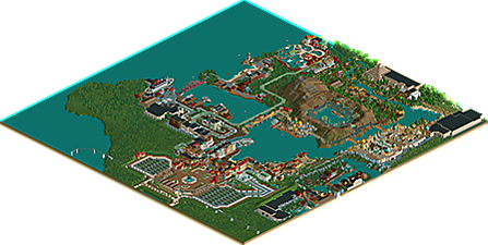
    Disneysea - Straight away you’re engulfed into the clean fantastic characteristics of a Disney park. I must say this park was immaculate and shows you as long as the architectural quality is there; you don't need rides to show you how good a piece of work is. My favourite was the secret centrepiece of the park. Mysterious Island was an absolute masterpiece with creativity flowing out of the middle of the hidden section. Another favourite of mine was the entrance. The Mediterranean feel really shot out at you straight away and was flawless. This park is spotlight quality for sure and with mostly architecture that's really scary. What I appreciate the most however is the time scale and research that's gone into the final piece. That's when you know a Parkmakers gone further with the game and strived for perfection.

    Congrats dude.
  • hpg%s's Photo
    Congrats on the spotlight, it's certainly well deserved.

    I don't want the focus here drifting towards the logo, but we really do need to shrink that down. Basically 400x300 has been the maximum size we've tried to adhere to, and most are even considerably smaller than that.
  • posix%s's Photo
    so, logo replaced. reduced one. are you people happy now? maybe you want it YET smaller? hmm??
  • J K%s's Photo
    I thought the size it was gave before had a greater impact. I'd like to hear the reasons behind reducing it. I'm not complaining but that logo is immense!
  • posix%s's Photo
    why i reduced it? because people were complaining it was too big.
  • Meretrix%s's Photo
    Scott, this park is amazing. The amount of love and detail you put into every inch shows beautifully. You truly are the king of disney. No question.
  • FK+Coastermind%s's Photo
    well, i just wasnt impressed. i really hate to be the person who hates on the spotlight, but i just didnt find this to be spotlight quality. the atmosphere was the most outstanding element, but it was really the only outstanding element IMO. i think the atmosphere could have been so strong, had this park contained some rides. you said you built it in scenario editor and then finished with rides in regular, but i really think this is what hurt you the most. In a game called ROLLER COASTER tycoon, it had two coasters in the park, and they were both boring. jorney to the center of the earth just spun around inside the mountain and the indian jones ride just sorta looked like a train ride. even with your water rides you had almost no drops. this park was just overwhelmingly one-sided and because there was nothing fun to watch, it made the park boring. also, having no rides to look at, we are forced to really focus on the scenery. the architecture is, for me, a bit old. maybe a year ago, this would have been amazing, but it just looks kinda blocky for me. it has some nice details, but compared to other work we see today, it lacked in detail. the arab area was my favorite. you really hit the nail on the head there, managing to put together just enough detail, and combined with the textures and structure get a really great feel. as for other parts, i felt towards the indian jones are you had just too much trees and foliage, while in the city, it look great, but you just had a ton of high buildings with rooves. there were alot of little details i liked, but i just got bored so quickly, because you had no rides. besides the top of the drop on jorney, you had no track showing at all. i understand what you mean with real Disney parks not having many coasters, but in RCT, you really have to have something ABSOLUTLY Golden in order to have no rides. this was good, it was just not enough for me.

    either way, it was great work, and defintly deserving of an accolade.

    FK

    Edited by FK+Coastermind, 14 August 2008 - 09:00 PM.

  • Highball%s's Photo
    i appreciate everyones comments, and im glad yall are enjoying the park.

    What I appreciate the most however is the time scale and research that's gone into the final piece. That's when you know a Parkmakers gone further with the game and strived for perfection.

    three years, over 1,000 pictures, and at least a dozen videos worth of research and time to be exact. this park was a little more difficult to pull off than disneyland, but i feel that i nailed it in most areas. i dont build for anyone but myself and i like to think of myself as a perfectionist in my work, so half assing this park was out of the question because i'd know it.

    it had two coasters in the park, and they were both boring. jorney to the center of the earth just spun around inside the mountain and the indian jones ride just sorta looked like a train ride. even with your water rides you had almost no drops.

    like i said before, the indiana jones adventure and journey to the center of the earth are not meant to be roller coasters. withouth significant hacking, their ride systems are impossible to replicate in rct2. i chose coaster tracks because i could maintain a constant speed and sense of adventure in comparison to other ride types. im guessing your comment about the water rides with almost no drop was in regards to sinbad and maelstrom? sinbad was meant to be a recreation of the real ride in tokyo. im not going to add drops to a ride that isnt intended to have one. maelstrom at epcot has some drops, but they are rather small as well. even though my maelstrom was meant to be a more thrilling version of the epcot original, i didnt want to exaggerate too much.

    again, i appreciate the comments guys. and maybe it was just me, but i liked the big logo. it matched the scale of the park. :p
  • Xcoaster%s's Photo
    Nah, I liked the big logo too. Ah well, it's still pretty big.

    And Epcot's Maelstrom isn't very exciting, so no surprise there.
  • Sulakke%s's Photo
    Sorry, but I have to agree with Liampie.
  • Sulakke%s's Photo
    Otherwise it'd sound so rude. :p
  • Kevin Enns%s's Photo
    deleted