Park / DisneySea
-
 30-July 08
- Views 16,795
- Downloads 4,261
- Fans 3
- Comments 55
-

-
 83.13%(required: none)
 Spotlight

Cocoa 90% no 5dave 85% no Arjan v l 85% no BelgianGuy 85% no MCI 85% no ][ntamin22 85% no geewhzz 80% no Liampie 80% no Louis! 80% no nin 75% no 83.13% 0.00% -
3 fans
 Fans of this park
-
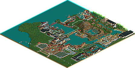
 Full-Size Map
-
 Download Park
4,261
-
 Tags
Tags
![park_3371 [H2H7 R5] Universal Studios](https://www.nedesigns.com/uploads/parks/3371/aerialt3057.png)
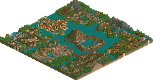
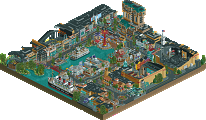
'Grats
what a great park from the screens. I think this is actually really the style of parkmaking I appreciate.
I'll give you a detailed review when downloading is finished.
edit:
I must say that I'm not really amazed after viewing it.
The screens promise a lot because after seeing them you think: "Wow, amazing to see how well the park is themed. Let's see how the rides look", but there are nearly no rides in this park.
The attraction I like the most are Seven Voyages of Sinbad and Caravan Carousel. I chose a water darkride without a drop and a carousel.
Now where are the coasters?
Why didn't the park atleast have something like Flounders Flying Fish Coaster? There are Journey to the Center of Earth and the Indiana Jones Coaster but even if this is Disney Sea i would have expected more.
Why not atleast some more flatrides.
If I remember right there is not one outdoor ride besides the steamer which was really cool, the Tram and the Venetian Gondolas.
The themeing for all three of them is impressive but a park of this sieze can't just have three outdoor rides which are all just for getting a view of the park.
Now let's come to a detailed review of the areas:
Italy:
I was really impressed by the layout of this area. I liked the fact that you managed to put so many HUGE buildings on such a small space but I was quite happy I must say when I finished watching this area. Even if building so many giant buildings on such a small space is quite impressive it's not really a good point for the park. The area was just way too crowded and though there were so many little details you couldn't really find any because there was just too much going on.
Between all the architecture I finally found the Venetian gondolas which were quite nice but I didn't like the color of the boats. The layout of them was good though.
USA:
After having seen Italy I moved on to the USA which was a lot better. I liked finally finding some more attractions (3) but still it was lacking something. I thought you needed one main ride per area and there was none in this one. I loved all the ships and the S.S. Columbia but after having seen your creativity when it comes to the use of objects I would have liked to see creativity in terms of ride design and ride interaction with the path. The trams were fitted very well to the area as the Manhattan Motor Madness ride did but still I can't get over the fact that there is no real main ride.
Port Discovery:
I liked Aquatopia as I have seen the real one on many screens. I think it's a great ride and it was pulled out very well. Storm rider is good too but it just didn't capture me for too long. There was just not much too experience in this area.
The overall layout of the area is great though and again you showed a great creativity here.
Lost River Delta:
For me this was the second best area right after the, yet to come, Arabian Coast. I liked seeing Indiana Jones without the roof but what made the two rollercoasters of the park, Indiana Jones and Journey to the Center of the Earth, even worse was that they are not what you expect when you want to see a coaster. Both had one main drop and the rest was just straight and boring in my eyes. Pls don't think I overall didn't like the park but next time just add more and BETTER attractions to it.
The steamer station was great here. I loved the atmosphere you gave this area and I can imagine that it's great in the real disney sea.
Arabian Coast:
This was BY FAR the best area in my eyes as there were the two best attractions. Caravan Carousel is a great, a really GREAT carousel. Maybe the best I've seen yet. I wish there were more attractions of this class all over the park. The same level of greatness had the 7 Voyages of Sinbad. I loved the indoor theme and especially the area in front of it. The whole area was layouted very well and was the only one which actually really gave me the WOW-factor. The architecture and atmosphere there was just great!
Mysterious Island:
From the overview it looks really good but even this one didn't hold my attention for too long. I don't really like Journey to the Center of the Earth. Island at the top of the world is just a motion simulator so there's not much to say about this.
I don't even know what to write about this area as I'd just write the same as I did when I commented on the other areas. The areas layout and the idea behind it is great but again it lacks at terms of ride design or just at terms of being interesting.
Scandinavian Inlet:
I quite liked maelstrom when I first saw it but I was sad when I noticed that the interior of that hall was not themed. The only ride which could have been themed well and have an interesting and thrilling layout with more than one drop was not themed. That was a bad fact about the ride in my eyes but with a bit of imagination I expect it to be a good ride in a real Disney Park.
The Overall layout of the park was great but if you had filled that part behind the facades of the USA with the Atlantis ride you wanted to build it would have been SO much better because then there would have been a ride which captures you for some time and as I said your park didn't have any of those.
I really think you let the wrong rides out because all those you mentioned in the read me would have been a great adition to the park.
Congratulations to the spotlight but please, even if this is a Disney Park, PLEASE put some more rides in your next parks!
Fisch
Edited by Fisch, 30 July 2008 - 11:56 AM.
I still think your Disneyland Resort should've been Spotlight, but with this park you prove your style is of high quality parkmaking..
I'm also glad to see quality PARKmaking is still alive, and not only those designs and small pieces of RCT which we've been flooded with lately..
I'll write some more elaborate review later, but one minor point of critique is the absence of a major rollercoaster (apart from 'journey' of course)..
Congrats on the parkmaker spot and Spotlight and looking forward to the Studios park!
SF
again im glad that yall are enjoying the park as much as i did building it. anyone find any hidden mickeys yet?
I don't see all the details everybody is talking about, there are way too many ugly objects, the rides were quite boring, the foliage was simple and bad, there is no real parking (you could have used the giant gaps you filled in with just a few trees) and some parts were too cramped.
Sorry.
Although I dislike this park, congrats on achieving spotlight!
I think it's a little unfair to criticise the lack of a coaster. Believe me, I am one of those people who loves parks to be ride-focussed... but this clearly is a park which is not trying to be ride-focussed. It's a DisneySea park; the aesthetics and theming of this is meant to overshadow the rides. So whilst in some senses it's a shame that there aren't more rides for the viewer to look at, I completely understand why there aren't more rides for the viewer to look at.
Chucking a random coaster in just for the sake of having a coaster would have been pointless. I mean, if you were making your own version of EPCOT, would people complain because there's no coaster? As much as I think rides should be the focus of RCT, I understand that putting lots of rides in this park would actually be unrealistic - as would building a coaster in an EPCOT-esque park. There's a compromise between realism and adding lots of rides solely for the benefit of the RCT viewer.
As I said, I do very much like parks to be ride-focussed and am always in the 'Rides > Theming/Scenery/Architecture' camp. I like realistic park-making, I like good rides -- I generally don't like fantasy. But this isn't really in either ballpark - it's realistic (not fantasy) but isn't ride-dominated. So what you're left with is basically a spectacularly themed map. And I think you've pulled it off stunningly.
I completely agree with your comment in the read-me:
'Some complaints were made in the Ad District that some of the facades were "too bare" or plain. I restate that this is based on a real structure and I'm not going to add details that shouldn't be there. Not all walls in real life are decorated beyond belief.'
You manage to pull off this realistic style of theming incredibly - without making it needlessly over-detailed. Bearing in mind difficulties with the object limit (I know how horrible that can be) and that makes the results even more impressive.
I love how each area has its own distinct atmosphere and style... and yet it all works together as a whole park. And how it still does feel Disney-esque. My favourite area was Lost River Delta - it just feels like such an absorbing part of the park. Glad you removed the roof off a few of the rides - I really liked Manhattan Motor Madness. But the best example of this was the Sinbad ride... It's so hard to make this style of ride (ie. a themed indoor Disney dark ride) work in RCT - but you've pulled it off brilliantly.
There are obviously so many details in this park, I haven't began to explore it all yet, but it's a really impressive showcase of your envisioning of a park. (I've only found two hidden Mickeys lol.)
So all in all what am I trying to say? I loved the park, it's well worthy of a spotlight. I completely agree with SixFrags's comment - it's so nice to see some proper parkmaking going on. You've clearly thought everything through very carefully when building this park. It's not a ride-focussed park - whilst that means that all the viewer is looking at is scenery, which is a shame - I do completely appreciate that this isn't really meant to be a ride-dominated park. What it is is a very realistic, beautiful DisneySea theme park. Congrats, and am looking forward to seeing your Studios park.
btw, when are you going to send me those pics??
Well, I will check this out as soon as I can but I just want to point out something. When Iceman first started showing off his first Disney park, he was praised for how detailed his buildings are. I haven't been around much in the past year, but I think it is funny that people are now complaining about the lack of detail on his buildings. I guess it really shows how the game has shifted with the smaller and smaller objects. But I really feel that these small, decorative objects have done more to make the game less realistic than realistic. As this park proves it, the norm is to now construct buildings more elaborately decorative than Disney, which ends up in just a pointless cluster of objects. Anyway, another argument, another time.
I support that this has won Spotlight and I haven't seen it yet. Not all parks have to be IOA, or ROB. I fully support granting an accolade to a park that succeeds in its execution. From screens, this is not a standard RCT park with your watercoaster, woodie, beemer, and arrow looper/intamin rocket that surrounds a lake. Nor does this park have RCTecture. Congrats and I will check it out tonight.
inVersed Offline
I really enjoyed looking at the park, however, IMO, some of the scenery pieces and the foliage detracted from the experience. Still there is too much good in this park to outweigh the bad and make this deserving of Spotlight. I agree with SF about Disneyland being spotlight.
I also really like the logo.
Kevin Enns Offline
Xcoaster Offline
Anyways, congrats to Highball/Iceman!!!
And very nice giant logo. Total opposite of Tilted Acres, lol.
Ok it makes sense now, too many bloody name changes in this place.
Kevin Enns Offline