Park / Chronicles of Arransia
-
 13-April 11
- Views 11,973
- Downloads 1,542
- Fans 3
- Comments 36
-

-
 77.69%(required: 70%)
 Gold
Gold

BelgianGuy 85% CedarPoint6 85% Levis 85% Liampie 85% Maverix 85% robbie92 85% geewhzz 80% Milo 80% RCTNW 80% Louis! 75% 5dave 70% posix 70% prodigy 65% turbin3 65% Roomie 60% 77.69% -
3 fans
 Fans of this park
-
 Full-Size Map
-
 Download Park
1,542
-
 Objects
491
-
 Tags
Tags
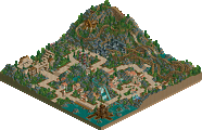
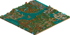
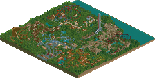
Xophe: Hey good to see you buddy, let me know what you thought of the park.
Wanted: Yeah, Phatage's woodie is sublime and was a joy to theme. Glad you like Manticore also. I feel the coaster designs (besides Phoenix, more on that in a sec) are easily my best to date. I think Basilisk (which you didn't mention) is my best coaster design ever in fact.
Levis: I will be interested to hear your take on this. Also explains why you picked me so high in the mock draft =)
Chorkiel: Glad you enjoyed it. The parking lot was a bit of an afterthought, it has to be said. I just wanted to show a sense that the park expands upon what you can see, and that is where I invisioned the parking lot. I guess it does look a little forced. Not entirely sure on what you mean regarding the "hall" of the spinning coaster. If you mean that the guests can see the back of the building, I guess that comes down to kinda poor planning on my part. Something I am looking to rectify from here on out and go into my parks with a clear vision of where everything is going to be. A Fantasy Tale was actually the last thing I built on the park, way after I had started it. Before it was just an empty area that I decided I wanted to build something on. As a result, I perhaps didn't take into account other factors as you mentioned. I guess that's a side effect of building the last area of the park 6 years after the first area of the park, which is just over the river =). What was it about the entrance you didn't like?
Liampie: Cheers man. Good to see that the park made an impact. Looking forward to hearing what you have to say!
JDP: That's all I get, no scrutiny over my coaster designs??!! =)
Cocoa: I'm not sure I agree that the themes were disjointed, but I do agree that I could have taken them a lot further. In some cases, it was just architecture and rides, a criticism I have had before (from Iris I believe). Thanks for the comments!
Phatage: Look forward to hearing what you have to say. Once again, thanks for the woodie man, sorry it sat unnattended for so long. I hope my theming did it justice!
Hulkpower & RCTMasta: Thanks guys
Louis: I totally agree with you. I had a great vision of how I wanted Arransia Castle to look and how Phoenix would interact with the area. I fell short in so many regards, and it was pretty much the last piece of RCT work I did for a looooong time. Probably went a long way to me losing interest in the game. Anyways, when I came back to the park, I thought long and hard about destroying the area and starting over. But I had a feeling that it could lead to me going overboard and revamping all areas and it never seeing completion. So I left the coaster as it was and worked on the castle walls, some of the architecture and theming around and I built A Fantasy Tale. I agree, the area is by far the weakest in the park, I'm not at all happy with the coaster design and it really brings the park down. Thanks for all the comments mate.
Gwazi: Glad I gave you a reason to whack out the RCT2 disc again. Hope you enjoy it mate.
I'd like to hear a few more people's thoughts on the park. Particularly from the judges...and more particularly from the judges that didn't like it as much.
Cheers guys
Metro
and I did mean the back of the building.
-JDP
As for the park there was only one thing I noticed that made me score this low (yeah go figure), and that was a lot of pieces where a bit bare where it would've made a lot of difference even with some foliage as filler to make sure you didn't have a few gaps in the transitions.
Coasters: although they weren't realistic all of them had incredible flow and I loved the woodie and the surroundings you gave it,
The themes and coaster where pulled off flawless is terms of the bench and the age of this park but the real pinacle here I think is just the concept behind it and how you implemented the game to create your own little world and that is something very few can achieve, I mean the older parks have this quality more than some recent parks but this was just the cherry on top the cake that was this park...
Congrats on still achieving a massive score for a park this age and I hope you're back and better than ever seeing you're already advertising new stuff that is looking equally great but more modern, I can't wait for your next release.
BG
But yeah, this park was everything I hoped it would be. What a great experience to see this style of park-making resurrected one final time. To put it most simply, everything on this map was just plain fun. Since this has been released, I've gone back to look it over at least four or five times. I really just can't get enough of it, honestly. What an inspiration to see this finished after all these years.
And, am I crazy here, or were the coasters really good? Like...mind-blowingly good? That was definitely something I wasn't expecting. I really can't get over Basilisk. The pacing was so perfect and smooth, and that first drop just looked like it would kick so much ass in real life. I watched the trains go through the circuit over and over again,keeping an eye on the speed as it seemed to increase after the MCBR. I'm no coaster snob, but I can definitely tell you knew your shit when you designed this one. All the elements of a great stand-up, for sure. Then there was Necromancer. Damn man, this was one hell of a ride. Like Loch Ness Monster on steroids. Everything about that ride felt...right. The inversions were placed so well over the lake, the drop looked gut wrenching, and the track colors and train colors were perfect. I'm going to go as far as to say that this was the best Arrow corkscrew I've ever seen. And that name, Necromancer, is really pretty awesome. Phatage's Intamin Woody completed the trifecta of awesome coasters. That was just another ride that looked totally badass, and in my opinion, was themed to perfection with the caverns and dragons surrounding the station. Manticore was almost awesome. My only problem with that one is that it was a bit too fast through that first helix, and pulled some strange laying-down maneuvers. The end of the ride with the pretzel over the waterfall, though, was really incredible. The Intamin rocket wasn't really my favorite, but that's not something I can really fault you on. I've never really liked that coaster-type in game (except for Bourbon Street Blast in BGS...woah).
Overall, I really loved this park. I can honestly say that it totally exceeded my expectations, and has found a spot in my top five favorite parks. It's stuff like this that reminds me why I got into RCT in the first place. Excellent job man.
I wasnt around when this park was first in the works, so obviously i wasnt anticipating this release. But this park fully deserves the score it got, although it may have scored much higher back in the day.
The entrance area was classic RCT2, with a modern touch. The archy was nice and it created a great atmosphere. I wasnt so much of a fan of the grass walkway area on the main strip, but it fit the area theme well, so no complaints in the end there. Basilisk had an awesome layout. I really loved the realistic 'pits,' if you will. The concrete basins underneath the immelman and Dive loops. Nice, realistic touch there. The supports are great...for when this was started. Obviously, you didnt have the objects we have for supports now, Toon's set, but for the time period these would be flawless supports. This goes for all the major steel coasters in the park.
Excellent job on the custom flat, Chimera as well as the surroundings. This area was kindof off to the side, but certaintly wasnt the worst in the park. Speaking of custom rides, Hellhound kicks ass. I liked this one better than Chimera, it looks a lot better. Phatage's guest spot was yet another great layout. Loved the wooden coaster.
The Arrow was classic rct. Really reminded me of some older spotlight parks with the layout and surroundings. Nice job there. I think the Beemer flyer had the best layout in the park, as well as the best queue. That queue line area may be one of the best I've ever seen. It just really popped out to me, no idea why. Maybe I'm the only one, maybe I'm crazy, but that was definetly one of my favorite little things in the park.
Wasn't really fond of the accelerator coaster. Two tophats in one layout? I get you arent going for total realism here so I wont fault that. The midevil castle theming of the area was great and another superb custom flat.
Overall, the park had great architecture, solid coasters, good landscaping and foliage, and several awesome themes and atmospheres. I say this easily deserves the gold, however it may have challenged for spotlight had you finished it back in the day
This also deserves more reviews/comments/replies. Come on boys.
The style of this park is my favourite. I know it's already been said, but this totally reminds me of Isole Calabria and Islands of Enchantment, in a good way. I loved how instead of tiny details, the park oozed atmosphere just based on colours, foliage and the like.
There were two areas that really captured me. First of all, the entrance area, as small as it was, fit this park perfectly. I assume this was one of the first things built? Although it looks older, it really built up the sense of adventure awaiting the guests. The architecture and shop ideas were my favourite, but I also loved the grass paths. Really cool! The second area was Headman's Hill, mostly because Necromancer was completely awesome. It's interaction with everything was great, and the colours and supports were nicely done. The path layout was also really interesting in this area.
I am excited what you can do with a more modern bench, and Molten Disaster seems to fit that bill. Great to see you back!
I feel i should explain myself but its really hard. For me this just wasn't as cohesive as i felt it could have been. Individually the areas were often excellent but i didnt think they gelled together that well. The area around the back of Wyvern was also poor in my opinion.
On the plus side the Pretzel on the Flyer and the Arrow were excellent as was the architecture like the castle wars was excellent.
Sorry I cant be more descriptive. but congrats on the gold award
First of all, this was probably the hardest vote I've ever had to vote on, and the only one that pushed me to close to the end of the three-day voting window. In the end, I voted this as spotlight, but there were a few small things that could've held it back for me. However, the benefits far outweighed the drawbacks and I found this park to be worthy of a spotlight.
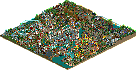
I'll get the negatives, specifically the biggest one imo, out of the way early so I can finish off with heaps of praise. The center island area nearly killed the park's chance at spotlight for me. It was just too much tarmac, and it didn't fit within the theme you had for the area. If you look at the overview, you have all these wonderful earthy tones for your pathways and areas, making that center area jarring with the rest. There was also an overabundance of openness in the area, eliminating the cozy theming found in the rest of the park. The architecture was also not up to the rest of the park's standards. Honestly, you could just eliminate this area and I wouldn't really miss it, beyond the coaster, which was very nice.
Now, with that out of the way, where do I start with the praise?
-Necromancer is OMFGworthy. This was my favorite ride in the park, in terms of the total package, with the woodie a close second. The cliff setting was genious, and it interacted with the surrounding area extremely well. Colorwise, it felt spot-on as well. That whole area was a masterpiece imo, and that ride alone put SPOTLIGHT right into my head.
-Phatage's woodie was also quite incredible as were the surroundings. A great plug-n-play and a great overall package as well!
-Manticore was also great. Great colors, great interactions, great supports... Just great!
-I loved Basilisk as well. What a great first impression it gives when you open the park. The realistic details were all done extremely well, and the layout was very nice. I actually really enjoyed the concrete ditches it goes through, as it felt very realistic.
I loved how this felt like a fantasy park, while still being realistic. I will admit I find it a bit mored difficult to get into your older works (bar Boscastle Heights, which is brilliant) because I enjoy realism so much, and it was an absolute joy to see a park take on fantasy themes while still sporting realistic details and a great sense of believability. I'm sad that this didn't win spotlight, as it totally deserves it, but I can't wait to see what you have in store for us with your next releases, considering Molten Disaster looks so damn good.
All in all, great park from a great parkmaker and I look forward to see you will bring us next.
Well done!
James
Robbie: Thanks a lot man, much appreciated. Looking back now, I probably could have easily got away with just getting rid of the Arransia Castle area completely and filling it with water. The park would probably have been better for it. It really isn't up to the standard of the rest of the park, I agree. I'm glad you were so fond of necromancer. It is definately a coaster that epitomises my style of parkmaking, using the landscape to it's advantage. I'm still very happy with how it turned out, especially considering it was the second coaster I made in the park. Thanks for comments, and thanks for voting it spotlight
James: Good to see you back buddy. I understand why the park didn't get a spotlight, and I completely agree that it didn't deserve it. Definately gives me something to work towards in the future. Glad you enjoyed the park, and thanks for taking the time to vote on it and come back and comment after your hiatus.