Park / Nebula
-
 31-August 08
- Views 4,256
- Downloads 582
- Fans 0
- Comments 30
-
 60.00%(required: 65%)
 Design Submission

chapelz 80% Xcoaster 80% nin 75% zodiac 75% 5dave 70% Fr3ak 65% Milo 65% Magnus 60% Evil WME 45% RCTFAN 45% ChillerHockey33 40% geewhzz 40% posix 15% 60.00% -
 No fans of this park
-
 Download Park
582
-
 Tags
Tags
I won't comment much on your personal decisions, but I do hope you pop in every so often for micro madness or whatever.
Nebula-
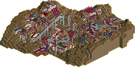
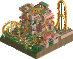
also a shame. This has a lot of the atmosphere OLE and I have tried to achieve with LL in similar, relatively bare space settings. I think it should have won, but not by a large margin. I simultaneously agree and disagree with posix. I like to think of him not so much as a person but as a small committee of overblown and decidedly pessimistic critics. He's useful for always providing that little bit of how you could improve, but don't pay him too much attention. The layout was good-to-great; i think the inline going to the half cork should have gone the other way, and it just kind of lacked the little extra "oooh, that was cool" bit. The caldera signs amused me. I have no problems with the trackitecture, mixed paths, colors, or ghost train windows- all were very well done. The problem i see with this is that, while you basically nailed what I consider to be the hardest part of RCT, you let of on the easy stuff. The atmosphere is great, and the whole thing is cohesive and comes off very nicely- nothing looks tacked-on just for bonus points or looks out of place, all of it is believably a part of the world you created. However, you seem to have not fully used your resources. The lift supports are cool and are almost well-done; you could have used codex to more precisely line them up. Also, the squares where you've used custom supports still have in-game supports. This wouldn't really fly in an RCT2 design, so if the less-LL-knowledgeable panelists saw that what would they think? The vertical supports also don't seem to touch the ground- maybe you could have used barrels or something as footers? stacked garden clocks mayhaps? Another thing you don't seem to have followed through on is that codex can change path square edgings. Its just a little detail that makes the park look professional. These things might seem minuscule in a larger park, say if this were one of six areas. When this is all you're presenting us with to scrutinize, however, the little things are magnified, and this is probably why you didn't win. (even though you should have.)
Edited by RCTCA, 01 September 2008 - 01:21 PM.
Great work and I hope you do build again in the future.
inVersed Offline
First of all, when the first post I made was irrational and portrayed a perturbed image of me as opposed to a reasonable one. I have nothing against the management here and I am cool with all the members of it. I apologize for calling them out for no reason in my first post.
Secondly, I do not want to retire from this game, at least, not yet (i would like to complete at least one full solo first). What I said in my first post in this topic was merely me running my mouth because of frustration of rejection. With that said, I still won't be as active because I really do not have as much time with school and all, but I won't be gone completely. In this topic, Posix brought up a valid point that if the only reason I play is to win accolades, I shouldn't play at all. There is truth in this that we all should head because it seems like all of us take this game a little to seriously at times. Myself, probably more than others. Generally, i do play the game for fun (that's why i never finish anything
Thirdly, thank you for all the positive feedback that I have received in this topic for the design.
I'll take a look at it later and let everyone know about my very important opinion.
Welp, after looking at it, I can see why it didn't get design. I wouldn't have. It's good, don't get me wrong, it just wasn't polished enough, I guess. Like, the buildings didn't have any purpose. If it was going through some space lab, make different rides for each building and label them. The theme may have been blaringly obvious in your mind, but it's pretty confusing coming from somebody who hasn't had the same train of thought as you. That's the biggest problem in my book. Yeah, it's supposed to be spacey and bare and high tech looking, but that's about it. And I know I've been guilty of that in the past as well.
And there were some parts that were a little bit sloppy. Like you can break up the path you used for your queue line where the fences are and the game's supports were pretty distracting in some places and some of the path-roofing was broken up. I don't know if it was supposed to be completely broken up, or completely together. You know. And the multi-colored path was pretty distracting.
It may just be a bunch of tiny things, but they all really add up and detract from the final product.
The fundamentals are all there and strong, it just lacks that polish that really sends it home.
That station was pretty badass, though.
Edited by tracidEdge, 02 September 2008 - 12:17 AM.