Park / Nebula
-
 31-August 08
- Views 3,874
- Downloads 470
- Fans 0
- Comments 30
-
 60.00%(required: 65%)
 Design Submission

chapelz 80% Xcoaster 80% nin 75% zodiac 75% 5dave 70% Fr3ak 65% Milo 65% Magnus 60% Evil WME 45% RCTFAN 45% ChillerHockey33 40% geewhzz 40% posix 15% 60.00% -
 No fans of this park
-
 Download Park
470
-
 Tags
Tags

inVersed Offline
I submitted this for design and it got rejected. What goes through the panels head is beyond me, but i really don't understand it.
Not trying to spark debate, but this is the second time i have been robbed. This is a bit frustrating but nothing to bicker about.
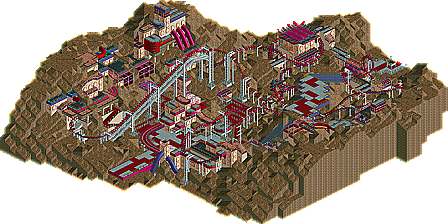
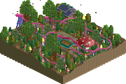
Heres the design:
Nebula by inVersed
I suppose this is the end of an era. It may be a while until you all see me again, i have a lot of other things to take care of now
Not because of being rejected, but in general, i miss the old NE (under iris and later corkscrewed) and how things operated then. The quality of the forums here seems to have declined recently.
I hope nobody hates me for this, for I did not make this post to spark animosity and angst but to say goodbye and release this design
It's been nice here.
Thanks for everything.
Edited by inVersed, 31 August 2008 - 06:43 PM.
RMM Offline
hahaa not to offend anyone but compared to most other designs here lately...
this defiantely deserves to be a design. no doubt about it.
great colors, nice layout. the architecture was one of my favorite parts.
everything went togehter nicely. the landscape, all of it.
the only thing I wouldve tweeked with was to get that intensity below 10.
other than that... definately design quality.
one of my favorite rct parks ive seen in a long time.
FullMetal Offline
But trees or no trees, this is definitely Design worthy, IMO. 17/20
Edited by Xin, 31 August 2008 - 10:12 PM.
i hate to see this released in the forums, not on the front-page where it deserves to be.
anywho, from what i could see, i like the look of this design. the colors are my favorite. reminds me abit of a less extreme Jkay. the lifthill was AWESOME, but all standards, LL or RCT2, IMO. you should feel proud of your work.
im sorry to see ya go InVersed. me being one who used to have little intrest in LL, your work really caught my eye. LL is truly taking a toll in loosing you.
FK
i personally loved this. it was something very different from what you usually see, and it was very refreshing. it's sad to see you go again, but i hope you return eventually.
oh well. I really enjoyed it.
But what of Fairwood..?
FK
anyway I'll be yet another panelist who agrees that you got blind robbed with this... I have no clue where some of the votes for this came from and what any reasoning for them is. I'm upset with the panel at this point and am very unhappy with the votes this recieved and am very curious to see the names behind said votes
And yes there are always going to be differences of opinions and some people might not like things as much as others but really I have seen no real reason said that this was not Design worthy. Quite frankly I've been concerned ever since this decision was made and am second guessing everything the panel is doing right now.
my vote was the lowest and was therefore not counted. but maybe that makes me the person who should explain why he didn't like it. to be honest with you, i found this to be nothing but random. play rct with a true inspiration in your mind and build something that tells me you enjoyed it. don't just use rides as trackitecture for the sake of it, do it for a reason. give the things you build a meaning. when looking at it, i couldn't find any of that whatsoever. additionally, i got the impression as if you couldn't be bothered in the end to clutter the rocks with shrubs and trees, something i would have expected to see but i was actually kinda glad you didn't do.
if you leave this site because your stuff doesn't win then your playing rct for the wrong reason in my opinion and it might just be for the best for you to take a break. again.
Best post I've seen here in years.
Seriously posix, what the hell are you on about? "Do it for a reason", how about that reason being to make it look better? It's a stupid game ffs, not everything has to have a meaning.
Inversed, you were definatly robbed with this.
Dunno why it was rated that low...
I have to agree with Posix last statemenet, though.
If you build your parks just to win something, then you don't seem to have fun playing RCT at all.
"MFG"
If you really wanted this to be a nice place, how about giving some useful input on the various discussions taking place instead of bickering.
posix is just one member of a panel of 15. In other words his opinion counts less than 10% and here it did not count at all. So do not blame him for the fact this submission did not win.
Our standards for design seem to be a little higher than before and I think that is a good thing. (i.e. Kumba's design got rejected at first aswell)
Why can you people not enjoy a release that does not win an accolade?
It is about having fun playing the game and looking at other peoples' work.
---------------
To me this one was nice, but not outstanding. Nothing was wrong, but there was nothing special pushing this above the design standard for me aswell.
The coaster was ok, the theming was nice, but a little repetitive and uninspired ...
All in all pretty close but below the design standard.
About the design, I didn't think it was all that special. There were a lot of little things wrong with it that should never been allowed to ever be in a release, like not removing the original supports when you make custom ones. Just fucking sloppy, dude. Nebula has no exit path...
Another big problem with it I have is that I can't tell what's going on a lot of them time because there's so much going on. The path colours blend with the buildings and the coaster... the raised path was a cute idea, but you can barely tell that it's there because you didn't make it look like it was raised up. There's nothing to show the elevation change--That could have been done with one single bush. The landscaping just kind of detracts from it all, really. I cant figure out the elevation changes because its all so jumbled.
Personal prefrence wise, I think ghost train windows need to be stopped. Immeadiatly. Worst LL innovation ever.
Constructive critisms, the coaster had great ineraction with the ground and buildings, something I wish I saw around here more often. And I'm glad you took on such an adventurous landscape. Nobody does that shit anymore.
Really, dude, this just reminds of old school NE work. Not that it's a bad thing, I was just never a fan of the style. Better luck next time.
as for getting robbed, i dont know about that
NE ruins the game if your only building for NE.
i would be proud of this coaster, little tweaks might have given you that +1
good work, sorry you lost the fun =/
Edited by rK_, 01 September 2008 - 11:41 AM.
"Our standards for design seem to be a little higher than before and I think that is a good thing. (i.e. Kumba's design got rejected at first aswell)"
you should explain this because if it got rejected then resubmitted then got the votes, thats fucked up.
Edited by rK_, 01 September 2008 - 12:06 PM.