Park / Hyatt's Northwest Adventures
-
 31-March 11
- Views 22,314
- Downloads 2,716
- Fans 9
- Comments 54
-

-
 84.23%(required: 70%)
 Gold
Gold

RCTCA 100% yes Kumba 95% yes prodigy 95% yes geewhzz 90% yes Maverix 85% yes Milo 85% yes nin 85% yes turbin3 85% no BelgianGuy 80% yes Casimir 80% yes Levis 80% no Liampie 80% no Louis! 80% no 5dave 75% no posix 70% no 84.23% 60.00% -
9 fans
 Fans of this park
-
 Full-Size Map
-
 Download Park
2,716
-
 Objects
487
-
 Tags
Tags
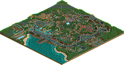
Just thinking how it's weird Americans all voted spotlight twice now, then the no spot votes all came from nonAmericans.. style preference maybe?
This is the one thing I have noticed. I mean, like Liampie said, A spotlight is something that is not only innovated, but memorable. While this is indeed memorable, it's no more than a fictional chain style replicated in other parks, which in itself is innovating in my mind.
Now, for my honest criticism:
First off, I've always loved your work, and this truly is something innovated on your end. Although some structures still have that "size" to them, they seemed small in prospective to the whole map. Though, they were of course big to peeps, and it dwarfed some of your coasters however.
Your buildings are wonderful from a far, like the overview shows, but when zooming in, they over bear the environment.
Anyways, that's your style, and I don't see the point of marking something down for that. Your buildings are so... model like, and I adore that.
Coasters: all I can say is
two issues with the coasters though that I can pick out.
1. Hyper was small, but no matter, it packed a hell of a punch!
2. this is your second GCI...not like it matters, but you have another one (with a station fly through) in a park adjacent to it.
In all honesty, my cons have no honest affect if I was really voting. 85 to 95 would be my cushion, and of course, I do have to say it should be a spotlight.
However, if you do go back to this project, the project as a whole will out weigh some simple vote of a yes or no for two parks so far.
Your work is innovating. enough said.
What? So if a park is spotlight quality, but a better one was released recently, we just drop it down to gold to redefine what a spotlight is?
And voting 'no' because we've been "giving away spotlights too easily" is kinda ridiculous. I'm not saying gold is bad, but god damn, if I made a fucking 200x200 park of this level to win an award some mini parks win, I'd be pissed.
That's not the reason I voted no. I voted no because I think it wasn't spotlight quality (very close, though). The question is what spotlight quality is... If I voted yes on this park, maybe I should've voted yes for Sonoma Falls, Calypso TP, Mysterium Adventures and HOA too. And Brighton Glen should've won tool; that's still the second most-cloe-to-spotlight-without-winning-it-park in modern times, in my opinion. But if I voted yes for all of those, or even half of them, there would be more spotlights than golds. In other words, if 'FUCKING FANTASTIC' has become the norm in RCT, I think the spotlight should be for the parks far above the norm; the 'EVEN MORE FUCKING FANTASTIC' parks.
If everybody started cranking out Dreamport-like parks, I'd not give spotlight to all of them but only the best among them. That's what I mean with constantly redefining spotlight quality.
We have had a few spotlights over the last 2 years I agree but not what you would call a lot and nowhere near what we had back when NE was a young sprite.
I think that coming so soon after Dreamport may have worked against this park to a certain extent. If we hadn't had another spotlight in 6 months then it may be a different story.
But I guess that is sort of your point Liam... But we may look on it differently at the end of the year If the only 2 near spotlight worthy parks all year were these two
The entrance area is fantastic. I abosolutely love how the train station is central above the entrance. It really works a treat and was executed fantastically. The train ride in general was fantastic giving guests great views and interactions with your impressive coaster line-up. I also think the train depot was really well pulled off and very believable. Great job there.
My irk with the entrance area, and in a few other areas of the park, though predominantly the entrance, is the 2 tone buildings. Your architecture is impressive and on a large scale, but I think some accents of colour outside of the 2 selected, and a bit more variation in style between buildings in the same area could go a long way. Your architecture is technically impressive, but after 8 buildings with the same colours, textures and roofing, one doesn’t become more memorable or stand out over the other, if that makes sense. Besides that, the entrance layout was genius, and once again, I’m a sucker for that train.
The boardwalk area of the park was one of my favourite aspects of it. The atmosphere it gave off was spot on and the stilts in the water were really effective.
The hotel was excellent of course, as I would expect from you James, but at this point I was a little tried of the brown wood and green roof/trim combo. I would have liked it to stand out a little more, or be more vibrant. I’ll use this time to say that I didn’t like those ventilation things you use on a lot of your flat rooves, they just don’t seem to fit into the game, and I think a more pleasant version can be made using building blocks.
Onto the coasters. The line-up here was impressive, very impressive indeed. Yakima was excellent. The layout flowed beautifully and I particularly liked the loop within the helix. The transfer tracks were done masterfully and the queue line through the orchard was a neat touch. The woodland walk going through the area was also really nice. I would have liked to see a bit more emphasis on panic plunge, it looked a little thrown in. Also, I prefer my steel coasters a little brighter in colour (like your other steels) so the colour scheme on this wasn’t my favourite. On the other hand, I’m not sure I’d be able to suggest a better colour scheme that would fit into what you were going for.
Mt Baker was really cool. The colours were lively and fun and the textures and colours used provided a nice escape from the rest of the park. The queue line was really believable with a good use of the brightly coloured tin rooves for shades. I loved the bridges going over the ride, it’s quite hard to make hypers and gigas interact well with paths, but the points you did it were really effective. In general, your bridges throughout the park looked really believable and expertly constructed, so props on that. Oh yeah, and the layout was excellent of course. Spot on. Again, you had “the gambler” in the area that is a pretty large thrill ride, but there just didn’t seem much emphasis on it. I think you could make the entrances and queue ways for your thrill flats rides a bit of a bigger deal.
Leavenworth was an epic wooden coaster that gave such an impressive feeling of scale. It just looked monstrous. The layout was really good once again, and the architecture in the area was really good also. One problem I did find is that the entrance of the queue was kinda hidden in a building and not very prominent. I couldn’t work out where it was initially.
Timberhawk was another cool woodie. The station flyby was awesome, though I feel the station was itself was a little uninspiring. Had some good interacting with bridges and the train, both of which I have mentioned before.
Mount St Helens was a really cool ride. Another nice escape from the prodominent architecture style in the rest of the park. The layout was really cool and very believable. I wasn’t convinced by the blue tin roof and dark brown wood roof combo in the area though. I think they clashed a bit. The setting of the Spaghetti Factory garden overlooking the lake with the coaster on the other side was genius, and I loved the little touch with the collapsed parasols. Neat trick.
The Mt Rainier Express was a pretty original ride. I love the way it circled the mountain but in an interesting way. The station was also very very impressive architecture work.
I’m undecided on whether having 2 mine train style rides in the park was overkill, but the Mt Adams Runaway Mine Train was definitely my favourite of the two. In some places I can just imagine standing on that path and watching the mine train cascading around me. It was really cool, and the station had some really nice touches to set it apart from some of the other stations in the park.
There’s a lot to look at in the park and I know this review certainly hasn’t covered everything. It’s definitely one I can open again and again and find new things I haven’t seen before. The park was fantastic and was done on such a great scale. The layout of some of the areas and the way at looking at things from a guest’s perspective was spot on, not to mention the fantastic coaster layouts, realistic details and what not.
All in all, I would almost certainly have voted for this to be a spotlight. It is a simply fantastic park with an epic line-up of rides, a very unique atmosphere and some breath-taking moments. Once again, congratulations on the gold James and unlucky for just missing out on spotlight. I very much look forward to what you have in store for us next (after your break that is).
Metro
I know it probably sounds mean but in a way I am glad this didn't win spotlight. The reason being that I simply didn't think it deserved to. RCTNW, I mentioned this to you already, but maybe to transfer the discussion in here, I'll repeat: I found this park having the same weaknesses as all your previous releases, and to me they are quite important. Cold and sterile atmosphere, repetitive and uninspired streaks of architecture, loveless ride design. I feel no warmth in this park. And I really really need that to vote something a spotlight.
BUT Majority of the euro players voted 80% or under and Majority voted No for spotlight
HMMM
Steve – The credit goes to cp6 for the layouts. They are some of his best!
Cocoa - I hoped you enjoyed the park
pierrot – Indeed!
JDP – Thanks. Will be interesting to hear your thoughts on the coasters.
Comet – Thanks
Turbin3 – Not surprised. Thanks
Levis – I’m not sure I understand by EVERYTHING being the same. To each his own.
Phatage – Glad you first impressions are one that will make you want to take a deeper look. I look forward to hearing your thoughts on it.
zburns999 – Point taken about the names and I’m glad you understand the concept I was going for with them. That said, I really hate coming up with names. Glad you enjoyed the park as much as I had building it.
tdub96 – Thanks. I look forward to hearing your thoughts on it.
dr dirt – Perhaps. Glad you liked it.
CoolCody – I noticed that also but chalked it up to coincident more than anything else
MeMeMe – LOL. Thanks but even I wouldn’t go that far. Glad you like it though
Now to address specific comments regarding feedback
djbrcace1234 - Thanks and thanks for the feedback. Part of the problem for the larger buildings was truly an object limit issue. Again, trying to find a good balance throughout the park was really the only difficult aspect of NWA. I appreciate the feedback though
BelgianGuy – Thanks BG! It’s a fine balance with this project seeing as the maps are 200x200 which I have no regrets when I consider the bigger picture of the project and the expandability it offered. That simple fact alone limited a bit in the amount of detail I could add. More on that later though.
Musicman – Thanks for the feedback.
- Although I agree that the Leavenworth area is a bit overdone however it is kind of what I was going for based on the real town.
- The Cascade Mountain Range in the Pacific Northwest is home to several volcanoes (Mt Baker, Mt Rainier, Mt St Helens, Mt Hood and Mt Adams) to name a few. Since this park was inspired by the PNW, I felt it fit the concept.
- The center mountain was a small version Mt Rainier and there is not much to them. They are snow covered peaks with minimal trees near the top and then more and more trees as it goes down.
- I’ll let cp6 discuss the hyper however I had no issue with it and it’s actually one of my fav’s in the park.
- As for having CGi’s in both NWA and HOW, I see nothing wrong with it. These parks offer something for the single day visitor as well as the “park hopper”/multi-day visitor. Aside from the train itself and the station fly-by, they are completely different layout and surroundings.
Again, thanks for the feedback.
Roomie – First off, many thanks for the kind words. I was especially pleased you noticed something I spent many hours on throughout the park and that was how the park looked from a peeps perspective. The helix on the hyper, the turnaround’s on the invert and mine train on the upper path ring along with a few other areas are intended to offer that “surprise” factor as the train comes into the area. They offer what I think is a great photo op and observation point. The other thing I really tried to incorporate was path interaction. I knew going into it that these were not going to be heave themed attractions so I tried to make up for it with as much path interaction without having it seemed forced. Again, it’s nice to know a few others picked up on that.
The waterfront area is an area I’m really proud of as I was trying to capture a bit of the older Seattle water front area from years past. Although I took some liberties, I feel I captured the look I was going for. The dock features are very similar to those used on HOA as all the parks are connected by a water taxi system similar to WDW. Glad you noticed the little touches.
What can I say about the layouts? CP6 did a great job and I really owe a lot to him for his contributions. It makes it very easy to build when you’re given a great starting point.
As for the future of the project, I’ll discuss it later. That said, I really appreciate the feedback and I’m glad you enjoyed it.
Liampie – Many thanks for taking the time to provide some great feedback on what you liked and didn’t like with NWA. The specific examples really help me understand what it was that you liked and didn’t like
- The entrance are just inside the park I think might have been missed by some in the execution of the concept and perhaps I should have explained it better in the readme. I was partially inspired by Disney’s Main Street. I’ll be the first to admit that this cannot compare to DMS, however it is very much intended to be for shopping and dining all along the street from one end of the park to the other. No matter how you leave the park at the end of the day, you have to pass by the shops. I also wanted the entrance area to have some width to it so that you don’t get that cramped feel as the park opens and closes after the nightly firework shows.
- As I have stated above, I have to find a balance between all the different aspects of the park/map. I did everything I could to free up objects however in the end, I still hit the limit. If the limit was not in place, there would have been so much more I could do, more detail around the hotel, improve the foliage, enhanced the flats a bit more, improved the various structures however as we all know, that is just not an option.
At the risk of sounding ungrateful, the only comment I do take exception to though is the “I'm sorry that you barely missed the spotlight”. It seems hypocritical to say that when you didn’t think this was spotlight quality in the first place. That said, I do really appreciate the feedback and the general feel you have for the project on a whole.
Metro – Where to begin! I’ll try to address a few of your points
- Ventilation units on the roofs – I actually had a different look for them using deco blocks but when I started to comes close to the limit, I had to make some changes with these being one of them. Although they are a bit off in the RCT look, it was better than nothing at all which would have been my only other option
- I had a very specific look I was going for with the hotel as it was heavily inspired by the Grand Californian hotel at Disney’s California Adventure. Although the tones were very similar to the rest of the park, I think it would have been worse to have a different look that would look out of place. Remember the park is trying to carry a single concept in that it’s a tribute to the pacific northwest where timber is a major product. I had every intention of using wood as a predominant material.
- The station on the MARMT, along with a couple others in the area, was all Robbie. I really wanted to get im into the park somehow as he really helped keep me motivated throughout the project.
All in all, I really appreciate the time it took to write up that review. As I have said before, I wish I could have expanded on a few other things you brought up however I really didn’t have a choice. Do I overdue one aspect at the cost of another or do I try to find a balance. Having done both extremes with HOA and NWA and have the same result, I just don’t know. That said, I feel NWA is leaps and bounds better than HOA and there is not much I would have done differently. Again, thanks for the feedback. It’s good to have you back!
posix – Like I said before, I truly don’t understand how this is “cold and sterile” by your definition and I guess I never will. I’ve heard this same comment so many times yet no explanation or specific examples as to why. If by sterile you mean clean lines, then I guess it is. This is intended to be a brand new park with manicured lawns and actual landscaping and not overgrown with weeds and sloppy foliage. All that said, I guess we will agree to disagree.
Now to address a few other things around the project status.
There has already been a huge discussion around this backstage and I’d rather not get into it here. However I do want to bring up a few points to explain my attitude lately
1 – Was I disappointed in this missing Spotlight, hell yes I was. To be honest, it was a huge kick in the balls to put this much effort only to have extremely similar results as HOA.
2 – Do I honestly feel I have a chance to ever get a spotlight in the future? Not after reading some of the comments from those that voted no. IMHO, the consensus from the no votes so far is that I must change my style and I refuse to change my style other than minor tweaks here and there like I did for NWA. I’ve put more hours into this game than most here, mainly because I enjoy building in my style. It’s taken years to develop. It’s who I am. It’s relaxing and I won’t make major changes just to win spotlight.
3 – Since I won’t change my style, can’t change the project map sizes to free up for objects to expand on the detail. Can’t change the spotlight criteria and with the same 15-18 member panel voting on parks and knowing I will always have same 4 no votes from HOA and NWA, there is no chance to get over that hump. The easiest way to explain it is if you have similar results (both NWA and HOA in this example) and you don’t change anything, you can’t expect different results. That along with this most recent result has really killed any motivation for me.
Which brings me to Project Aries. Right now, it’s dead and to be honest, I have no clue when it will be back. I may add to it here and there but I doubt it will have any completed maps released other than maybe a resort or two. I have very high standards when I work on the final touches before submitting a park and to be honest, I hate doing it. Yes I build for myself however If I’m going to go through the pain of finishing a park and submit it, I want to know I have a chance at getting the ultimate result. I know most of my submissions would be silver or even low gold at best however the actual parks, I hope to get Spotlight just like most of us do.
Do I think HOA deserved spotlight? No way. However I do feel NWA deserved it. It truly is the best park I have built and the first one I felt deserved it, even more than MMW.
I have no hard feeling towards anyone on the panel or the site. This is what makes NE so great. Everyone can express their opinion and there is mutual respect for the process and each other. I also know this may come off as a “pitty party” and perhaps you’re right. That said, I can’t help how I feel and I’ll just leave it at that.
Finally, I'd like to apologize to Gee, posix and Louis for my behavior during the release process. I made it personal and childish and for that I deeply apologize. You guys have kept the site alive and if it wasn’t for you, we wouldn’t even have had this discussion.
Thanks
James
the layouts of the GG and B&M hyper gave an obvious voyage and hd:tr but the execution was awful. pacing wasnt all there and the element transitions were rough, very rough. the pacing was solid on the GG but its turns and dips were painful to look at (such as that turn over the water towards the end). the b&m hyper creeped over the diagonal hills and didnt supply any air time, it was boring to watch. ashame because the turn around elements were done nice, but were not enough to carry the coaster. i dont know why a park would have a b&m hyper thats just as tall as the woodie and have them both face the same direction. terrible park designing there.
thought both mine train coasters were rough drafts; especially the powered one, i was so bored. the other one looked as if it was trying to be a family coaster but decided to add intense turns and helix's that gave the coaster no definition.
i was so happy to see the mack and gci from the overview, and i should have left it at that. both designs were obnoxious and way out of character. the mack and its three inline twist made me do an actual face palm... then i realized you were shooting for a horseshoe roll. it backs up my statement of lack in execution in the layouts. then the gci coming from cp6 should be a shoe in right? no, not even close. once again we see cp6 forcing a station pass through in one of his gci designs, how cliche. and brain, you were the person that told me that a gci's lift hill usually has the layout return back around it... after that initial drop, the coaster never came back to it. and i understand gci is really messing around with their styles, but this went too far. the quick wide tall gci layout was messy and the first drop looked terrible. once again, the whole layout seemed forced.
im getting lost in thought with all the coasters... that overview really gave me false advertisement. brain when it came to the coasters i know you rushed them or was given only so much room (at least i hope so). but like i did say, the invert was perfect and i mean perfect. element lineup, pacing, the layout in general was perfect. after watching that coaster, then the rest... it was a real let down.
James like usual this was some awesome work done by you, but understandable why you didnt get spotlight. the repetitive architecture kills your chances every time. i thought the park itself was going to have a lot of innovation when i saw the tram cars but nothing else came after that. so with that said and the okay coasters i would have given this a gold myself.
keep up the good work james and good luck on your next release!
-JDP
Brian, my thoughts completely contrast with JDP's. I found these coasters to be your best ever, besides possibly the intamin mega from WWAP. Each one felt true to the manufacturer, yet was unique, interesting, and felt new. This lineup and these coasters blow HOA's out of the water. pun unintended. I found them all to also be your most beautiful, with some of the best and smoothest transitions you've done. The GCI was pure class and completely gorgeous while still feeling like a true GCI. About the station fly-by, it may be "cliche," but it's a feature MANY GCIs use, both in the past and present, and is still realistic. Its drop was great as well. The hyper was wonderful too; again, pure class. The powered mine train, yeah not the most interesting, but that's the most interesting version of that ride type I've seen. The intamin mine train was great too, feeling like a family thrill ride perfectly. The Mack was awesome as well.
Just to point out that is exactly what Intamin Mine Trains Look like.
They are certainly not as tame as their Vekoma counterparts often are.
Btw, Brians mega in wwap flashed over the airtime hills way to fast. me and brain can talk coasters for hours with no problem. i told him that before and he understood. its a matter of opinion, deal with it
-JDP
It's all opinions and there's no need to completely rip into your fellow players. Please try and keep it civil at least.
And now I will disagree with JDP in a slightly more refined way
I must disagree on the Intamin Mine Train observations being a confused family coaster. As I stated earlier it fits the spec for the 2 Intamin mines trains in China and Denmark. They slot in at the Extreme end of the family coaster spectrum along with Mack's Gran Montserrat at Parque Espana.
When it comes to powered mine trains, I think boring is the name of the game really. Rides like Buffalo at Drayton Manor come to mind when I think of these types of ride. And that's what the one in this park reminds me of.
all i'm going to say for now (until i can do the comment justice) is say this deserved spotlight in my eyes.
HOA was significantly different to HOA in our approach to the park and why I fell it's my best work and why I think it went up so quickly. I had a clear picture of the parks layout that was marked out to include a rough idea for the main paths. I didn't do that for HOA and it suffered because I found that I had significant challenges working the peeps around the park. NWA I fell is balanced in it's approach.
With the exception of Leavenworth, Timberhawk and Mt St Helens, all the others went through modifications. For example, the early version of the Invert as much higher than I was looking for. We talked about it and he came up with this fantastic layout. The turn around for the hyper was not originally in that location and he was not completely happy with it. We talked and he came up with a great modification. Finally, the location for MARMT did not have it in it's current location. The original plan for that area was for a racing/dueling woodie but it just wouldn't fit. So even though the park is mine as the primary builder, when it comes to the coasters, Brain ultimately has the final say on the final layout. I need for him to be happy with it as it's his name and reputation that is on the line.
As for you other comments, I too felt it a bit harsh in your approach however I'll leave that for Brian to address. That said, I feel this is some of his best layouts and currently, there is no one better at them IMHO. If the opportunity ever presents itself again to have a CP6 layout in one of my parks, you can bet your ass that I will be asking for his assistance once again. Not only are his coasters top of the line IMHO, but he and I enjoy our discussions and we BOTH listen to each others feedback and is willing to make adjustments as needed for the better of the park.
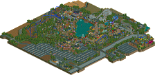
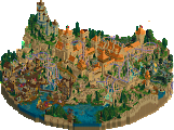
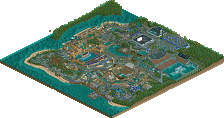
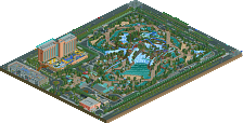
Finally, here is a snap shot of the parks construction over time.
Enjoy
James
Posix, that is the biggest load of bullshit I've ever read. This was the 'warmest' park ever released. Sterile atmosphere? Are you kidding me? You like SCHUSSELER's boring, sterile atmospheres. This park was amazing. Deserved spotlight. Amazing park RCTNW.