Park / Red Quake
-
 27-March 11
- Views 7,001
- Downloads 1,166
- Fans 1
- Comments 17
-

-
 69.62%(required: 65%)
 Design

Milo 80% RCTCA 80% robbie92 80% prodigy 75% turbin3 75% Casimir 70% Liampie 70% Louis! 70% Maverix 70% posix 70% geewhzz 65% Wicksteed 65% Levis 60% 5dave 55% nin 50% 69.62% -
1 fan
 Fans of this park
-
 Full-Size Map
-
 Download Park
1,166
-
 Objects
347
-
 Tags
Tags
![park_2097 [NEDC] Schwarzwald - #2/9](https://www.nedesigns.com/uploads/parks/2097/aerialt1887.png)
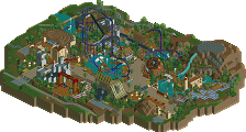
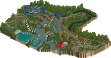
-JDP
It wasn't bad but I'm just not a fan of this way of building.
gratz on the design !
tdub96 Offline
this is fucking brilliant, who's idea
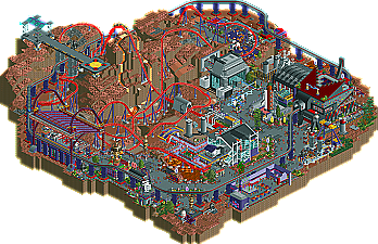
Happy to see this released as a design. Sure it's not the most flowing design ever, infact it is kinda a mess theme-wise, but it's got the great coaster and cool elements scattered all around.
Was fun working with Goliath and Walto. They were both very reliable and creative, so needless to see I hope they can both be Hurricanes whenever we get around to H2H6
I mean there's so much more creativity in a small map here than I've seen in way bigger maps lately
But space-themed RCT work is just really not my cup of tea, as long as it's ought to be achieved by using the vanilla RCT space objects and textures =/
James
1: I thought the usage of the fog was overdone, like it was a way to create more atmosphere and aesthetics in a park already filled up.
2: The styles of the parkmakers had issues matching up... this was seen more on the weaker monorail station made out of track, and the fact some huts are invisible and others are not.
3: Even for fantasy, some issues I find with it is it can be "sloppy," and this seemed sloppy in the essence of colors
And one more...but this is just a stupid nitpick (
The Huss Frisbee goes too far for the arms of the Frisbee to really extend that far in actuality.
All in all, the score reflects exactly how I feel, so congratulations to the three of you!
As for the park, it really wasn't my kind of thing. While I appreciate the skill that was used to make it and the unique ideas you guys came up with, I just couldn't fully appreciate it as the things I appreciate in RCT weren't the main focus.
The coaster: It was nice though I felt it took some sections a bit too fast. Considering how crammed the park was of ideas, the coaster wasn't themed much also, which is a bit disapointing.
The architecture: It varied from awesome to dismal. I echo the thoughts of those that didn't like the trackitecture monorail station. I really didn't enjoy it at all.
The landscaping: The terraforming around the coaster was definately the highlight of this entry for me. Props to whoever did that, it was a stellar job.
I think overall, while it really isn't my style, the skill required to make this and the ideas used make this a deserved design. Well done guys!