Park / Fiesta Gardens
-
 26-February 11
- Views 2,913
- Downloads 827
- Fans 1
- Comments 2
-
-
 djbrcace123490%
- imawesome112410%
-
-
1 fan
 Fans of this park
-
 Download Park
827
-
 Objects
210
-
 Tags
Tags
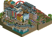
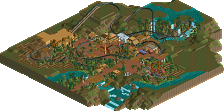
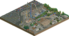
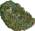
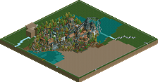
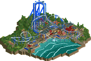
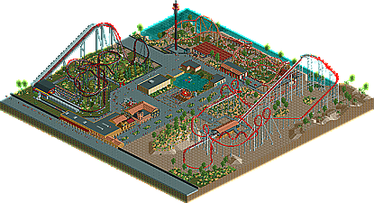
Not doing so well this round , and I can see why. I was trying to pull an RRP style with open spaces, but I was pressed for time when the deadline was changed. Stupid procrastination. Anyways, this is not my best work, building wise, but I like that layouts.
Enjoy!
Edit: I would like to thank the staff for uploading this!
And all the coasters have red in it. But I love your use of diagonals, layouts, some archy, and supports.