Well, the livecd didn't do shit , but I tried changing the way the computer accesses the hard drive from "RAID Autodetect/AHCI" to "RAID Autodetect/ATA" and it worked!
So once I get a couple missing CS files I'll start work on Ikran again.
Oh wow, I haven't updated in a good long while, have I? Here's a progress report... ~~~ Ikran: * Would still like to know if I can increase train length. * Got a bit more work done on it since last update. ~~~ WorldScope: * A little bit of a Cuban-themed flying coaster finished since last update. ~~~ Thrill City: * A micro park I started. Based heavily off of Thrill Towers by Camcorder22. ~~~ Formula Rossa Recreation: * That's right, a Formula Rossa rec. * Trying to configure the track so that it goes the 128mph but is still rideable...it's very difficult. * Would eventually like some landscaping help to get this right. I'll contact someone when I get around to this project, but it's on the back burner. ~~~ Timber Wolf: * Yet another woodlands-themed coaster. Not much is done of this, but it's not on the chopping block yet. ~~~ Project Force: * Really nothing new here. ~~~ Project Eco: * You're kidding, right? ~~~ Teletopia: * Actually built a little on this. * I could use some help. When I get around to it, I'll contact a few people. ~~~ Digital Domains: * Going to revive this at some point... * But for now, it's off the stove entirely. ~~~
Presenting, the update's spotlight new project...
Dueling Flying Coaster, invisible track. Still in planning stages, though; nothing is set on the map yet. Going to be tricky getting those canals and buildings juust right. ~~~
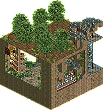
I really like that station building! Very modern and the glass on the left is making it varied enough.
The second screen is nice aswell. I really like that bridge and the canal but that building needs some work. The textures don't really work together and it ain't really varied aswell. Experiment some more in shape.
Edit: I have looked trough your topic and altough your stuff ain't really aestheticly beautifull there is still someting which is very attractive about your work.
RCTM, I'm not a big fan of that first screen, mainly of the quality-rape.
However, for some reason I like that second screen quite a bit. Just make it more aestethically pleasing, get read of the sharp corners and such things.
Just some advice, if you are using Paint to convert your BMPs, never ever save them as .jpg but as .png or .gif. The 'quality rape'(as Chorkiel) states of that program of jpeg image is just too huge. Also never save jpegs multiple times as you lose quality every time you save it.
Whoah, I see what you mean; that is terrible. Sorry about that. And thanks ty, I'll be sure to save them as .png from now on. ...And by the way, that building in the second screen is just the front that's pictured , so it's no big deal to rework it.
Not to sound smug but: Yes, yes I have. ~ Moving on; a bit of an update... Still working on Ikran; here's a screen:
But why stop at one? Another angle:
~ Comments are always appreciated. P.S.: AHEM...
* Would still like to know if I can increase train length.
Just one more question... How do you lengthen trains in RCT2? Since I'm trying to make a 6-car Dive Machine train and it's like my RCT is hackproof or something...it just won't let me do it!
After I've landscaped the rest and all that stuff, then I'll rework everything. I just like to lay my ideas down in the game before I really develop them, instead of focusing on one specific idea. In other words, the sharp edges will-quite literally-be "smoothed out."
Well, he hás improved, and he's smart enough to realize it. There's no shame in that.
There's still a long way to go, especially when it comes to the foliage.
Try to make everything into a dynamic, versatile whole, variety in vegetation and
theming are essential. The flowers are way to repetitive. And the coaster station
seems to have no visual, nor functional logic. Use Symmetry, color and detail to
create something visually balanced and aesthetically pleasing.
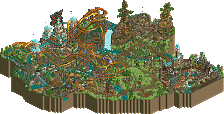
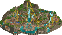
Hey, it's me reviving this thread again for an update. Just thought I'd show everyone what I built a few minutes ago in a spontaneous (and actually unusual for me as of late) bout of inspiration.
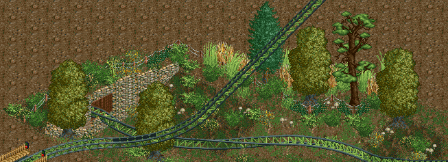
Hey, another new project. No actual "bog" on the map yet, but it'll eventually show up. As for whether or not it's going to be a mega-lite...eh. Probably, but don't count on it.
Ignore the lack of supports, I turned them off for minimal obstruction of the view.
While I admit it's not very much to comment on, I figured I at least had to put something out there for shameless, wanton self-promotion to the H2H team captains.
I think it's the black rails. Solid olive green with light brown supports looks a lot better, imo:
And yes, the first lift support is supposed to be missing one side. If I make it like the others, the support is much too close to the track. Also, I'm planning on making those two awkwardly tall footers into rock formations or something natural-looking, so don't worry about it.
120 Comments
RCTMASTA Offline
So once I get a couple missing CS files I'll start work on Ikran again.
-RCTM
RCTMASTA Offline
Here's a progress report...
~~~
Ikran:
* Would still like to know if I can increase train length.
* Got a bit more work done on it since last update.
~~~
WorldScope:
* A little bit of a Cuban-themed flying coaster finished since last update.
~~~
Thrill City:
* A micro park I started. Based heavily off of Thrill Towers by Camcorder22.
~~~
Formula Rossa Recreation:
* That's right, a Formula Rossa rec.
* Trying to configure the track so that it goes the 128mph but is still rideable...it's very difficult.
* Would eventually like some landscaping help to get this right. I'll contact someone when I get around to this project, but it's on the back burner.
~~~
Timber Wolf:
* Yet another woodlands-themed coaster. Not much is done of this, but it's not on the chopping block yet.
~~~
Project Force:
* Really nothing new here.
~~~
Project Eco:
* You're kidding, right?
~~~
Teletopia:
* Actually built a little on this.
* I could use some help. When I get around to it, I'll contact a few people.
~~~
Digital Domains:
* Going to revive this at some point...
* But for now, it's off the stove entirely.
~~~
Presenting, the update's spotlight new project...
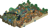
Dueling Flying Coaster, invisible track.Still in planning stages, though; nothing is set on the map yet. Going to be tricky getting those canals and buildings juust right.
~~~
I'll update again eventually...
Arrivaderci.
RCTMASTA Offline
Got some more work done on Ikran; it's the front of the station building...
And even a little on the dual flyer. No ride yet, but the themeing is getting there, sort of...
ivo Offline
The second screen is nice aswell. I really like that bridge and the canal but that building needs some work. The textures don't really work together and it ain't really varied aswell. Experiment some more in shape.
Edit: I have looked trough your topic and altough your stuff ain't really aestheticly beautifull there is still someting which is very attractive about your work.
posix Offline
Very cool architecture in the first screen. Contrast-play overkill. Works for me.
chorkiel Offline
RCTM, I'm not a big fan of that first screen, mainly of the quality-rape.
However, for some reason I like that second screen quite a bit. Just make it more aestethically pleasing, get read of the sharp corners and such things.
tyandor Offline
Chillsons Offline
RCTMASTA Offline
...And by the way, that building in the second screen is just the front that's pictured , so it's no big deal to rework it.
GigaG Offline
RCTMASTA Offline
~
Moving on; a bit of an update...
Still working on Ikran; here's a screen:
But why stop at one? Another angle:
~
Comments are always appreciated.
P.S.: AHEM...
*hint. hint.*
Wanted Offline
RCTMASTA Offline
K0NG Offline
leonidas Offline
There's still a long way to go, especially when it comes to the foliage.
Try to make everything into a dynamic, versatile whole, variety in vegetation and
theming are essential. The flowers are way to repetitive. And the coaster station
seems to have no visual, nor functional logic. Use Symmetry, color and detail to
create something visually balanced and aesthetically pleasing.
Brent Offline
RCTMASTA Offline
~BOG MONSTER~
Hey, another new project. No actual "bog" on the map yet, but it'll eventually show up.~~~~~~~~~~~~~~~~~~~~~~~-**#**-~~~~~~~~~~~~~~~~~~~~~~
~~~~~~~~~~~~~~~~~~~~~~~-**#**-~~~~~~~~~~~~~~~~~~~~~~
As for whether or not it's going to be a mega-lite...eh. Probably, but don't count on it.
Ignore the lack of supports, I turned them off for minimal obstruction of the view.
While I admit it's not very much to comment on, I figured I at least had to put something out there for shameless, wanton self-promotion to the H2H team captains.
Liampie Offline
leonidas Offline
I agree with Liam, those colors seem weird somehow.
RCTMASTA Offline
And yes, the first lift support is supposed to be missing one side. If I make it like the others, the support is much too close to the track.
Also, I'm planning on making those two awkwardly tall footers into rock formations or something natural-looking, so don't worry about it.