Park / Dreamport
-
 25-February 11
- Views 42,494
- Downloads 4,126
- Fans 14
- Comments 127
-

-
 93.08%(required: 80%)
 Spotlight

BelgianGuy 100% yes RCTCA 100% yes turbin3 100% yes Kumba 95% yes Liampie 95% yes Maverix 95% yes Wicksteed 95% yes CedarPoint6 90% yes K0NG 90% yes Milo 90% yes nin 90% yes prodigy 90% yes RCTNW 90% yes RMM 90% yes John 80% no 93.08% 93.33% -
14 fans
 Fans of this park
-
 Full-Size Map
-
 Download Park
4,126
-
 Objects
554
-
 Tags
Tags
![park_2420 [H2H6] R4 - Reservoir Dogs - Atlantis Resort](https://www.nedesigns.com/uploads/parks/2420/aerialt2160.png)
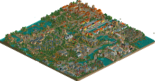
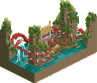
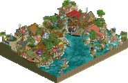
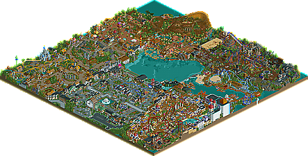
This park was simply amazing work. The level of detail was above anything I would have imagined when I left the community. The creativity and thought put into the details is to me what makes this park outstanding and probably the best piece of RCT2 work I've seen. I am sure everytime I open it, I'll be making new discoveries. It certainly gives me a feeling of where the game has evolved to.
However, for me there is something missing. It's almost as though the pieces, tho brilliant individually, don't add up to the type of cohesive whole I prefer. There is just something missing in the aesthetic flow of the park as a whole that I wish was there. To me, it's almost like there is too much there and because of that I find it harder to appreciate the individual bits of brilliance that could have been showcased better. Having cookies are great and finding some little feature that makes you smile at the creativity of the parkmaker is great, but I also like to see the parkmaker show off a little and direct my eyes to the features of the park.
That is not a criticism, so much as just a personal taste. I like to see some space in a park to frame what is truly beautiful and brilliant, rather than it being crammed in. It's certainly a frame of mind I grew into as a parkmaker when I was still active, but something that, as I come back and look at new work, I find myself more and more longing to see in the current style I see being released.
I hope that makes sense.
Taking a look at some overviews of other parks where I didn't share the same opinions as most other people, I think this is a common theme that sets good and great parks apart for me. The sprawling thing, as with all things really, is fine in moderation but it shouldn't be the majority of the park. This park layout thing is something that can't really be critiqued from seeing screenshots or sending the park out to testers at 95% completion, so it really does have to be dealt with in the planning stages.
So I feel pretty much the same way that Toon does. Not exactly sure it's for the same exact reasons but it was fun to look at and had a nice, light (in tone, not immersion), and fun atmosphere. But it's hard for me to actually go into this park and explore because of it's lack of direction.
This park was exceptional, don't get me wrong, but when I think about what it would have been if it had achieved that flow and revealed itself to me more fluently, I think of a park that would have been without parallel in RCT2. I hope that J K creates another park because he has the talent to create something that could far surpass even Dreamport.
I think this statement still holds true to this day to certain extent, and in fact in recent times this trend of detailism which I think grew out of Dump-Place screens by Sey, Robbie, K0NG and co. over the past two years is something I look at with a great deal of concern. I think it wastes people's ability to play as they can't but barely produce screens of ridiculously detailed shopping arcade facades. The few people who actually have this hardcore motivation to finish projects applying this "style", then produce works that, like Toon and Phatage, I can't really immerse myself in, as there is just this amassment of stylistic indicators without cohesion or an all-encompassing composition. There's no macro, just micro. The goal today is accuracy through intricacy. I wish it would excite me more.
fantasy v realistic. combine the both. the dive needed catwalks imo.
However, I'm not sure it's just us old codgers who have that problem with today's parkmaking. To illustrate I'm going to the matchup in H2H in 2009 between Parc Asterix and Spiderman. I think those two parks actually represent a distinct matchup of the very issue under discussion. Spiderman was packed with ideas and they were very well executed, but there was a lot crammed into the park. Asterix on the other hand, had some great ideas, but gave some space for them to stand out a little more. Asterix was more about the macro, Spiderman was more about the micro. The part that surprised me was the Asterix won quite handily. Perhaps the people looking at parks these days do know that there is something missing, but just don't know what exactly.
I've been gaining a lot of inspiration from my travels and a lot of places have gotten me ready to begin the lengthly process that is another solo. I just need to find the inspiration now as I feel very, very rusty.
Thanks for the comments guys, I'm sure my next solo will better Dreamport for sure.