Park / Dreamport
-
 25-February 11
- Views 43,107
- Downloads 4,136
- Fans 14
- Comments 127
-

-
 93.08%(required: 80%)
 Spotlight

BelgianGuy 100% yes RCTCA 100% yes turbin3 100% yes Kumba 95% yes Liampie 95% yes Maverix 95% yes Wicksteed 95% yes CedarPoint6 90% yes K0NG 90% yes Milo 90% yes nin 90% yes prodigy 90% yes RCTNW 90% yes RMM 90% yes John 80% no 93.08% 93.33% -
14 fans
 Fans of this park
-
 Full-Size Map
-
 Download Park
4,136
-
 Objects
554
-
 Tags
Tags
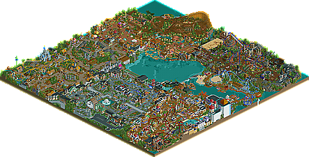
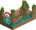
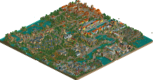
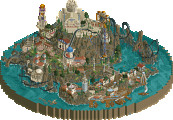
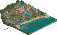
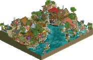
![park_2420 [H2H6] R4 - Reservoir Dogs - Atlantis Resort](https://www.nedesigns.com/uploads/parks/2420/aerialt2160.png)
I got the chance to see this park develop since quite a while ago, and it was really something special. It's got some of the most stylish stuff I've seen in a long time and the atmosphere is to die for. The themes are incredible, and I know how much thought has been put into them.
The entrance area is pure class. The custom rides, the colors, the shops, all blended together perfectly. The little details really make this: the camera shop, the airplane building, the slide are just a few I can think of off the top of my head. Elegant stuff throughout this area, the balloon ride is just beautiful.
Enchanted Valley was just as good. It brought some familiar stories into the park. Griffon was probably my least favorite layout, not that it's bad, but it interacted with the environment perfectly. My favorite thing in this area was Robin Hood. I love how it fit in with everything else and the whole idea behind it was brilliant. I love the swan building in particular too.
Mexico had some really awesome architecture, and I loved the use of mine track to circle that ride. The salsa dancing, the soup shop, the ruin-looking area around the woody really stood out to me. The woody itself was pretty epic, especially that opening maneuver. The rapids looked great underneath the woody and really completed the area.
Twisted acres had some of the highest points of the park, but also the lowest. I think Lycan was my favorite layout along with the mega-lite, and I absolutely adore its colors. I'll say it again, the Cornfield massacre was fucking badass as hell. The entrance from sea legends also kicked some ass. The obviously low point of the park was the Zombie Combat, the roof just looked so awkward even though I liked the zombie statue.
Sea Legends was still my favorite. The textures, the atmosphere, was just spot on. The mega-lite was just awesome, JDP, and I actually liked the use of bright sand under the first turn. The kraken was sick, and the boats were just perfect. You nailed the harbor theme, and the show was cool too.
Agrabah had the best architecture and style. The domes and spires looked so damn good, and everything looked so elegant and epic. The diver was cool and the gorilla face was incredible. The magic carpet ride was the best themed custom flat in the park. Then the water ride was just plain cool, the building looked great, and the surroundings made it look soo good.
Astonishing work on this one my man. Glad to see you've got spotlight, and not to mention the highest scorer ever.
Bye, guys.
First off, you'll get no dispute from me that this park is absolutely amazing, JK. You've managed to create a place to visit with this piece of work, not just the simulation of one. It really says a lot for a park when I open it up for the 4th time and realize I've completely missed out on an entire custom flat, sculpture, themed ride or architectural detail. To be honest I doubt I'll ever find every nook and cranny in this park (much like you would acknowledge with visiting a real location) and I think that's fantastic because it makes looking at this so much more of a personal and valuable experience. It's easy enough to simply convey a series ideas through this medium but Dreamport invites each person who views it to make their own decisions about their favorite spots in the park (again, much like a real place). For example I could see myself just relaxing in that entrance area for hours.
I'm not going to go through each area individually because I think what has needed to be said already has been. I will say that Agrabah was a bit off balance from the rest of the park because it had a bit more of a tongue in cheek/bigger than life style that felt slightly out of place from the rest. It was actually one of my favorite areas however, perhaps because of that style.
Throughout the park you did a fantastic job of getting across what everything was: this is a sheep, this is a ride, this is a fire engine. It's tough to get past the fact that so much of this park is static model though. You gained an impeccable level of detail at the cost of some of the liveliness that I'd prefer to see. It's true your architecture and theme ideas really work hard, and sometimes too hard, to capture the viewers attention. At certain spots it was tough to take a step back and view the big picture simply because I was too busy trying to dissect and extract every little detail on my screen at the time. There were also some eerily quiet "dead spots" where on the whole screen there was no sound or motion, just a massive amount of things to look at. These spots kinda killed the immersion and made viewing a bit of more like a quest to search for the more vibrant areas than really delving into the park as a whole. An example of this is the area around the Robin Hood shooter ride. It's a great spot, one of the better executed areas actually, but I find myself wanting to move on quickly because all I can really hear and see is the noise from the ride and the motion of the cars. At that spot it feels about as exciting as standing in the middle of an empty Disneyland watching them test the rides, sure you're surrounded by cool stuff but at the same time it's pretty lifeless and slightly unnerving.
One thing I want to get out of the way is that I don't think peeps are the answer to the problem, not for this park at least. If it was just a case of throwing them on the map and watching them bumble around, occasionally riding a coaster isn't going to add much atmosphere. I do think that this style could work well with peeps but it would have to be planned from the start and just about everything would have to be peepable, from seating areas and maybe even maybe the custom flats. I'd actually like to see you tackle something like Fatha's Scenario project in this style, maybe in a Design or mini side project so you can really do it justice. For Dreamport I would have liked to have seen some of the flats at least semi operational. Next time I also think you need to work on trying to get some music and motion throughout most of your park to kill the "dead zones". A simple ride under the path open with in game music playing at quiet points would do wonders for the atmosphere. See Bijou Magique, specifically the entrance area, to illustrate what I'm talking about. I'd also like to see you use some hacked rides/moving cars as animals or other details. Basically just try to give your work some more moving parts.
I agree with Ed about the lake in the center layout, I'd love to see your next park break away from this. I also think that the layout didn't help with the weird thing you have going on with your area sizes. Put simply I think the entrance area was a little large and sprawling, as was the Fairy Tale area. The work was good throughout but I actually think it might have been prudent to limit yourself to a more even space for your areas. You had a massive amount of ideas for the Fairy Tale one but in the end it got so much love that no matter how awesome Deep Sea Legends is, it just isn't going to feel like more than an afterthought. I think the lake in the middle layout really highlights the awkwardness of your area sizes although I think a less uniform park layout with the same area sizes would have worked out pretty well. Imagine if you will, Deep Sea Legends with the same amount of content tucked in a cove behind a mountain, perhaps behind the Mexico area with the back end of the rapids ride kinda blurring the boundaries between the two areas. I don't think areas should be of uniform size but try to use a park layout that accents small gems of areas (kinda by hiding them/tucking them away) along with the more sprawling areas that you have lots of ideas for. Kraken also should have been wrapping its tentacles around a ship instead of just waving to kids on the dock, just saying.
For now I'll stop here although this park is worth so many looks that I might have some more things to say down the road. Thank you for making such an awesome piece of rct goodness for us all to savor, JK. I look forward to your next work as always.
Reply time coming soon but if anyone else hasn't commented, please leave your thoughts
First of all, congratulations J K for completing a massive park to such a level of detail. This is a great feat and on that should not be underestimated. Second of all, congratulations for winning Spotlight. My previous sentence applies once again.
As for the review, I shall do it area by area:
Grand Central
This was my least favourite area of the park, so it’s a shame I have to write it first, but it is the entrance area also, so alas, here we go. The parkmaking ability shown here, and throughout the park far exceed anything I thought possible when I used to play the game. The architecture is sweet, and of course, the details, which this park is famed for (and for good reason), are in great abundance. The little sculptures on top of the shops to give them identity and character work really nicely. The custom flats are really cool (something that was kinda new and quirky when I was playing RCT, but now they seem to be the norm). Either way, they really really impress me and look really elegant. I really like the double decker carousel and the area is packed with things to look at. However, what I can’t get past is the basic concept, and that basic concept, I don’t like. An area themed around transport is just not something that appeals to me personally, so I guess this is pretty subjective, but I just don’t think the area works. This is not reflective of your parkmaking ability, because I am of the belief that however well you did the area, it just wouldn’t appeal to me. For the record, I think you did pretty much all you could with it. This is a hard thing to put my finger on, so I’ll just leave it and go to the ride reviews.
Grand Central Copters: This was an obvious choice for an area themed around transport (not a criticism) and it works nicely. Gives the area a bit more identity and something for guests to look at other than buildings.
Cops and Robbers: A fairly cool idea which ties into the theme of the area well. But there’s only so far you can go with it.
Fly Bye: You will notice how impressed I am with custom flats in this park (and any park), they just look so damn impressive to me. This is no exception and fits into the area well.
Agrabah
Um…Wow. Now this is what I’m talking about. There’s such a distinct theme which gives each piece of architecture so much identity. I understand why an entrance area doesn’t necessarily have such a distinct theme (like with grand central) but seeing it next to this makes me wish yours did, because Agrabah is jaw dropping. The use of colour is masterful and architecture is some of the best I’ve seen in RCT2.
Jafar: Sweet Dive Machine. Really solid layout, though perhaps a little too meandering. I love the lamp and Jafar sign at the back of the building but it’s a bit of shame the guests already have to be in the queue to see it. I also really wish the path didn’t go behind the demon head thing and the dive machine just plummeted down into mystery then burst out of it’s mouth where everyone can see it. There’s nothing really to see behind the head, and it looks a bit ugly and underwhelming for guests. But altogether, great ride, and I love me some deep interaction with path and guests.
Side note: What’s with have (B&M) in this ride’s title, when no other of the rides in the park have the manufacturer’s name in the title?
River of the Magic Lamp: Ok, I’m not wise on this film, but this name seems suspect. How can there be a river of a lamp? That’s like having a mountain of a toothbrush or something. Names aside, this is a really well excecuted water ride. The building it goes up in is really believable, whilst still being so glaringly themeparkish. I love the blue walls with clouds to make it look nicer at the back where guests can see it, and as a backdrop to the lighthouse.
Magic Carpet: A really impressive custom flat. Looks so much better than the actual magic carpet RCT ride.
Deep Sea Legends
This area was quirky. I liked the idea and it was executed well. The wooden paths teeting over the edge of water worked really nicely. I don’t particularly like the layout of the area. Say guests are coming from Agrabah and they want to get over to twisted acres of to ride Mako, they have to skirt around some thing paths to get there. I can see why aesthetically it was done like this, but functionally it makes the route kinda awkward. Pretty picky criticism there. The kraken thing eating the paths was so well pulled off, I though it was actually a purpose built custom scenery item. Good job.
Maelstrom: Again, I’m a sucker for custom flats, this one is pulled of exceptionally.
Mako: Yeah it’s nice. Not mind blowing, but it is pretty elegant.
Twisted Acres
Now this is my kind of area. Steep tiled rooves and dark, yet colourful theming. The area was put together really nicely with some awesome idea for rides and shops implemented.
Lycan: I’m sceptical on the name of this ride. There were a good few choices of name you could have had for a flyer in your horror themed area, and I think Lycan was not one of them. The ride layout, I didn’t particularly enjoy. I think the pacing was off in a couple of places and a few parts looked a little awkward, and not quite as flowing as I would have liked. This is more than made up however, by how good the theming was. The path interaction was really sweet (as previously mentioned, I’m a sucker for this ). The pretzel loop was framed beautifully and created a nice centerepiece to the area. As a side note, I think it’s always good to try and hide the awkward S-bend you have to have when making a pretzel, so good job. I loved the color scheme for the ride as well, and the station building was sublime.
Mousenstein: I absolutely loved the tower that the lift hill came out of. Looked really cool. Nice little ride, curious about whether guests would understand why it’s called mousenstein, hehe.
Monster Museum: Nice use of the broomsticksride. Couldn’t really see much of what it was doing, but it invokes cool images to the mind of what the guests riding it would be seeing.
The Haunting of Rose Mansion: This was really really cool. The architecture is spot on, exactly what I would expect to see in a horror movie as a stereotypical haunted mansion (is there a particular piece of real world architecture you actually based this off?). I love the use of strobe lights also, gives this a really old school theme park haunted house vibe.
Cornfield Massacre: Not exactly the kind of thing you would see in a theme park, but it was a well excecuted idea. I particularly like how the station is exactly how I would expect a US large country house to be.
Old Mexico
I loved this area also. Really well executed in architecture style, foliage and details. Love the Mexican wrestling ring and how the rides and stalls represented what you were going for so well.
Ehecatl: This coaster was framed beautifully on the hillside and makes me imagine just walking into this area and seeing this beautiful roaring woodie to my right hand side. It probably has my favourite layout in the park also. It’s also good to see you mixing it up with some rides having such intense path interaction, and some framed so guests can sit back and see the ride in it’s entirety like this one.
Crazy Sombrero: Awesome custom flat here and fits into the area perfectly.
San Juan River Splash: Excellent rapids ride. The theming at the back was really cool. I like water rides that interact with coasters also, I think they create a good contrast. My main 2 criticisms are that I think it was probably a little too long, though that’s based of my assumptions rather than actual fact, and I think there was too much underground also.
Fairytale Land
This could well be my favourite area of the park. The whole atmosphere it had was warming. I love the use of grass to give it such an upbeat feel and the architecture (of course) was a delight. I did feel however, that a couple of rides were put in where there wasn’t really space to do so, making them lose quite a lot of value. Mainly the spinning wheel and jack and beanstalk.
Merlin: Another awesome custom flat. Was actually really impressed by an aspect of it that I can’t quite put my finger on. It just seems like a really realistic thing that a theme park would do, just to build this ride in this style with this name. I just can’t quite put my finger on it, or get across what I want to say, hehe. I do however think the queue line was far to short on this one.
Robin Hood: Awesome adventure ride with well implemented ideas. Really great job here. Particularly loved the bit where it goes through the forest with the tree houses.
Cow Jumped over the moon: Really novel idea pulled off excellently. Though I fear you already reached your threshold for tracked car rides about the time you left grand central (another reason why that area is my least favourite, you had better tracked car rides outside of it).
Griffin: I wasn’t a particular fan of the layout to be honest. Can’t quite put my finger on why. More than made up by the station though, which was a beautiful piece of architecture and the elegant theming around it was awesome. I really liked the drawbridge in particular.
All in all J K, fantastic and more than worthy of the Spotlight accolade it was given. So many ideas here that it is definitely one I can come back to on many occasions and find more and more things of interest. The architecture was impeccable, the theming was awesome, the ideas staggering and the details inspiring. For next time, thing I would improve on are:
Making your coaster layouts a bit more flowing (more like your woodie, less like lycan). This is a pretty useless comment I realise, hehe.
Considering guests perspective. You did it in a number of places, but in the Agrabah area, there were a few epic signs and theming that most guests can’t see, and parts that guests can see that they wouldn’t want to see, if that makes sense.
You don’t have to cram every single square of the park with rides or architecture. Some open spaces work nicely. Not every path has to be lined with a building and broken up with a sculpture or foliage.
Once again, well done J K, and I look forward to what you have in store for us next!
I hope the Korean forum got to see this as well as some of the Dutch and German community-players that aren't on NE.
I remember discussing this with J K months ago. He said 90+ was best for spotlight. I was like "no way you get that many replies". And look what happened...
I cannot wait for your next release, JK. Your works of art blow us all away.
~RCTCA
I was hoping to hit the 1000 mark before I went away. Thanks everyone
Mine are wilder
(BTW is there a park that has a hundred%)