Park / Dreamport
-
 25-February 11
- Views 42,526
- Downloads 4,126
- Fans 14
- Comments 127
-

-
 93.08%(required: 80%)
 Spotlight

BelgianGuy 100% yes RCTCA 100% yes turbin3 100% yes Kumba 95% yes Liampie 95% yes Maverix 95% yes Wicksteed 95% yes CedarPoint6 90% yes K0NG 90% yes Milo 90% yes nin 90% yes prodigy 90% yes RCTNW 90% yes RMM 90% yes John 80% no 93.08% 93.33% -
14 fans
 Fans of this park
-
 Full-Size Map
-
 Download Park
4,126
-
 Objects
554
-
 Tags
Tags
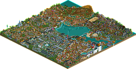
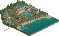
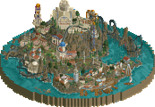
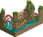
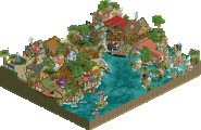
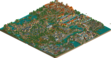
![park_2420 [H2H6] R4 - Reservoir Dogs - Atlantis Resort](https://www.nedesigns.com/uploads/parks/2420/aerialt2160.png)
Thnx JK, I'll do that
and Many Korean players even RCT3 players already know you, your parks and NE
as I said, Thnx your favor.
Let's begin with the entrance. The entrance was very beautiful, although the building itself was a little bit to high imo. Moreover I wasn't a big fan of the path-texture. But all the custom flatrides were really well done, very realistic and very good-looking. And the atmosphere was good, I could imagine myself sitting in there and watch the rides.
Secondly, the fairytale-area. I loved it. The theming was superb and I especially loved the coaster, it's layout was "wow". All colours were composed really well and the landscaping, foliage, etc was great. But I wasn't a big fan of the custom flatride, the one with the cups, because the connectors of the cups looked ugly imo. Robin Hood The Ride was excellent. I loved the interaction with landscaping, theming, foliage, etc and again, your ideas were great.
Now my favorite area: Mexico. When I saw it I nearly orgasmed. It's one of the best areas I have ever seen in a park. I often tried to do a mexican theme but I never got so great ideas or so. The woody-layout was awesome and the landscaping on the backside of the woody was great too, lovely atmosphere there. What I loved on this area where all these colours and the, again, great ideas, like the sombrero-shop etc.
Now, Twisted Acres, with my favorite coaster in the park. The layout of the flyer was simply amazing and the interaction with the station was excellent. Moreover it's colours gave a good contrast to the rest. The zombie on the top of the Zombie Combat building looked really cool and the idea with the foto-wall thriller was really well done.
The Deep Sea Legends area with the mega lite coaster wasn't that good imo...the intamin-layout was good, the theming too, but nothing wow'ed me. Just the idea with the whale was superb. The lighthouse was okay, I've seen better stuff from you though. Another good thing in it was the frisbee, great look. Oh, completely forgot the 3D cinema, I felt in love with it.
Alright, now the last area, which was my second favorite place in the park. It was very brown but the colour accents were awesome and so it had a great atmosphere. I loved Jafar, because of its station which was uber awesome, simply mindblowing. Moreover the water ride was great, although it was a little bit too big...nice towers though.
All in all these park was mindblowing, the ideas, the landscaping, the foliage, the theming, the rides, etc were just amazing and it definately deserves the spotlight. I couldnt find many weak points in it: Some things were too big, like the water ride in Jafar-section (sorry, forgot the name, lol) and I wasn't a big fan of the path textures.
I could write so much more things about the park, but it's very often the same - just awesome!
I hope you understand most of it
Congrats on the win again, looking forward to your next projects!
This is how I feel about Alton Towers.
1)The "lake in the middle arrangement" is a classic formula because it easily distinguishes each section and establishes a clear flow from one section to another. But it's also a cliche for the same reason. It works, but it's not the only thing that works. Fatha's last LL park, Busch Gardens San Simeon, is the very antithesis of this particular cliche and it works even better, I think, because the landscape feels so much more like a real place. Amusement parks can get pretty artificial looking. Which is fine if that's the style you want to go for. But it's valuable I think, in your growth as a parkmaker, to try ideas which take you outside of your comfort zone.
2)In a similar vein, I'd like to see you move beyond the "one coaster per section" strategy for designing your overall layout and mix it up a little more. I've found myself more and more going back to one simple idea as the root of what makes RCT interesting to me: rides interacting with other rides. As much as I was affected by the static beauty of early parks by Greg Reese, Liquid Crash, and Joe Holland (which are probably not in the database yet? I'll see what I can do to correct that sometime soon -- Posix I know I've been promising this for awhile
3)Height! When you did allow yourself to do a little landscaping -- behind Ehecatl, with the little cemetery next to the Mako coaster, and the waterfall in the corner that Griffen goes though -- it looks wonderful. Overall the park is pretty flat though. I'd encourage you explore using the X-axis more.
All of these come down to stylistic choices more than anything. This park leans more towards realism to me because it sticks pretty close to the amusement park formula. Which is fine, of course. It's lovely. And I feel pretty cheap trying to come up with things to fix in a park that's basically flawless. So my suggestions aren't intended as improvements in any way, I'm just speaking as someone who's played the game for a long time and the way I've kept myself interested over the years is by allowing myself to try new things. Maybe you already have all of this in mind anyway. And certainly you should do your own thing, whatever you determine that to be. But maybe my words will be helpful in some way.
------------------
CoolCody – Ikr, I appreciate there’s always going to be the tougher guys to impress. How did you find the park?
Gijssie – There’s plenty more details where that came from, hope you’ve checked out the park and you enjoy it. I’m a personal fan of your style and love what you do with the game, I hope to cross over sometime and build a more solid amusement park just like your style. Hope you found the park interesting.
Sssammy – Cheers Sambo that means a great deal coming from a player with an opinion I respect a great deal.
Chillsons – Glad you’re so speechless and I’m also glad it’s your favourite park. I hope my next projects live up to this.
SGTBLOOPER – What would make you describe this as fantasy? You’re not wrong but I’m really, really intrigued to learn how this can also be perceived as a fantasy creation.
Dr Dirt – You prick!
Goliath123 – I myself believe the entrance was slightly cramped so I need to sort that out in my next solo. I also agree the rapids needed more definition to direct guests towards the area as it did seem lost. Hahaha I love how you renamed Lycan to Lycra, maybe that’s the girly version of the ride
Nin – Yeah there’s quite a few reasons why I disagree with you and I can simply put that down to the fact you’re not really getting my style considering we have a different approach within the game.
‘Maybe it was your intention to simply throw together rides and attractions together because the one thing they had in common was a very basic, shared theme.’
The point I set out to prove all a long, was to produce a park with, every cool thought I’d want to see in a theme park, put it on a map in a cohesive way that would create an awesome viewing experience. I haven’t ‘simply thrown’ any ideas in this park due to a ‘basic theme’ yet deleted, thought-about, re-done and re-modelled every thing that’s gone on this map to make it feel right. The six areas themselves don’t unite in approach or the core theme, yet the park itself compliments each other into making you believe it’s a real park.
Example – Alton Towers, one of the greatest theme parks in the world. We have forbidden valley full of rust with the legendary Nemesis, known for it’s incredible theming and an amazing layout. Right next to it we have Air, a B&M flyer with generic, contemporary theme, suitable for that ride which is what the park have done instead of trying to compliment nemesis. Also in the park we have Rita, the parks launched Intamin themed to racing in the section of ‘The Dark Forest’ where they have horror and thrills, it doesn’t really match but it’s no big deal to myself as I haven’t gone about this approach. The point I’m trying to make here is real theme parks don’t always stick to the theme themselves, yet in my park I believe every ride, works with each other but can also stand by themselves.
I’m not sure what you’re getting at to be honest as the only potential areas I can see you thinking this about are the Deep Sea Legends and Twisted Acres section of the park. Does a mouse themed Frankenstein, evoke the same impression of a big scary werewolf, nope. Does the legendary Kraken, share the same waters with a giant shark terrorising a dockside, not really. I’ve never seen it done but surely in a theme park atmosphere you’d expect to see ideas coming alive not only to stimulate your experience but also make you believe in something beyond the norm.
With my next solo, I’m going to extend the map, as I believe I ran out of space to fully execute the landscaping to theme parks full potential. With this, I’ll have more space to create the themes on an impressive piece of land, a lot like Zippo’s (which blows my mind every time I view it.) I believe that is the flaw in Dreamport’s design, which Ed has also suggested on the third page. With this in mind that’s for the next one, but for this chapter I wanted to cram every single idea I had in my mind to create a united piece of work that takes you guys on a journey. It’s not your cup of tea and that’s fine, as I love constructive criticism but is this park ‘thrown together’ and ‘very basic’, definitely not.
djbrcace1234 – Such a brilliant way to sum up a piece of work very special to me, thank you very much for your comment and thanks yet again for posting it on Theme Park Review. The page itself was very professional and surely has gotten the park a few more downloads which I’m very grateful for. I’m looking forward to hearing your thoughts on my up and coming pieces of work and your release themselves as your pictures in the dump lloked awesome!
Xophe – Hey buddy! I was hoping you’d be seeing this monster of a park, hope you got to see it in game after viewing the overview and I hope you enjoyed the horror area just as much as your initial reactions. Hoping to hear more in-depth criticism from you.
Highroll3r – Cheers, I didn’t think it would be as popular as it is but I’m really proud that it’s received only positive reviews so far.
Pacific Coaster – Thank you
Levis – I think this was because the 15 downloads were downloaded so fast after the awards. After it’s hit the 15 mark I think it doesn’t show up in the jobs panel. Have you seen the park yet?
Cena – Haha thanks for the support buddy, firstly I was also annoyed by John’s vote but now I actually really, respect the fact that there are always tough critics that you need to impress. While I believe the ‘No’ spotlight vote was harsh, the man has an opinion and thankfully, was the only person on the panel that thought so.
Luketh – Thanks dude, your work and ideas are looking pretty flawless too as of late.
RamSam – Glad you could see some of the realistic input in the park. As I’ve said before I did not set out to create a real park but I did set out to built over the top themes that ‘could’ be seen built in a real theme park. Griffin is a personal favourite of mine as well but then again, every coaster in the park is pretty special to me. Thanks for your feedback.
JDP – Wow the coaster man himself a big fan, maybe you don’t need fully realistic layouts to convert the realists hey? I hope I did your layout justice, as in my eyes it’s perfect. Thank you very much for the guest-spot and thanks for lifting the Deep Sea Legends area and giving it a real good thrill. You’ve been a fellow cane, a good person to talk to on aim, a guest-spot and now a poker buddy. Hope for more good memories soon
MA – Have you opened it or are you being too stubborn?
Posix – What did I really do to deserve those comments? Lol. Such nice words yet again from another person I’m very fond of in this community and a name I constantly look out for, to hear your opinion and respect your point of view. My strict order to Liam was not to include the Lion head in Agrabah in the screens to the spotlight page. I wanted to shock people as they turned the camera angle around to get a better view of the drop on the dive coaster. This truly worked in my favour, as I believe it is the pinnacle of my endeavours with sculpture, in RCT2. To suggest that I’m one of the best ‘themers’ in the game is very bold of you yet I will only accept that compliment from you as you’ve been around here long enough to be able to suggest that. I thank you for those words as its expression like that, that makes we want to do this whole long process again, and again.
You have a very keen eye when it comes to RCT as for my personal progression I knew I needed to evolve my style by, Making a greater landscape (like Zippo’s), learn Gee’s no station hack and execute it to perfection (like prodigy), and give my areas more space and room to breathe. A bigger map will surely help me do this but I’m going to have to be extra careful with the object limit and design a bench ready to oppose that. I also think that my pathways are far too confusing so I’m going to try one swooping pathway through an area, whilst building ideas on the main path segment to see how that works, it may look bad but I may as well try it.
Thank you.
tdub96 – Another really great review and you included three really big parks when I entered the community which I absolutely adored, haha it’s awesome to think that Dreamport fits with them in that genre. I love how you also loved The Cornfield Massacre and Robin Hood’s ride just as much. I love adventure rides and they were so, so fun to build. It’s also great how you appreciated the coasters; I know my layouts sometimes are unorthodox but I think I make them my own so I’m glad you could appreciate them. Anyway Adventures Amusement Park had some real promise and I’m looking forward to seeing your creations as well. I feel very self-conceded talking about myself so much in this thread. Yet again, thanks for the perfect review!
Ps. I lol’d at Cool Cody starting the topic as well.
Cocoa – The Enchanted Valley itself was one of the first areas to be built in the park, it’s weird how I feel it’s my best yet the bulk of it was made two years ago. I feel very privileged that it matches my current style and I don’t think without this theme the park would be that good as this set the bar. 5Dave did an absolutely incredible job on the mouse ride and I truly believe it’s one of the best rides in the park. He also did the shark in the sea area that was hung up which people seem to think it’s myself. That magical touch was down to him and something I don’t think I would of gotten right. Also thanks to Liampie for conserving the object limit for me by turning the boats I made into one object, this was a massive help, as I love the Deep Sea area of the park. Thanks Cocoa, such an in-depth review with such great thoughts, it’s crazy what different people take from the park. Looking forward to seeing most of your stuff as well, I still stand by the ‘Best dual game player’ vote.
Dotrobot – I hope you’re up for some translating for me with this park, it would mean a great deal to hear what the Korean community have to say. Glad you enjoyed the park
Cocoa x2 – Did you find the Cheshire cat yet?
Liampie - http://www.contrib.a...osla/cookie.jpg
Insanity – Had you opened the park before you shit your pants? Lol, Do you have any thoughts or personal highlights on the park?
Giga G –The score shocks me as well. I have to say though; I think you need to open up to Semi-realism more. I did not want to go for catwalks and lift hill chains to brag about how realistic I am. On second thoughts I wish I had removed the transfer track on Griifin in the fairytale section, to stick to my roots. This wasn’t a park to brag how good a chain like Six Flags is, but just to represent what I’d want my park to look like. Unfortunately when thinking of an amazing theme park in my head, transfer tracks don’t come into the equation.
Harkonnen – Thanks buddy! Where about do you live in Thailand? I’ll be making my way there this year!
pierrot – You should try and explain or you could always write in Korean and hopefully Dotrobot (sorry to always put your name forward) translate it for you
Kumba – BFF Kumba with a good old 19, seriously though get your feedback to me on time, next time as I wouldn’t of minded another 20 ☺ I would have pulled out the IOA example if you wouldn’t have done yourself as I believe each theme works really well together. Great review and you seemed to pick up the important points throughout this thread which made it a great read, even if you were slightly drunk
Wicksteed – Thank you very much for the little things, in my opinion that’s when you know your park has done good as people respect it enough to do that. Thanks a lot buddy. I remember I was waiting nervously for the final vote and I didn’t know who it was going to be. I was thinking the worst, perhaps gee might be hating it and marking it down but when I saw your final vote I nearly hit the roof seeing that final score. You kept me waiting very nervously but it was all for a good reason
Paradise coaster – Thank you
Chorkiel – The transitions from area to area will be a lot better next time, I agree it did seem crammed from the entrance area into Agrabah and then the deep sea legends areas as well but I had so much I wanted to put in the park, I just didn’t want to sacrifice any ideas. Thanks for your comment.
Turbin3 – 120% would’ve been nice lol.
Trav – Thanks for the comparison, that’s pretty huge. Trav I really respect your opinion so a detailed list of what you didn’t like in this thread would be required, if possible. I’d like to build on what I have now to take it into a third solo and impress the likes of you, Chorkiel and John, as constructive crit is the only way to do this. I think the fact that it garnered the accolade it did was because it made people feel like it deserved it due to the overall skill. I think most people bar nin feel they made the right choice and the score reflects this. If the scores were all over the place I would question the high score but as it’s all pretty consistent I have to say I fully believe this deserves spotlight.
Cool Cody – Rome wasn’t built in a day but Dreamport was in fact built in 2 years lol. Thanks for your comments and I’m glad you liked my creativity and the architecture. I hope to impress you more with my next solo.
Sybren – Quite a few people are using the ‘P’ word, I’d say it’s far from perfect but I’m very hard on my own work.
MCI – Thanks buddy!
Wildroller – Thanks for getting my name moved up to the top of the banner, hope you enjoyed the park
Dimi – I’m really proud how everyone is recognising all the ideas that have gone into this park, it makes me feel there is a space for heavy details and depth in a park because people do really pick up on them. If you have a good idea and you’re skilled at the game, good architecture and foliage will follow
Liampie – I would’ve loved to add even more to the Sea legends area but unfortunately the object limit wouldn’t allow me (5 times for that matter). I do however need to thank you personally for your constant support and encouragement (without seeing the park . . . wow!) also for taking the screens of the park so they were perfect. You also made a great object for me and helped me overcome the object limit. I thank you a lot and I’m looking forward to working with you again in the future, even if we’re not building on the same map but helping each other in different ways. I have learnt from you that the surrounding area of a theme park is very crucial and a well planned out bench can easily overcome the object limit.
“Does RCT talent really exist or is it just something everyone can learn? In this case I disagree. This is some serious creativity and artistic skill.”
One of the best compliments you’ve ever given me, thanks mate. You also summed up nin’s confusion very well, that’s how I want the park to be perceived, not basic themes, thrown together. I also didn’t really get John’s vote till you explained to me it was still a good score (for john), you see things very well and I appreciate your opinion very much so.
Music man – Don’t be sorry for your opinion as it’s fully valued. I honestly think what it comes down to with SR is the fact some builders just don’t put realism as their number one priority, I try to make nice flowing layouts and awesome theming if it works, I’m happy. Transfer tracks are not first on my list of things to add to a coaster, I’d rather theme it first and like I’ve said above I kinda wish I’d deleted the transfer track on the arrow to stick to my SR roots. I’m glad you can see these ideas in a real park though, I’ve hit the goal I was striving for if that’s the case.
MeMeMe – Well thank you, I’m really glad you enjoyed it and I hope you look at it for years to come. Do you have any personal highlights?
John – Apart from the cohesion issues what else can I improve on for next time to make your score get a little better? I understand with DJINN it was the coaster but here I’m really confused. What would make this a spotlight for you and what do you determine a spotlight? Thanks for your congratulations.
olddtfan1 – Hope you’re still finding those details
Cole – I guess you liked it then, any personal highlights?
RRP – I would say I’d like to improve on the stuff you’ve posted you hate but I actually think that reflects my style as a park maker. I agree the park layout can be worked on to make things run smoother but I seem to love architecture or anything else for that matter interacting with rides.
Music man x2 – I think that, the custom flats and non custom flats are balanced out pretty well.
Louis – Disney-like? Wow thanks buddy. That’s an incredible brand for my park to be likened too. If you could please list the inconsistencies for me so I can work on it in my up and coming projects. Also what can I do to improve the coasters in your eyes?
Posix – Each layout is very special to me as well
tdub96 x2 – I remember having a conversation with Brian about the wooden coaster and I said how it didn’t seem realistic so I was going to delete it. He told me to keep it and that was the sign I needed. If Cedarpoint ok’s a coaster then it’s good in my eyes. He said it was really unique and I’m glad I stood by his judgement as the wooden coaster travels round the area really well.
Belgian Guy – Glad that you picked up on all the tiny sculptors I did in the park (or big sculptures concerning the Kraken and Cave of wonders), it’s great that you recognise how much time and effort has gone into each one. Thanks a lot for thinking it’s the current perfect park, I’m sure you’ll be making one very soon and knocking me down the rankings. Also thanks for your constant feedback and words of encouragement.
Roomie – Wow that’s excellent to hear, really great thoughts especially from you. I hope you do well with TTA so we can get back on top with the British players scooping up the most spotlights in the year. I also hope to be opposite you with a nice trophy for my effort with rct, as I’m sure you’ll be getting best LL player. Let’s take it home for the brits!!!
Posix – Do you agree with my reasoning’s for labelling this semi-realism? I’m really intrigued in your thoughts. About this subject as semi-realism was only really defined when realism came along
Coaster Ed – I saw your name had left a post in the topic last and I truly got excited. It’s weird what your opinion does to me lol. Firstly thank you for taking the time to write such a lengthily reply, I’m touched how people can see the vision I’ve had in my head for a good time. Not to sound like a psychic but when you think of your perfect park you see certain rides in your head. The dive machine was one of them and Robin Hood was the other one that stood out in my head, When I’d completed them on the park it was hard to think of another image like them to try and rival them yet co-exist in the same park.
During this thread I was starting to think that my coasters were very marmite (vegemite to Cocoa and Goliath) where you either loved them or hated them. I had an overwhelming reaction towards most of them with a few guys not really being bothered about them. You’ve made me realise that it’s ok to be gutsy and build a coaster like Ehhecatl or Griffin and make it work in a theme park setting. Someone nailed it a while back saying that Griffin was like a test model arrow never got to build, that makes me feel great as I’m always worried that my coasters may pull quality down.
I agree that experience rides are the best rides that can be made in RCT. I originally had a busted jeep tour in Mexico that steered off track which fell down into a snake pit. I’m going to recycle this idea, as I had to hold a few things back because of the object limit. You’ll be seeing a lot more rides like this from me in the future. I can’t decided which is my favourite experience ride in the park but I do think The Cornfield Massacre is clearest in vision, which I’d love to see in a real park.
You used quite a few legends from yourself to Xsector in your write-up, I must say I’m very touched and I actually haven’t seen Xsector’s stuff in the game yet as it’s all LL. I have been linked to him before however with some previous work which was interesting so I’ll need to get someone to take quite a few screens of his work for me.
Overall I didn’t expect so many nice comments from one of the legends in the game but I’m thoroughly overwhelmed with all the great stuff you said. Hurry up and get back to the game so we can do that thing we talked about.
Liampie x2 – Ikr
Coaster Ed x2 – You have good eyes, a lot of people haven’t found it yet. It’s not the best detail in the park but I can say if you’ve found it you’re pretty close to witnessing all the hidden details in the park.
Posix – Yeah you have a very happy member right now
Sala – Did you manage to post the topic on the Korean forums? Could I have a link?
Turbin3 – I understood everything perfectly thanks dude! You’ll always hate my path textures so that’s something I’ve come to live with
Louis – It gets you fit though!!!
Coaster Ed x2 – I agree, I’m a perfectionist and I’ve started to look at this and find flaws so I’m not going to open it for a while. The search for perfection is going to kill my park making one-day lol. The lake in the middle of the park did have the themes facing the lake but when the object limit hit, those areas where first to go as they weren’t all completely finished. I fully agree about the height of landscaping, my local park is Alton Towers so I’m going to take a lot of inspiration from that. I have a lot to do to up my game on Dreamport but I am ready and I’ve been planning the next solo for some time now. I have some good ideas and after I come back from travelling round the world, I’ll be starting it. Thanks for your second comment Ed, it wasn’t just helpful but it summed up everything I needed to focus on now.
---------------------------
Thank you everyone for making this a largely viewed topic, I’m obsessed with bettering myself so everything you guys have mentioned has really helped my personal style. I’ll look to improve everything and give you another release bigger and better than Dreamport. I’m rather excited for what the future holds in RCT and I’m also excited about what other spotlights we have this year.
Things to expect for my next big project
+ Larger map for a bigger landscape.
+ Better Transitions from area to area.
+ No random lake in the middle.
+ Smoother paths so the guests don’t get confused.
+ Entance area straight and just architecture.
+ More areas!
+ gee’s hack nailed to get rid of entrances and exits.
+ Ride interaction with multiple rides.
+ A clearer theme park atmosphere.
Fuck! 4592 words and 9 pages filled up in font size 12 of a word document, I’ve been busy! Thanks a lot guys, as always more comments are always appreciated!
P.S – For future spotlight winners, reply as soon as you can so you don’t have to type for a whole day!
Also sorry for any spelling mistakes, I've found a few but I'm not really in the mood to proof read it at the minute lol.
When I said X-Sector I actually meant Xcoaster (DisneyAir, Disney's Shadowlands, etc). I get the names confused sometimes. I think that comment makes more sense now. A lot of X-Sector's best work, while very pretty, is actually the opposite of what I was talking about. Xcoaster's two Disney parks, on the other hand, seem like pre-cursors to the type of park you've made.
When I said x-axis I actually meant y-axis, but I guess you figured out what I meant anyway. It's been a while since I took calculus.
I do still have you in mind for the design we discussed, but unfortunately I tend to work at my own pace with RCT parks which is quite slow and tedious. I've got a lot of different balls in the air at any one time and if I'm not feeling inspired on any one thing I end up starting something else. WME's been more patient with me through our collaboration than I would have thought possible, and it's amazingly rather close to being finished now. So anyway, if you are still interested-- and it sounds like you are-- I'll get back to you later this year when my schedule clears up a bit and we'll get things started.
I'm not of the opinion nin had, but I thought I would add to this comment.
Alton Towers does have an overall theme. People may not see it at first, but all the areas have some sort of Mystical/Spooky/Creepy/Fantasy theme. Linking the whole park together. Forbiddon Valley, Dark Forest, Gloomy Wood, X Sector.
Air was originally meant to link into Nemesis. It was originally meant to be a military theme, crashed planes etc, trying to take down an escaped Nemesis. Then 9/11 happened, so they scrapped that idea and went with the more generic theme they have now. So they did try to compliment Nemesis, it's just something came up which meant they weren't able to in the way they wanted.
Also Rita was rethemed. It no longer has it's racing theme. When the Dark Forest theme came along it was rethemed to getting on Rita to escape the forest and the wraiths of Th13teen.
I know I'm not of the same view as nin, but I'm just saying the example you used, doesn't really highlight your point, in fact it probably strenghtens nin's more as there is an overall theme to Alton, it's just a loose one.
Disney-like in the sense of submersive theming.
Inconsitencies like the Deep Sea area. I know you ran out of objects etc, but it wasn't as submersive as the rest of the park. The same with some other areas, there were areas jam-packed with details, other areas just weren't.
Also your coasters had inconsistencies. Some were fabulous layouts, some just werent.
You also are claiming semi-realism with them, which most are, however you built a mega-lite. A mega-lite that was pretty realistic.
I also wouldnt call your park Semi-Realistic. Yes the coasters aren't pure realism, but they have realistic tendencies. Also the details you put into the parks are realistic. I would say you the park was more realism than fantasy. Putting it in some sort of Quasi-Realism category (along with parks like Phatage's Busch Gardens and several others).
To improve the coasters I'm gonna say the one thing that I know wont go down all that well. I would say to improve them, they need to be more realistic. Realism, done well, brings pacing and flow that other layouts just cant compare to.
I would have been more indepth here but I'm in a rush. So sorry about that.
The balance between SR and Realism is a tough one but I want people to accept the park how they want, I don't think this is full realism and I certainly know this isn't fantasy. I know there are influences from both but I've settled in a common ground as I think SR describes it best.
If there was one thing I missed about the park is not having the peeps running around. Although there is movement in the park, the peeps would have added so much to it however I know that was not an option for you and am glad you chose to keep the detail and release it without peeps. I'm not sure how the peeps would have responded anyways since they park was full of custom flats that they would have been able to ride. All that said, I do hope your next parks is "peepable"
On to the good things, I love the coasters and custom flats. If I had to pick a favorite coaster, it would be Lycan as it had some great interactions and worked really well in that area. However my favorite attraction would have to be Robin Hood - The ride. Great idea and executed perfectly.
Again, my deepest congrats to you Jonny for creating a park that continues to set a new standard in quality and creativity. I look forward to your next creation.
James
Which isn't to say that it's flawless... I don't understand why such a well developed and large park would have an Intamin Plug & Play rather than a full-on hyper, there's a few tiny details I noticed that I could go around taking screen shots and circle with little red loops... I'm not the biggest fan of Griffin either... But fuck it, this "FEELS" right. Honestly, the last time I remember feeling the way I did when I was exploring the little nooks and crannies in this park was back when I was looking at Rivers of Babylon the first few times. Even the best coasters in the park made for more of a backdrop for the beautiful details wrapped around the path. It's probably the best park I've ever seen trying from the "god angle, but trying to imagine it as a peep" perspective. The color and texture choices throughout just ooze with class and sophistication. There's a sense that you're very aware of everything that's come before and doing your damnest to make sure that all the best aspects, and ONLY the best aspects of that are present.
When I saw the first target for Robin Hood, just the little arrangement of shrubs, I knew you'd nailed it. It was perfect. Then there's the traffic lights, 3D glasses, the zombie statue, the haunted lighthouse (or hell, that whole harbor was gorgeous)... The custom rides were universally brilliant, well thought-out, placed, and highlighted, and I even liked Ehecatl, Jafar, Mousenstein, and the Flyer (missed the name though)!
Overall a brilliant park that I expect will hold up amazingly through the years. The density of brilliant ideas, pulled off well to boot, just makes this an astonishing accomplishment and if ye ol' list still existed I'm sure this would land very very near the tipsy (or perhaps even drunk) top!
Definitely one of my 10 favorite rct2 parks, of any size, and that's after only one viewing!
Ride6
PS- don't sweat the coasters too much, I never like them all... I think the only two full-sized parks (with more than 2-3 coasters) where I like them all are Rivers of Babylon and Tropico Horizons... That's literally it!
I don't have the game anymore (can someone guide me to gettin it on a mac?) but I just wanted to say that this park looks incredible. I've been keeping my eye on this site from time to time, and this is certainly the best thing I've seen lately. The ingenuity and imaginativeness is well executed and so much fun to see. That octopus sculpture? The architecture? Fun, inventive, whimsical. I'm a HUGE sucker for anything Arabic-themed, so Agrabah looks divine. Especially love that bold red coaster interacting with the landscape/pathways. Great job guys!