Park / Dreamport
-
 25-February 11
- Views 42,842
- Downloads 4,131
- Fans 14
- Comments 127
-

-
 93.08%(required: 80%)
 Spotlight

BelgianGuy 100% yes RCTCA 100% yes turbin3 100% yes Kumba 95% yes Liampie 95% yes Maverix 95% yes Wicksteed 95% yes CedarPoint6 90% yes K0NG 90% yes Milo 90% yes nin 90% yes prodigy 90% yes RCTNW 90% yes RMM 90% yes John 80% no 93.08% 93.33% -
14 fans
 Fans of this park
-
 Full-Size Map
-
 Download Park
4,131
-
 Objects
554
-
 Tags
Tags
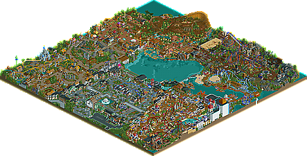
![park_2420 [H2H6] R4 - Reservoir Dogs - Atlantis Resort](https://www.nedesigns.com/uploads/parks/2420/aerialt2160.png)
The facades
Th river of the magic lamp. Best area visually hands down
The custom rides/ small rides. I love how you gave each flat ride a personality
The shop fronts. Same as above
The bad:
The coasters
The unnecessary theming/path interaction on coasters. You seemed to go overbored with this,so much so that it didn't add anything to the rides and instead made it seem like you were trying to add to layouts that weren't amazing.In short,every ride doesn't need a tunnel or underground section or to travel through a building.
Clutter. Far to many tree and theming on the paths meant i couldn't take it in or follow the walkways.
Lining every path with a building
Up and down path.Land height variation is good.You don't need to have a bridge or raised section every 100 feet.Can you image trying to walk round this park. I don't know about you but id soon get sick of walking up and down hills constantly.
Smoke and fire.I hate this when i see parks made by kumba.Its not 1940.Every building doesn't need blooms of smoke puffing from the chimney
Crazy paving.You do this on every release,stop mixing in different colours. You don't need to add a checker board effect for no reason
Good job finishing.Too many ideas cluttered in with unnecessary additions.Hidden gems that are passed over to easily.
7/10
I know you've heard this before J K, but it's just for the benefit of others.
Looking back on it, there are some inconsistancies, certain things that aren't spot-on or perfect. Also the coasters aren't as strong as they could have been, but I still stand by my score (the highest i've scored anything), and I still believe it deserves it's spot as the highest scoring acolade so far (now I have to work even harder on Batman
The Custom Arrow looper was pretty good, although you dont see many cobra rolls on this type of ride. The Dive machine was realistic and very believable. JDP's mega-lite was nearly spot-on, as expected from Mr.Coaster himself. The flyer was awesome, my favorite coaster in the park by far. The wild mouse was good too. But the woodie wasnt very realistic. It seemed like too many different builders all in one. It had GCI characteristics, some CCI, and I couldn't figure what builder you were going for there. But all that aside, it was still a great paced, very entertaining coaster.
I firstly want to say I really loved it to begin with and I just enjoy exploring the park to its full potential you really made it look and feel.
My favourite area must be the deep sea legends for some reason, I really liked the way it displayed the calm feeling you have in a seaside village, I personally live extremely close to the sea so I have a serious bias to this kind of theme. First of all what struck me in this part of the park where the boats who looked absolutely stunning and the Kraken wich looked extremely well made and inspirational for anybody who would make a sea themed park. Also a great Layout by JDP and kudos for that one because it is one of the best I've ever seen in the game. It all had room to breathe and be a part of a greater whole in this section and again another piece of art with the custom flat.
The other 2 areas I liked best where Agrabbah and old town Mexico, just the vibrant atmosphere of both did something to me and the cave of wonders was phenomenal to look at with the coaster comming out of it. I like the fact you really immersed yourself in this theme for the fact that there was little path uncovered wich is needed in this type of theme since in the real life counterparts its blazing hot there so shade is a must. Both areas packed a lot of colour wich I love in a park like this that doesn't want to be accurate in a ridiculous way and I don't mean anything bad with that, but I think this type of park is just way more fun and more for the viewer rather than the builder in a way I think. I mean I won't rant here but realism is the builder trying to achieve his goal of getting it accurate while semi-realism tries to focus more on aesthetics and is more build with the eye of the beholder in mind rather than technical accuracy. And I believe this park does just that in a subliminal way. There's so much to take in an too much to look at in just one sitting of the park.
The other 3 areas aren't by any means less to the other 3 I just said but those did it more for me personally.
I have to just add that you aren't a builder as much as you are a sculptor with this game and I admire your effort to make the shapes you did produce such as the lamp, the Kraken, the cave, the sombrero, the griffin and all the cars, plains and helicopters you made in this park.
I still stand by the vote I gave and I simply think this park is the best park I've seen done in this time-setting and available objects and such. I mean I would've voted some of the old spotlights the same in their respective times and I think you really nailed the ability you now have achieved and show what can be done with this game in terms of inventivenes and simple beauty.
I also think its safe to say I will check this park again for many months to come and looking at what you did with DJINN and ILMINTE, I think its safe to say I'll have to click that top vote again in the future.
You only have to promise me one thing for your projects to come and that's not to stop making stuff in this game cuz to me you just made the current perfect park.
BG
What Dreamport does well though is find a niche in-between fantasy and realism that few parks find. There are so many little details in here and the depth and extent of your creativity across the park is astounding.
PS: looking at RRP's cons list I would put most of them in my pros list
yes there's one of those chairswing thingys c:
J K, what would you say yourself?
I think Semi-realism is always going to be hard to describe as it's the "sitting on the fence style" between Ghost cell crisis and Six Flags Carolina. I agree this semi realist style doesn't match the parks of artist or Fatha but I also think semi-realism can progress into a style like I've shown. The funny thing is some people are calling this a great fantasy creation where other builders like yourself are thinking it's a real park. Both flatter me but I believe where Semi-realism lies is something that astounds you but is believable at the same time. It's hard to describe but my intentions where never to label myself, yet just reflect my style and immerse people into a park I'd want to visit myself.
One of the things I like best about this park is that the coaster layouts are all pretty non-traditional. At the risk of giving myself too much credit, your style of building reminds me a bit of my own. And the coasters are one of the biggest reasons why. That double-twisting first drop on Griffen, for instance, is the kind of thing most people would shy away from but I love it because it instantly gives the ride it's own special identity. And the rest of the layout flowing out from that is a nice mix of conventional ideas -- loop and turnaround, double corkscrew -- arranged in a unique configuration.
My favorite coaster in the park though is Ehacatl which is a great example of how to make a wooden coaster look interesting. The diagonal lift leads into an inverted diving helix which coils back into itself then a brief interlude before the big turnaround which frames the lift perfectly and takes you back for a swooping turn that intersects the first-drop helix. I tend to build my coasters this way -- aligning elements at proper angles to each other so that every individual element of the ride compliments everything else. At least that's what I try to do, though rarely as successfully as you've done here.
Lycan is probably the most conventional looking of the coasters, but you did one thing in particular which was exactly right and makes the ride for me -- you buried the annoying but necessary S-curve at the base of the pretzel loop. That's exactly the right instinct because I can look at the ride from afar and pretend that S-curve isn't actually there. Jafar is a great piece of eye candy, tucked into that gorgeous Agrabah cityscape and viewable from everywhere on the walkway. I noticed with your designs too that you tend to place your rides with the intention of maximizing their drama to anyone on the walkways. More on that later. Mako is probably the weakest of the coasters -- I think the layout could have used tweaking in just a couple places to make it more visually effective, but it's still a nice little ride with lots of airtime tucked into a small space. It looks like it would be fun to ride anyway. I didn't even look at any of the stats for your coasters. I don't care what they are. The rides work, which is the important thing to me, and each of them is special in it's own way.
I wanted to make sure I specifically pointed out two rides that I think are the best in the park (so far that is) -- the Robin Hood ride and the Monster Museum ride. Coasters are fun to play with sculpturally but we all pretty much know what they're going to do. iris used to like making lists of the best RCT rides back in the day and he asked me to make my own list once. I remember I leaned heavily toward themed experience rides over coasters because they were just more memorable for me. Your Robin Hood ride would be very high on my list if I were to make one today. It's a very simple concept but each scene is impeccably well-themed and each one furthers the story. What I like the most about the Monster Museum ride is the section in the middle where the track weaves through a broken piece of wall and swoops by the people waiting in line. Fatha' talked about this once too in reference to RoB -- creatively aligning the interaction of rides and their surroundings to create memorable images. That's one of the most successful examples I've seen in an RCT park of exactly what he was talking about.
There's so so much more to comment on, but I suppose I can save come comments for later. The last thing I wanted to say right now is that, similar to X-Sector's parks, the details themselves are more impressive for the ideas they represent than the actual skill of the architecture or the landscaping and whatnot (which is, of course, considerable). When people post screenshots a lot of times we're critiquing the visual look and the skill required to achieve it. But what you've done so well with this park -- and I'm quite certain it's the greatest RCT park I've seen to date -- is that you've managed to transcend RCT style completely. The level of detail you're working at, for me anyway, is very effective at conjuring up images of a real place. So eventually I'm not even thinking about looking at an RCT park, I'm thinking about visiting this wonderful imaginary place you've just created and discovering all that it has to offer. I used to get really annoyed when I saw people making RCT parks that were essentially just references to other RCT parks. People would use awnings in particular ways, for instance, because other people had done it before and it looked pretty. That's fine in itself, but when the park underneath all the pretty trappings was basically conventional coaster, queue line, and a few generic shops-- well, I'd get annoyed. But anyone trying to copy this park, I would hope, would eventually have to concede that it's just not possible to achieve this effect without spending the bulk of your time coming up with ideas for each unique detail like you have. And that's what's really impressive. Someone could build this park in real life using this as a blueprint because you've already figured out most of the details for them. Each shop has a purpose, each station building has a unique style appropriate for the ride.
PS-- I also wanted to mention the Cow Jumps over the Moon ride. Brilliant! The chase through an overgrown cornfield. The sombrero ride, make that the whole damn Mexico section! The Mako shark strung up next to it's namesake coaster. A coffee cup sticking out of a coffee shop, a camera on top of a camera shop. Sheep! A beanstalk signpost. Every single building in Agrabah. Lifeguard chair! Okay, pretty much just the whole park. It's gorgeous JK. I wouldn't change a thing!
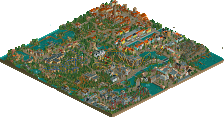
I didn't think to look for it before, but it's actually quite visible even in the zoomed-in park map picture.
I couldnt say anything....
JK, I'd like to review this park on the korean web site.
Is it OK??
*sry.. I cant speak english well.
Sala your English is fine don't you worry