Park / Dreamport
-
 25-February 11
- Views 42,643
- Downloads 4,130
- Fans 14
- Comments 127
-

-
 93.08%(required: 80%)
 Spotlight

BelgianGuy 100% yes RCTCA 100% yes turbin3 100% yes Kumba 95% yes Liampie 95% yes Maverix 95% yes Wicksteed 95% yes CedarPoint6 90% yes K0NG 90% yes Milo 90% yes nin 90% yes prodigy 90% yes RCTNW 90% yes RMM 90% yes John 80% no 93.08% 93.33% -
14 fans
 Fans of this park
-
 Full-Size Map
-
 Download Park
4,130
-
 Objects
554
-
 Tags
Tags
![park_2420 [H2H6] R4 - Reservoir Dogs - Atlantis Resort](https://www.nedesigns.com/uploads/parks/2420/aerialt2160.png)
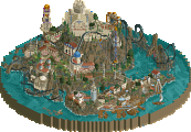
Dreamport by far is my favourite park EVER.The architecture is Simply amazing.
Everything just stands out..
im just speechless J K!
Again Congratulations on your success!
Longer feedback wil come soon.
This pretty much sums it up for me. The creativity is fantastic, and you're comparable to XCoaster in that sense, but your architecture, rollercoaster designs, and things like that just don't come together to me. All I saw was the same buildings throughout the park with slightly different colours and textures.
For the record I would have voted this at about 70-75% and voted no to Spotlight. I think we've become far too ready to award Spotlights now, it seems to me as though when a large park is finished to a decent standard, it's awarded a Spotlight where in the past something of a similar quality would only be a Super Runner Up. Just to compare, I'd say this is an extremely similar park to The Masterpiece in that it's a good park, but the architecture is a bit samey, and there are flashes of brilliance, but also bits that could really do with being improved. However, this is considered technically the best park ever, where as The Masterpiece wasn't even a Spotlight. Looking back, the last park that achieved Spotlight that I think honestly deserved it was DisneySea, and before that D:RoC.
Just not my cup of tea there, but I'm incredibly hard to impress, so don't pay attention to me. If you want a more detailed response JK, just say and I'll PM you with a run down of things I liked and didn't like.
+++
I really loved this park by the way.
Creativity is there for sure! 10/10 on creativity
Also your architecture is very smooth and very well planned. I like your style a lot.
Again 10/10
Seems like you really took your time, made things close to perfect as you could in RCT2.
Like they say Rome wasn't built in a day!
Well deserved spotlight. Looking forward to your next project.
Grand Central was my least favourite area. Unlike the other areas, this was more generic... If I recall correctly the transportation/dreamport theme was added later, and considering that you did a really good job. There were fun ideas all over the place, like the police and robbers chase. That was awesome. The architecture reminded me of Spellbrook Shore, and it's no secret that I don't really like that park... Generic, and in places I can find some examples of bad architecture (gallery screen, central top facade with the queue entrance for instance). Another thing that bothered me was the uneven distribution of colours and the lack of high foliage. Overall though, it's a very strong area and these minor imperfections aren't really a big deal. 80%
Unlike many others, I think The Enchanted Valley was one of the less good areas. I didn't like Griffin's lifthill supports, the tiles along the map's edge that looked unfinished and the lack of elevation and high foliage to disguise how bare some of the paths and squares are. But that's it! Everything else was fantastic. Cool ride ideas (Robin Hood!), atmospheric architecture, good ideas and details all over the place all testify to the great craftsmanship you possess. I love how hard to find some of the details are, that's especially what makes me come back to parks after I viewed them once. I'm sure there's still shit left for me to discover. Goes for all areas, by the way.
I don't know what to say about Deep Sea Legends. On the one hand it's the most original theme in the park, on the other hand it's way too small and I think you could've done much more with the theme if you had more space. I love what's there but I just have the feeling half the area is missing... I expected more 'legends'. Strangely, it's the small (custom) flatrides I love the most in this area. Mako was good, but it didn't really do that much for me. Typhoon 3D is nice, but confusing as well. The entrance promises an indoor ride with a 3d glasses show, but what you get is an open-air storm simulation. I think there should've been either this with the glasses removed or an actual cinema. On the contrary, the architecture in this area was amazing and spot-on. Beautiful colours as well, I couldn't have done it better myself. And most of all, Kraken looked fantastic. 90%
Agrabah was an area I looked out for a lot, as I love Arabian themes and you didn't advertise even a single screen from this area. What I found was not quite what I expected though... I could've known that it looked Disney. I'm not saying I was disappointed though; the greatness of this area overpowers my usual Disney-hate and I think it's one of the strongest areas the site has seen in years. Somehow the architecture looks so new, while actually it's you're generic style with just a few added details and shapes and all in a great colour scheme. The architectural details and colours really made this area. On top of that, the custom music fitted. 90%-95%
Twisted Acres is my tied favourite area together with Old Town Mexico. Everything was just right. The atmosphere was dark, but not depressing. The rides were the best in the park, Lycan being a pretty much flawless coaster with brilliant colours, Mousenstein being just fun, the cornfield ride being really creative and original and Banshee being one of the best custom flats I've seen, even though it didn't operate. The foliage was the best in the park, the architecture wasn't really that interesting but it did its job and the ideas were the best in the park tied with Enchanted Valley. 95%
Old Town Mexico is my other favourite area. I knew that in a matter of seconds, due to the amazing colours here and the incredible coaster. I just adore how dominating it looks. I said WOW out loud. Again, the details and ideas were fantastic here. Tequila Shot was awesome. I disagree with a quite a lot of your object and colour choices in the area, but it's not really a problem as it all comes together so well. What I also really liked was the backside of the mountain, it was the only place in the park where there was space to breath, and yet there was good shit to discover. You should have more of these spacious areas in your next park. The landscaping was probably the best thing in this area (and the park): the plant selection worked so fucking well with the use of land textures, it's amazing. The mountain makes up for the lack of interesting landscaping in the rest of the park, really. It feels so unique and fitting. This and the amazing colours create a very strong atmosphere that just screams FUN and WARMTH. 95%
You already know this as I was a tester, but virtually I just couldn't find anything wrong with the park; most of the time it was a matter of taste rather than flaws, and that's unevitable; I can't really blame you for making a quarterblock orange where I would've made it brown. The only real flaw I found in the park was that the lake was enclosed by architecture. The lake was pointless and filler.
Just alone writing this post and thinking about the park makes me feel like I just came back from an epic adventurous journey. Some people say RCT is just a meaningless game... Sometimes I think that's right, especially because four accolade-winning members, some befriended and some coincidentally here, happen to come from the same Dutch town and have attended the same school. Does RCT talent really exist or is it just something everyone can learn? In this case I disagree. This is some serious creativity and artistic skill.
To me good themed areas ar always either a story of an atmosphere. In a story-area everything has a purpose and is directly related. In an atmosphere-area, the elements are relatively unrelated which means less restrictions for the parkmaker and often more exploration fun for the viewer. Think of it as a city; unrelated elements like roads, sewers, a mouse population, concentrations of highrise architecture et cetera all cooperate to create one subtile and less predictable atmosphere. An atmosphere area is the random stroll through the city, the story-area is the tourist route. I agree with your observation - the random collection of details and rides - , but I don't consider a bad thing at all.
To all John-bashers (not just Cena of course!): don't forget that 80% is a very high vote anyway. If you look into John's vote history, out of 56 jobs Dreamport is among his top three favourite releases. You can't hate John just because he voted "I really really liked it" instead of "I really really really liked it". I'm sure John has his reasons to not vote higher, and evidently there are more people who can find flaws in this park. However, I obviously would like to know why he didn't vote higher as well. Just like I asked Evil WME for his motives for his 50% vote on Legacies, one of the lowest votes a spotlight park can possibly get. I never blamed him though and I like him as much as I did before; I actually appreciate his honesty and after he explained his vote I could totally see where he was coming from.
In short, just respect other's opinions and/or be a good sport... And if you ever vote lower on a submission by John himself, you're a fucking retard.
Just curious, what would you expect of a spotlight nowadays? (any screen examples?)
I agree, it's wrong... But I'm sure the admins are aware of it and it will be fixed sometime.
Disclaimer: it took me quite some time to write this post, I was fucking tired already so I don't feel like reading my own post to get rid of any spelling mistakes. I'm sure there are plenty. Ignore, please.
Pros-
Realistic supports
Catwalks (on most)
Marvelous theming
Creative ideas "i.e., Cornfield Massacre"
The wild mouse cars on the conveyor belt hack
Cons-
Only semi-realistic.
Sorry JK, I just enjoy SFC better. But I can smell who's winning the 2011 Awards...
Well first off congrats for winning and yada yada yada, but i just want to say that from following this in the ad i always knew youd win spotlight and it was a joy to check out new updates!
The entrance area was quite funny to me, in the way that it felt a bit to cramped. We have this huge entry gate and then all it really is, is architecture cramped around paths and the occasional flat. Dont get me wrong it was still a well done entrance area but it was a little too different and not to my liking. What was there, in terms of archy and theming was all very good, i especially liked the details like the antique cars going around the clock tower thing.
We'll move along to the fairytale section as that was my 2nd favourite area, really really good, i loved this area quite alot actually, from all the ideas such as the robin hood coaster, the stores themed to old fairytales, such as the 3 little pigs stall and photo shoot, and other stuff like goat feeding, all made this a well done area. Architecture was a joy to look at and Griffin was a greatly done coaster, that interacted with this archy in well thought out ways. I also think that this area has the best foliage out of all the others.
Moving to Mexico. I liked this area alot, but some parts not to much. Firstly i loved the wooden and how it interacted with the whole area, and the rapids, but mainly because if you positioned yourself in that area as a guest looking up at "the god of wind" would just make me so excited! Again, great architecture, i loved how people are saying most of the archy is similar, thats probably because most of the shapes are the same, but in hindsight, the way that you always themed each building differently is enough for me to love it! What i didnt like was the lack of notification for the rapids, i just thought why built an awesome ride where no guests can see it, especially the back part.
Now to the horror section, my absolute fav theme, in this park and out of all parks that have ever built a horror section as well. Let me just say this, Lycra. Was. Amazing. Brilliant layout in the way it interacted with the surroundings, but not just that, mainly the station and how it turned through the station was what i felt made this coaster one to remember, the station itself? Remarkable. Other ideas, such as the lemon tree thing was awesome, really really loved that. Generally the architecture was good but some sections were amazing, such as the haunted house and manor, which i loved, especially stuff like the lightning bolt and the ambulance. BTW, i loved all your vehicles, from the ambulance, to the boats to the trucks for the back stage areas in the park.
To the port area, i liked this area, but not as much as the others. What i liked the best was the 3D ride and the light house, i thought you pulled those two off very well. Mako was weird for me as i kept on thinking it didnt belong there, we have the coaster and then right behind it we have a horror section. I think it would of been better off in the area where the Frisbee was (which i love) as that is the centre of your harbour area after all.
Lastly, the Aladin section. Very nice but there was some things i didnt like. Number one was the dive machine. I didnt like the layout, i know this is fantasy realism but to label it as a B&M didnt make sense, as it seems un realistic to me., I also didnt like how it kep on diving in and out of the ground mainly, i think that after the loop it should of stayed above the path, not below it. The rest of the area was awesome though. Great architecture and i absolutely loved the water ride.
So in conclusion, well done mate, i really like this park and look forward to whatever you have planned next.
19/20
That is patently false. Look at my voting history. Not to mention, dedicating two out of your 13 posts to wage some vendetta against me is pretty ridiculous.
Cena, I am not part of a three-ring circus and won't be tendering any resignation. Thank you.
Therein lies the difference in our thinking: nothing is ever nearly flawless. That's why I consider 80% a pretty high score, having only given that score three times so far.
Two things. One: the highest-scoring accolade in NE history also tied in receiving the highest score I have ever given. What's your excuse for scoring this lower than other submissions that have received much lower panel scores?
Two: if people are on the panel as a vehicle to inflate their own scores (by rigging the scores they give to other panelists), I think we've discovered a new shade of pathetic. I vote based on what I see and I think that my voting has been very consistent with what I personally view as important in parkmaking. You may disagree with what I think is important and that is perfectly fine. Don't be shocked, however when our scores differ.
Your opinion is just that. There is no right or wrong, even if you did intend that comment to be facetious.
Coincidentally, that was my number one issue with the park. There was very little cohesion overall; as individual parks I would have enjoyed each section much, much more. As a whole, it just didn't jive for me like it apparently did for others.
Thanks, Liam.
At the end of the day, I'm not sure what the big fuss is about. I'm not about to change the way I score things to coincide with the rest of the panel. That would defeat the entire purpose of there being a panel. There are 15 panelists on any given submission and the highest and lowest scores are dropped. It is amazing that people still cannot comprehend that.
After all of that nonsense, I'd like to congratulate you, JK. Even though it wasn't my jam, I did appreciate the park a lot and it certainly seems like a lot of other people enjoy it as well. Congrats again!