Park / Dreamport
-
 25-February 11
- Views 43,202
- Downloads 4,142
- Fans 14
- Comments 127
-

-
 93.08%(required: 80%)
 Spotlight

BelgianGuy 100% yes RCTCA 100% yes turbin3 100% yes Kumba 95% yes Liampie 95% yes Maverix 95% yes Wicksteed 95% yes CedarPoint6 90% yes K0NG 90% yes Milo 90% yes nin 90% yes prodigy 90% yes RCTNW 90% yes RMM 90% yes John 80% no 93.08% 93.33% -
14 fans
 Fans of this park
-
 Full-Size Map
-
 Download Park
4,142
-
 Objects
554
-
 Tags
Tags
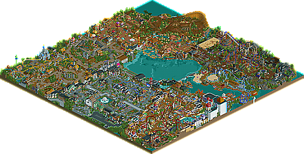
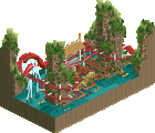
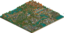
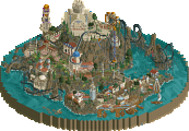
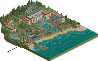
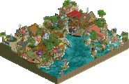
![park_2420 [H2H6] R4 - Reservoir Dogs - Atlantis Resort](https://www.nedesigns.com/uploads/parks/2420/aerialt2160.png)
Now seriously, J K, your ability to theme is beyond everything and everyone I've ever seen in the game. It struck me with DJINN and this is a strong confirmation of my impression back then. I had moments like when I discovered the octopus coming out of the water grabbing the path and just said "my god ..." aloud because I was in such amazement. The same happened when I saw Jafar where trains would come out of that mouth. It was such an intense moment combined with the custom music. You look at all your theming elements and they are just so hardcore convincing that it puts you into these moments of complete awe because you see something so superior it just fills you with silent admiration. Your amount of detail is very high, and yet they all make sense and are easy to comprehend. This is an ability that takes an extremely high level of skill, and yet in your park it looks as if everything is filled up with it because you have so much of it. Amazing.
Let me suggest a few things that I feel would be worth giving your attention to for future projects.
- Alignment of areas. Sometimes it felt as if they were rubbing each other's backs, so to speak. It wasn't always easy to find the transitions between them. A layout issue perhaps.
- More attention to ride entrances and queue lines. Some of the rides have wonderful sculptures or banners by their entrances already though. I assume these were done later? Still, I would give them even more emphasis, especially main rides. I felt a bit sorry for the woody whose entrance was so timid and hidden. And queue line design, too, could be emphasised a bit more. Looking at the queue often holds an element of getting excited to board the ride. I think you would do wonderfully when putting this more to the viewer's attention.
- More space around the map edge. I'm afraid this might have happened by accident though, I know at least this is how it happened for me. An example would be the ferris wheel which unfortunately is just too close to the map edge.
- You have followed RCT conventions on the entrance and exit huts, sometimes trying to force them into a building and giving some flat rides a very oldschool appeal because of it, as back then the huts always HAD to be burried and in turn encircling the ride with a big wall or tower was common. This doesn't look terribly nice I think. Although I absolutely understand that hiding the huts is usually a time consuming extra hack that can cause problems.
Please ask if there are specific things you feel you need feedback on. I will be most glad to give it to you.
As for now, thank you for this huge delicious piece of sublime RCT work and please update me about every step you do in the game from now on.
So now for my review. Let's go by area, shall we? Ok:
Grand Central-Awesome entrance area. I loved the giant clock, the helicopter ride, the fountain and the balloons ride. Architecture was flawless, another reason I believe you're the best at architecture in the community.
Enchanted Valley- Had a Busch Gardens Williamsburg feel to it, well to me at least. Really liked the coaster, Griffin. It had some great elements, and I really liked the interaction of the cobra roll to the bridge. The little sheep on the hill was a nice touch and the Jack and the Beanstalk ride was the best themed observation tower ever. The Robbin Hood ride was great, truly an idea executed to perfection. All the little details to the Robbin Hood ride were amazing. I also loved the mushroom themed slide. The area oozed atmosphere and was one of the best in the park. Again, more excellent architecture in this area.
Mexico, too, was executed perfectly. All the details, architecture, atmosphere, foliage, everything fit perfectly into the Mexican theme. Sweet rapids (loved the flamingos), and an awesome woodie. @The Tequila shot, lol
Twisted Acres was probably my favorite area. Its definetly one of the best, if not the best, semi-realistic area ever created. Cornfield Massacre was great, and Lycan certainly should be a candidate for Best Steel Coaster of 2011. The theme was fabulous, the layout was beautiful. Great interaction on the pretzel loop, best part of the ride. Awesome theme here.
The Deep Sea Area certaintly was no slouch either. Mako was a terrific coaster, great work on nailing the Mega-Lite layout, JDP. Only one comment I have on it: I was wondering why you didnt complete the first drop into the 270 degree turn instead of banking the bottom of the drop as you did. Either way, it doesnt matter as the ride was fantastic, start to finish. Don't see why this couldnt be a Best Steel Coaster candidate as well. I really liked the port area, the boats were really cool. The Kraken busting through the port was sweet. And, yet again, more flawless architecture.
Agrabah was yet another great area. I loved the custom flying carpet. Jafar, the dive machine, was sick. Camel tours was a nice touch and overall, I really think you (and RCTFan) really nailed a difficult theme here.
So that brings me to the end. I'll be looking through this park for the next hour or so, I know it. And I'm sure I'll come back time and time again to view your flawless creation once again. Congrats JK, on one of the greatest creations in RCT history. Cant wait to see what is instore for us at NE in the future from you. Great work.
Edit: Anyone else notice how it says CoolCody started this topic? Just thought I'd put that out there for the admins.
So let me go through the things that I especially love, because you know that everyone adores it already, and I have favorites even though I love every bit of it.
Grand Central: I love the balloon drop ride and the monorail station, they were just so classy! And I though the thanks signs on the back of the monorail station was a great idea. The other custom ride was cool too, in fact all of the custom rides were amazing.
Fairy Tale: I love the three piggys picture sign, I actually said wow out loud. The best bits were in the sort of area around Robin Hood (and actually Robing Hood itself was stunning, I love all of the little details and interactions). Maybe this section was newer or something, but the archicture was stunning and full of life. Merlin was cool too. I also liked Rumpil Stiltskin's spinning wheel.
Mexico: First of all, that is incredible, vibrant architecture. Certainly trumps any other Mexico area I've ever seen. The woodie was great too, but the crowning attraction was the rapids, especially the bit behind the woodie with the semi-ruined buildings or whatever. Overall this is probably my favorite section.
Nightmare: The thing that made this area was all the little details. The giant piranha plant, the skull in front of the Monster Museum, the broomsticks to ride on, the hay ride, and best of all, Mousenstein. As well as having a great name, the tower that the ride came up on was so beautiful... that's really all I can focus on when thinking about the area. Oh yah, the flyer! That was beautiful too, and the pretzel loop was pulled off really well.
Seaside: Shame for the object limit, this area could have gone so far! But as it was it was still brilliant. The kraken is so amazing, especially with the baby kraken ride positioned next to it! The best bit though was the general atmosphere and architecture surrounding the boat shed/typhoon 3D. The boats were pretty beautiful too.
Agrabah: The architecture here was just as good as Mexico. I loved the little frog hopper inside one of the buildings! The drop machine was pretty epic too, and although I haven't seen Aladdin in years I can still appreciate all the nice little details.
Congratulations, what a great day this has turned out to be!
One question, has anyone found the Cheshire Cat other than 5dave?
I did.
This is Freakin amazing!!!, words have difficulty describing this!
Gotta check this out soon.
I'm your new behind the scenes admin!
It's very hard to describe how wonderful it is!!!
I can't explain how I feel...damn, so sad not good at english, just...I love you JK.
Every area in this park had a great type of inventiveness. I think I liked Mexico the most, but it would be closely followed by the fairytale area. Also loved that somewhat small sea area. Agrabah I guess I can agree did not fit as it's a Disney theme you stuck in a park that has nothing to do with Disney, you were just using a old theme you had sitting around. Still you created an awesome area with it, well imo minus Jafar which had a lot of things wrong with it, mostly around the station with all the good stuff where no one could see it.
I disagree with what nin said tho. I always point to IoA when people pull crap out of their asses about how areas don't mesh. When it opened you have lost continent next to Dr. Seuss. Maybe the most fucked-up bed fellows possible, yet imo it is/was the best theme park ever made. I love that you mixed up your themes. If you had saved them I think DP would only be at like 45% atm and maybe you have another park or design going with them and never get anything done. When you use your favorite ideas you get things done and really enjoy doing it. That helped me on DRC. Tho keep in mind nin will never finish anything, I mean look how little he did for the two of us in H2H5
As far as realism goes I can give a shit less if this is realistic, semi-realistic, semi-fantastical, maybe-sorta realistic-fantish or whatever the hell type of labels people want to stick on it. What it is happens to be great RCT that flows with creative ideas. That's all that matters to me and I don't like when people try and label parks like this.
Seems you just barely beat out Kumba for the highest score in AP history. I don't mind since this is a park... but if it was a design id be fucking pissed and beat the piss out of your buck-toothed British ass! Speaking of people who need a beat-down, WTF John? You have real issues if you don't think this is a spotlight. Not a good idea to score things like that when you might be submitting things soon. I won't think about that when I vote on your stuff, but others might. It could hurt you and for what?
In the end I don't think this is the greatest park ever. Really there are a lot of parks that will come to mind when people try and think of which is the best ever. This is one that will pass through peoples heads. I still think SF's recent spotlight is the best recent one we have had, hence my only 20 vote ever, but this is right on its heels.
Congrats on a fantastic park J K and I hope your happy I posted one of my longest replies in a while on it... even if all of it was incoherent near 1:00 AM rambling that stems from chatting with the old fuckbucket to much
I agree though that I'm a bit puzzled why one would not vote this a spotlight.
Wicksteed Offline
and JK, i'm coming back with a sammy analysis at some point, you can look forward to that
I agree with John. I liked this real much and it was really well done but there were also some flaws. I don't like the transitions between the areas and that's (to me) a real big reason for not being a spotlight, I know I'm not on the panel just giving my opinion.
I think a lot of creativity went in this one, but I just don't like what he made.
Therefore it's an opinion and I think John voted to his opinion.
The best part of this was the creativity but everything else wasn't like the best ever made to me.