Park / Bobcat

Park_1831 Bobcat

10 Comments

  • Comment System%s's Photo
  • highroll3r%s's Photo
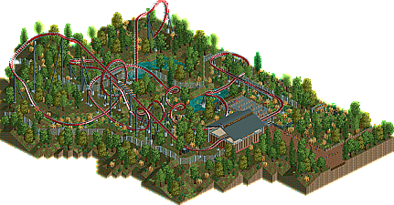
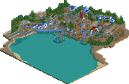
    the layout of this looks awsome. loop around the lift hill, barrel roll over the mid course brakes and exits through the loop. and a cobra roll under the lift hill. man this is a really good design, layout wise, but seriously lacked in scenery and theming. next time concentrate more on theming and you should receive an accolade for sure. :p
  • Fizzix%s's Photo
    Looks like an excellent layout, but the surrounding area really lacks. Try to make your foliage have layers, and make it grow in clumps, instead of just randomly. You should be able to pick up an accolade next time!
  • musicman%s's Photo
    needs more cowbell.

    In all seriousness though,the layout is pretty awesome except for the double corkscrew on a B&M (first!). You're missing a lot of small details though, including an area of fence in front of the queue entrance, and with this style of ride, you really need some realistic details you don't have here, most notably catwalks and a transfer section.

    Of course, I really have no need to talk. :)
  • djbrcace1234%s's Photo
    I love how the loop goes over the lift hill, and that the zero G roll goes through it as well, but nothing is there to really support the coaster. Like musicman said, you need more details if you want to get that accolade, but I enjoyed it nevertheless. :mantis:
  • chorkiel%s's Photo
    Maybe a flat would've made it cooler to start off.
    lacks theming but I LOVE THE LAYOUT ! :D
  • Roomie%s's Photo
    I really liked this layout as others have said. The only change I would have made would to have put the Cobra Roll in a trench so you could use the larger half loops.

    Not only do I prefer the look of the bigger loops, it would also have provided a good spectacle from the station.
  • tdub96%s's Photo
    The layout was good, very Kumba-esque, and the landscape was good too. But imo, this was lacking a little bit, keeping it from a design. I think you needed more surroundings, more of a theme than just a coaster, station and landscape. I would've voted it below the design lvevl, but the potential is there.
  • CCI%s's Photo
    Thanks guy's for all the comments! The reason the surrounding area is dull was that I forgot to put some items that I needed into the bench. Secondly I had lost all interest and just wanted to submit it after a while of working on it.
    Rest assured that my next submission will have a lot more to it. ;)
  • CCI%s's Photo
    Random question: But if some small changes we're made to the layout and of course more stuff added to the overall area would I be allowed to give it a second shot?
  • geewhzz%s's Photo
    yes
  • 39.62%(required: 65%)  Design Submission
    Percentage of vote: 39.62%
    Roomie 65%
    Levis 50%
    Louis! 50%
    robbie92 50%
    5dave 45%
    Kumba 45%
    RCTNW 45%
    posix 40%
    prodigy 40%
    CedarPoint6 35%
    K0NG 30%
    Liampie 30%
    turbin3 30%
    Wicksteed 25%
    Maverix 20%
    39.62%
  • No fans of this park
  • Download Park 625
  • Objects 130
  • Tags