Park / Ace

Park_181 Ace

11 Comments

  • jusmith%s's Photo
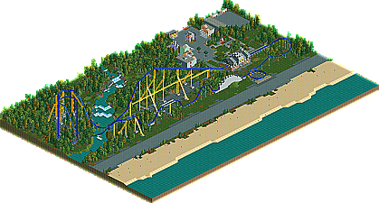
    This is a design I worked on about a month or two ago. I sent it in for design, but it missed by one vote. Still, it was the first time I ever tried anything in rct1, so I'm proud of it. Definately not my best work, but I think it is still somewhat nice to look at.
  • CedarPoint6%s's Photo
    I found the layout to be very pleasant, and just a good solid hyper coaster. As I remember, RCT doesn't have Morgan or Intamin track/trains for this type of thing, but I think they would've suited better, especially with the lift supports. That being said, I had a fun time watching the coaster and I'd say it was certainly worth a download.
  • posix%s's Photo
    i really enjoyed this. i was sad to see it was so close for it to not win design.
  • Louis!%s's Photo
    I enjoyed this. Not as good as the LL screens you've shown in the ad district but some nice solid work.

    It was a shame to see it lose out.
  • Comet%s's Photo
    Looks pretty good.
    Can we get some more screens for the non LL'ers?
  • JDP%s's Photo
    ^ Yeah.

    And yeah CP6, they have morgan trains in rct. :)
    -JDP
  • jusmith%s's Photo
    Thanks for the comments so far!

    An overview:
    Posted Image
    The Station
    Posted Image
  • Milo%s's Photo
    I thought this was a pretty good design and voted yes for it. It had a real nostalgic quality to it that I liked and overall I'd say it was pretty nice. The treeing and landscaping was very well done imo and created a great setting for the ride. The layout was ok by my standards but it had some major flaws in it as well that even I noticed and when compared to other layouts, doesn't really stand out. The buildings were alright as well but probably the biggest downside to the park. The station didn't really fit in with the other structures and the trackitecture there just didn't work out. Some other minor downsides were the unnamed staff and ride scenery and I would have liked to maybe see something done with the surrounding land other than just the rock texture. Some black path or black maze tiles would have been a better option imo.

    It was a good entry though and it came really close to Design although in the end I can see why it didn't make it. Hope to see some more (LL) work from you and perhaps next time you'll get a spot on the front page :).
  • geewhzz%s's Photo
    Very nice design here...my only complaint is that the lift supports could have resembled the B&M formula a bit better, but other than that this was lovely, as is all your other work.
  • geewhzz%s's Photo
    anyone have this file?
  • jusmith%s's Photo
    Just bringing this up again. I don't have it as the old computer I used to play LL on died. Anyone else?
  • geewhzz%s's Photo
    err duh, found it.

    Attached File  jusmith_Ace_DesignSubmission_.zip (107.68KB)
    downloads: 261