Park / Amerigo
-
 14-January 11
- Views 1,792
- Downloads 621
- Fans 0
- Comments 4
-
 No fans of this park
-
 Download Park
621
-
 Objects
65
-
 Tags
Tags
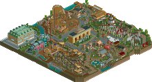
![park_2095 [NEDC] Archimedes - #1/9 (Winner)](https://www.nedesigns.com/uploads/parks/2095/aerialt1885.png)
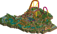
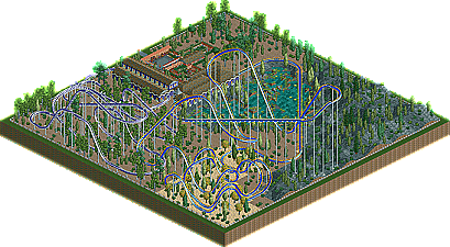
(Though now that the overview has completely loaded, I can honestly say that the coaster is... unique. Keep working at it!)
every FUCKING coaster doesn't need to be realistic or inspired by a real coaster. The author already expressed himself for not wanting to make them. It just needs to have good flow
Maybe you could have expanded the building for the station some more also.
Also I find it kinda dissapointing with such a nice hill landscape you didn't use it. why not make the coaster fly trough a cayon or dive trough a little tunnle etc.
My tip for the lay-out. Try to make the lifthill a little bit less high and try to use the landscape more so you can go deeper to get the speed you need. don't try to make the coaster go that much above the land. it just doesn't seem right unless you use eleborate structures to support it.