Park / Magic Realms Resort
-
 06-September 08
- Views 18,537
- Downloads 4,464
- Fans 10
- Comments 56
-

-
 85.45%(required: 80%)
 Spotlight

postit 100% yes posix 95% yes 5dave 90% yes ChillerHockey33 90% yes Xcoaster 90% yes CedarPoint6 85% yes Evil WME 85% yes geewhzz 85% yes Magnus 85% no Fr3ak 80% yes RCTFAN 80% yes Milo 75% yes nin 70% no 85.45% 84.62% -
10 fans
 Fans of this park
-
 Full-Size Map
-
 Download Park
4,464
-
 Tags
Tags
![park_2401 [H2H6] R3 - Hurricanes - Avatar](https://www.nedesigns.com/uploads/parks/2401/aerialt2145.png)
![park_4093 [H2H8 R2] Forgotten Mekong](https://www.nedesigns.com/uploads/parks/4093/aerialt3831.png)
![park_4103 [H2H8 R3] E.V.I.L.](https://www.nedesigns.com/uploads/parks/4103/aerialt3847.png)
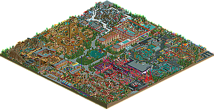
Bits of the other areas (especially Fort Phoenix and China) had the same qualities but just didn't hold my attention as long. Things like the park layout got kinda odd and felt almost rushed. The park had kind of a lopsided feel with one half being the most epic stuff I've seen in a long time and the other not quite up to that level. It was all really fun to look through though.
probably my favorite things in the park were the ride/que entrances... really badass sculptures and custom paths. Major props to that.
Kevin Enns Offline
One of the best brochures I have seen.
Only things:
I really thought it was WAY too cramped. I just think it didn't have any room and it was cramped, plus I think the Rock and Roll section could have been executed better. I couldn't do better, but I just think it could've been better, IMO.
overall i liked it. i thought the themes were flushed out pretty well. the aztec area was by far my favorite, the architecture is exactly what i think of when i think aztec. rattle snake was my favorite coaster with the terrain interactions and that badass water wheel taking center stage by the splash boats. a few things i didnt like were the lack of theme transitions and the compact feeling of the whole park. if there had been just a little more space between lands, both of these problems could have been helped. rock n roll plaza was my least favorite area. i didnt like the colors and the lack of variety in textures made the whole area feel bland. i did however like the guitars.
good job and congrats again on the win.
I really love this park. Everything seems well thought out and there are loads of original ideas. I particularly liked the big inverted coaster.
The only things I didn't like were (as some other people have said) how compact the park is. I felt that each area was wrestling for some room - they could have done with a bit of space to breathe. Some of the paths also seemed a bit squashed in and narrow. Another minor point is that the park ran quite slowly for me with peeps which was disappointing as looking at the peepless version wasn't as atmospheric. That's not your fault though of course.
The brochure you made to go with the park was absolutely superb. Brilliant idea and execution!
So overall congratulations on the Spotlight. You deserved it.
The woodie is superb as well. Just a great layout there too. The castle (I'm working off of memory here, I'm not at home) is one of my favorite buildings. Great interaction with the water coaster!
I'd post more, but I can't remember more... I'll post again sometime soon.
Todd
Congratulations on the spotlight and I look forward to seeing more from you.
Boy, did I feel wrong. I realized that the allure of this park came from the atmosphere had creativity rather than the details. Although I'm not the hugest fan of your architecture, your creativity in creating the areas was amazing. Each looked complete, full-fledged, and exciting. You may not have the best small detail work, but you've created what many parks lack: a great atmosphere. I was never tired of your ideas and the execution. The invert is brilliant, along with Montezuma. You found a way to create a Maverick-style coaster without copying Maverick's layout.
Overall, I love this park. It may not be my absolute fav, but it's definitely up there.
Because the hotel is in the middle of the park and that the heart of the park(just like the Cinderella Castle or Sleeping Beauty Castle) and most of the areas are based of of Disney areas like the western area is based of of Frontierland.
Absolutely Great park BTW
Edited by DrummaBoi, 02 August 2009 - 06:14 AM.
eyeamthu1, I'm sad we haven't heard from you ever since. I take it RCT has lost some of its excitement for you?
inVersed Offline