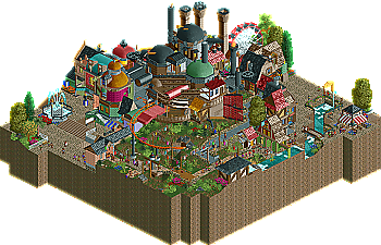
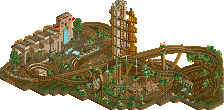
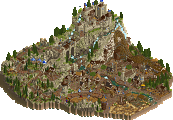
Very though. I've been waiting to see Howl's castle ever since Cocoa unveiled he was working on it. I have to agree with Casimir on that it would have been nice to see it on a larger scale. I would have tried to make the castle bigger so that all the details and small parts of it would be more visible. But apart from that I really liked the execution, captured how I remember the castle perfectly with all the odd. moving, potruding parts and an overload of textures and colour. The town also looked really neat and atmospheric to me. Only slight minus was the foliage, which I felt was poor in places, especially those textureless, bright flowers which just look bad in themselves, never liked that object. As for Gondwana, the first thing I thought when I opened it up was "this is how lotusflower should have looked". The overgrown, organic look was pulled off perfectly, and I loved how you could see buildings and peeps moving beneath the coaster. The vertical tower was cool aswell. In the end, I will go for Cocoa's entry, mainly because I'm a huge Miyazaki fan.
^ Yeah, I just couldn't finish it at the same quality that we'd carried through...I tried but just ran out of time. And, you know me well enough to know I wasn't just gonna fill in the gaps. Pisses me off cuz we definitely would have won this. But, maybe we'll just expand it like we'd discussed and send it in for an accolade or something. Sorry, bro.
OH, the entrys seem interesting from the pics, gonna download them
^ Yeah, I just couldn't finish it at the same quality that we'd carried through...I tried but just ran out of time. And, you know me well enough to know I wasn't just gonna fill in the gaps. Pisses me off cuz we definitely would have won this. But, maybe we'll just expand it like we'd discussed and send it in for an accolade or something. Sorry, bro.
Well personally I prefer it being submitted later and with the quality we intended than sending in a half-assed entry for the contest and being ashamed of doing so I prefer losing by forfeit and knowing we'll deliver something great at a later time than losing because we rushed it...
That's not the point I'm making here. K0NG and hopefully others will understand what I mean.
I see the point that you think you're trying to make here but, there's no comparison. In H2H5 I was healthy and we had severe technical issues...with this, Belgian Guy and I both had RL issues that simply didn't allow us enough time to finish it properly. Massive difference. Although any time I personally miss any sort of deadline, people like you will bring H2H5 up for comparison. Doesn't bother me a bit, I'm past that...it's history. Though I do find it funny that some people seem to live simply to enjoy others failures instead of striving for their own success. Cena and hopefully others will understand what I mean.
Can we get some comments on these entries? Last 9 posts have not been...
I like what Cocoa did, his style is very pleasant. Thing is I have no idea on the theme since I never saw the movie, so I did not get any details he put in related to that. Still it looks good in RCT, so congrats on the votes your getting, this is close
Kumba: I liked the look of it a lot, but other than the naming which was pretty random it's so generic... A few good ideas and the coaster was awesome. The tower looked pretty although I have no idea what it is supposed to be.
Cocoa: I like the architecture and each seperate area, but overall it was a mess. I found it hard to distinct the areas from the castle. The rides were boring, sorry. Luckily this was backed up by the architecture and details. I enjoyed it!
27 Comments
Kumba Offline
This poll will decide the 2010 Monthly Micros Champion. You will have 48 hours to cast your votes for a winner. The two entries are...
Gondwana
by Kumba - Download
Howl's Moving Castle
by Cocoa - Download
It was a great season and it is nice to see that two the top competitors sent in a pair of really nice entries for the championship.
Most votes by January 3rd at 11:00 AM EST wins.
Jaguar Offline
turbin3 Offline
Casimir Offline
Gonna post a more detailed explanation later.
wheres_walto Offline
Splitvision Offline
Cocoa Offline
anyway, thanks, and I always was worried that I would lose to Kumba's aesthetics, but right now I'm not doing too bad...
K0NG Offline
BelgianGuy Offline
no worries though my fault aswell^^
K0NG Offline
BelgianGuy Offline
Cena Offline
Head-2-Head-5 Finals déjà vu anyone?
BelgianGuy Offline
Cena Offline
Liampie Offline
You're not making a point at all.
K0NG Offline
Kumba Offline
I like what Cocoa did, his style is very pleasant. Thing is I have no idea on the theme since I never saw the movie, so I did not get any details he put in related to that. Still it looks good in RCT, so congrats on the votes your getting, this is close
Liampie Offline
Cocoa: I like the architecture and each seperate area, but overall it was a mess. I found it hard to distinct the areas from the castle. The rides were boring, sorry. Luckily this was backed up by the architecture and details. I enjoyed it!
Voted for Cocoa.
SSSammy Offline
Cocoa Offline