Park / Amethyst
-
 08-September 08
- Views 4,820
- Downloads 567
- Fans 0
- Comments 21
-
 58.50%(required: 65%)
 Design Submission

Magnus 75% Milo 70% posix 70% Xcoaster 70% CedarPoint6 60% nin 60% chapelz 55% Evil WME 55% 5dave 50% zodiac 50% geewhzz 45% Fr3ak 40% 58.50% -
 No fans of this park
-
 Download Park
567
-
 Tags
Tags

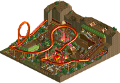
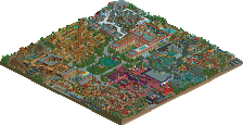
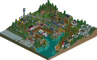
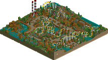
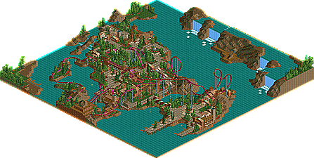
This is my failed design attempt, Amethyst, an Inverted B&M themed loosely around the Amethyst Quartz.
I'm very proud of this work, i admit the end of the coaster is a little weak but i had fun building this. The landscaping on this map is some of my best, i broke away from a lot of the things that were holding me back in LL an this project flowed amazingly well.
I got one more design attempt in the works then I'm starting the solo =)
enjoy, more work to come soon.
Download: Amethyst By rK_
Looks great, rK_. That station looks incredible, though the ride design isn't the BEST, I would still have given it a page. Well done.
The theming and everything looks fantastic, but the coaster itself is a huge let down. I'm only looking from the overview, but I can already tell that the coaster won't flow right.
It looks like you did the theming, and then put the coaster in, and struggled to make it fit right.
Looking forward to more work from you
(oh and I forgot to reply to the PM, sorry)
I'm sorry, but do you mind explaining what "confusion" you had previously?
Seems a bit dull to come here complaining especially when you were in a direct position to have a lot of influence of the outcome of said topic.
I always find non-inversions on inversion heavy coasters to be the funnest part anyway, and those sweeping turns from island to island would probably be one of the highlights on this ride, not the loop or corkscrew they can find on any ride of this tye.
It looks really great and probably even Design worthy, hopefully you are successful in your next try.
Great architecture, great foliage, great landscaping... mediocre layout. And for a Design, the layout is more important than any of the rest.
That said, it's wonderful to see some classic LL around.
-ACE
Actually form what I recall, the comments I received on it were good comments and were from today's moderators.
-JDP
Edited by JDP, 08 September 2008 - 06:33 PM.
and yes the point of a design would be the layout. thats why im not surprised this didnt get a spot, its not a typical layout, but it does flow very well if you ask me.
overall im happy with the votes i got, its given me alot more confidence with my work, my coasters were sad a few years back =/
Xcoaster Offline