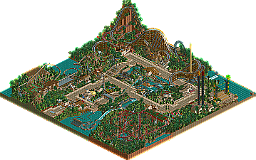
Park / Dino Delights: Adventure Park
-
 20-August 08
- Views 4,712
- Downloads 603
- Fans 0
- Comments 22
-
 45.56%(required: 50%)
 Spotlight Submission

RCTFAN 70% nin 60% Magnus 55% Milo 55% Xcoaster 50% CedarPoint6 45% geewhzz 40% 5dave 35% Evil WME 35% postit 35% posix 20% 45.56% -
 No fans of this park
-
 Download Park
603
-
 Tags
Tags

Well,
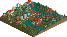
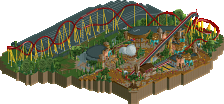
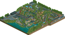
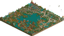
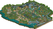
It lost. Im pretty disapointed but it is what it is. Anyways, when this park was in the building stages it was called Project: Dino. Started in December 05' and started advertising in April 06', it's been a long, fun journey. I'd like to thank RMM and Ride6 for their amazing roller coasters, thanks guys. Also thanks to hpg for the fabulous logo, Gwazi, Milo, inVersed, jusmith, etc. So enjoy Dino Delights: Adventure Park, and look out for something related to this park in the near future.
for those who can't view LL. \/
=========
=========
Enjoy!
--RCTCA--
Great Job, and Good Luck in the future!
inVersed Offline
Anyways you know what i think about this. Nice work man.
RMM Offline
glad to see you finished the park off.
turned out pretty nice.
Xcoaster Offline
Don't give up! You were close on this one.
Same with my Flyer, I did that what... 18 months ago or something? Back when I still played this game often anyway.
I'll review this further when I get home. Can't excactly download and look at that here (at work).
Peace.
Ride6
Archy- Your architecture is becoming stronger, I think. Most of it is still a little basic, and at points is rather boring or unattractive, but then again there are places when it shines. The T-rex cafe and the first aid building show some unity of style and together make that side of the park look pretty good.
Coasters- unfortunately it becomes painfully obvious which one you built. The suspended just doesn't feel like it was thought out well- the section from the first lift to the second is too short and rather dull, and considering the coaster type I feel like the layout had far too many camelbacks and not enough curves. The station buildings are all a little meh- Serpent's might be the best one, but even if it is a well-dressed block it is still a block. Ride stations are some the best opportunities to create a memorable and exciting visual- they just need to feel solid, if not epic.
Little things- the foliage choice here was fairly obvious, and you did a decent job with it. the more heavily tree'd areas feel suitably jungle-y, and the more I look at the hill behind Pterodactyl and the are under Serpent the more I like them- that said, you probably could have done a little more with the Serpent area- not a whole lot, but compared to the amount of visibility and interaction the other two rides have, Serpent just seems lacking. I do enjoy the turnaround area by the woodie. The observation tower is very nicely placed, and the little monorail steel support under the turnaround is a nice touch- but why wasn't the whole path crossover done up like that? The rapids are pretty cool- awesome work with the rails and such, and the fencing and dino underpass on the drop looks great- the station, however is fugly. The entrance building is a tad busy but works out fairly well, I think. the landing area just past it would be really neat in person, with the whole park spread out in front of you, massive woodie in the distance, and off to the right a little postcard view of Serpent rising above the trees past the rapids. Really a nice little park, with some obvious places to improve, and a lot of places where you obviously have already improved.
The treatment of the guest builders contributions was very polite and I appreciate that as well.
RMM's woodie really held my interest for a couple runs as well, very unconventional but all the better for it.
As for your work, it's definitely improving. Your architecture is, at least in spots, starting to form into several smaller boxes rather than one large blob. Even the coaster stations, which were rather bloby, were well decorated enough to pull it off acceptably (though not beautifully). The variations in height throughout really helped matters though the park was generally too flat and too pathed for it's rather small size. The way you lined the edges of the path with a different type and then used rows of those stunning pink flowers really works for the atmosphere though. Reminding the viewer that it's an amusement park themed to the jurassic era, not a jurassic era theme park.
The foliage was also well done, very rugged. And raft ride showed some solid touches as well with it's covered waterfalls and custom railings. Back near the station it went all aqueduct with those "castle wall" fences as it's sides, which was an excellent touch.
You've got the right ideas, and a good feel for atmosphere. The problems you need to tackle are your coaster layouts (needless to say I didn't bring up your suspended. No reason to punch someone who's already bruised in that spot), which is, admittedly a touchy-feely kinda thing. Even the best have built shitty coasters at some point in their career, whether it be for the sake of experimentation or they weren't thinking about flow and pacing yet, or whatever.
And architecture. While it's continually on the rise with you (as most others at your stage in rct) it's still the area the people tend to struggle in the most. In LL it's extremely difficult to create buildings that aren't just big or small boxes... I understand that; but it still doesn't mean I want to spend a lot of time exploring parks with the same-old same-old 2X2 architecture or giant station boxes. You're getting good at decking them out, but it would be even better if you abandoned that idea all together and pursued more unique courses. Trackitecture & Station archy was only beginning to be scratched when RCT2 took over as the main event and allow forms otherwise impossible, regardless of which game you're playing. But the biggest thing is imagination (as corny as that sounds). If you can imagine a building, exactly how you'd want it to look from an aerial view, then try building that in rct. Sure it'll be a rough appoximation at best, but that's okay because it'll be unique... It'll be 'you'.
Ride6
RMM Offline
Edited by RMM, 21 August 2008 - 11:05 PM.
you have made some big steps in the way of park layout, architecture and details... I liked the custom flat a lot as well as the guest spots. I'd like to see you work on your layouts and attempt some different types rather than suspended
good job though and I look forward to future work from you
--RCTCA--
right now...i have given up...for the time being...just like inversed did.... thanks though...
--RCTCA--
Edited by RCTCA, 08 September 2008 - 07:25 PM.