Park / Worlds of Amusement - Berlin
-
 11-January 11
- Views 6,771
- Downloads 1,580
- Fans 1
- Comments 11
-

-
 58.85%(required: 50%)
 Bronze

Kumba 80% nin 70% K0NG 65% Maverix 65% posix 65% robbie92 65% prodigy 60% Wicksteed 60% BelgianGuy 55% Liampie 55% Louis! 55% 5dave 50% dmaxsba 50% Levis 50% turbin3 50% 58.85% -
1 fan
 Fans of this park
-
 Full-Size Map
-
 Download Park
1,580
-
 Objects
417
-
 Tags
Tags
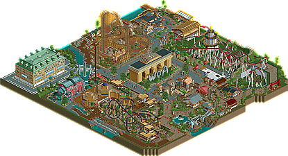
![park_2097 [NEDC] Schwarzwald - #2/9](https://www.nedesigns.com/uploads/parks/2097/aerialt1887.png)

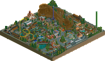
You have some real skill though and I look forward to seeing some more work from you, maybe a future Worlds of Amusement
There was so much to like but also so much that could have been better if the quality had followed through. The coasters in my opinion were fine, not great but looked well thought out. I guess what really turned my score down for it was the emptiness I felt in the larger structures and in several areas of the park itself.
Congratulations on your win Casimir (and SSSammy).
that being said, i think this park as a whole is beautiful.
nice work buddy:]
I was glad to see some of the staff were named however it could have been better. I also like how you worked the shadows from the letters and the coaster layouts were fun to watch, that said, there just wasn't enough to keep my interest (other then trying to follow the trolly underground
All that said, congrats on the Bronze and I look forward to seeing more from you in the future.
James
More work from the two of you together would be great to see!
Wicksteed Offline
I think if I'd be voting now i'd vote a little lower (bronze instead of silver). I feel that you have really brilliant (!) architectural ideas and you are able to execute them well but you don't really seem to have a concept how to put them together in a park. It looks like you just put one idea next to another.
I recommend using landscaping and foliage more to separate one area from another. Also if you give your park more space, as InCities said, you can better develop the theme, instead of having one themed coaster next to a differently themed one.
It is a shame though because for what is clearly a good amount of work he gets less points than a design, especially when diablo (while decent, but really small) gets more points it does seem a little unfair. but congats, checking it out now.
UPDATE: after checking it out I have to say there is really some quality work in there, but some parts are just really lacking. The entrance really is a gem, great work. But after that, it sort of falls apart. The beemer is pretty good, some nice pagodas and shit, but the big one was just too big, and it was too empty around it. The buildings around kane's entrance were confusing and sloppy too. in general every coaster station was way too small, enclosed, and blocky, and the coasters were too bare. You had a good thing going with the black mamba, but it felt like you built some nice buildings at one end and then gave up on it. the train station was beatiful, but it felt so out of place and it was confusing that the peeps would have to walk so far to get to a train used for park transportation.