Park / Piraña

46 Comments

  • Comment System%s's Photo
  • Dotrobot%s's Photo
    Ho-ho-ho-holy shit
  • pierrot%s's Photo
    Ahhhhhhhhhhhhhhhh yes! First non-coaster design?!

    Loving Atmospheric station, Surrounding foliage, and Path.
    I Really want to embark on Piraña.

    forgot to say this..
    Logo is fucking beautiful JK :drool:
  • Fizzix%s's Photo
    Wow, if it wasn't so friggin' late, I would download this tonight, but I'll have to get it in the morn. Looks incredible from the overview, I'll tell you what I think after download.
  • Louis!%s's Photo
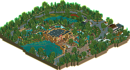
    I kinda had trouble scoring this, which is why I am probably the 2nd lowest vote. Mainly because I see designs as coaster submissions and felt this was more of a cut-off of a park, and would have done better being submitted as a park.

    I did think it was worthy of an acolade though, hence my 70% score, but yeah, had it been submitted as a park, I would have viewed it as a park, not as a design, which would have boosted my score quite a bit.

    Anyhoo, really nice work.
  • Cocoa%s's Photo
    that looks pretty awesome, I'm gonna download it now. You should check for capitol 'I's in the review though.
  • Sybren%s's Photo
    This ride is just perfect!
  • Goliath123%s's Photo
    Wo ho oh man this looks good for many different reasons, the new objects, the uniqueness of the it alll and the overallk theme, looking forward to checking this one out man.
  • Croustibapt%s's Photo
    Wow, once again, it blew my mind.
    Liampie is definitely a genius!
  • Levis%s's Photo
    I honestly didn't feel anything with it. not only because I feel a design should be a coaster. but it just didn't look right for me... don't know why exactly.
  • posix%s's Photo
    Levis, I am going to assume that your vote's reason was that you didn't like his intepretation of Efteling, and further that he claimed to have recreated it, which among you Dutchmen, from the outside, sometimes seems to be made a task too difficult that any human being would ever be worthy of it, because the park is all too dear and holy to you, so that whenever someone dares to take on it, he is punished for his presumptuousness immediately.

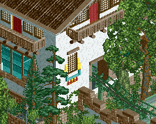
    As for the design, Liampie, I had to tell you my thoughts immediately on the prep page after voting, because I loved this with a passion. "Atmospheric" is a term used by many who replied above, and while it points to the great strength of your new works, I feel its vagueness does not do the magic behind it justice. Unfortunately, I am afraid I am not wordy enough to properly capture it, despite being equally struck by it. So let me just congratulate you for touching on a building style that has been resting in peace for a long long time, and that I hope you will continue to explore with your future projects.

    Finally, I am sorry this could not be released in 2010, as you had asked. It was just too beautiful of a release to not use it for the special occasion of New Year's day.
  • F0ndue%s's Photo
    WOW,this was really great.Your archy was flawless as always,and I also espicially enjoyed the view on the Bobbaan,for me as swiss.I`d really like to see it as spin-off,if that would be possible.And thanks for the diagonal path,it was that what I was looking for.Liampe you made me happy again with your great skills!
  • Timothy Cross%s's Photo
    Loved it from top to bottom. I don't mind that it's not a coaster. It was a very well done rapids ride. I'm going to spend quite some time in this design. Well done. :)
  • Levis%s's Photo

    Levis, I am going to assume that your vote's reason was that you didn't like his intepretation of Efteling, and further that he claimed to have recreated it, which among you Dutchmen, from the outside, sometimes seems to be made a task too difficult that any human being would ever be worthy of it, because the park is all too dear and holy to you, so that whenever someone dares to take on it, he is punished for his presumptuousness immediately.

    As for the design, Liampie, I had to tell you my thoughts immediately on the prep page after voting, because I loved this with a passion. "Atmospheric" is a term used by many who replied above, and while it points to the great strength of your new works, I feel its vagueness does not do the magic behind it justice. Unfortunately, I am afraid I am not wordy enough to properly capture it, despite being equally struck by it. So let me just congratulate you for touching on a building style that has been resting in peace for a long long time, and that I hope you will continue to explore with your future projects.

    Finally, I am sorry this could not be released in 2010, as you had asked. It was just too beautiful of a release to not use it for the special occasion of New Year's day.


    that not it. Recreating the efteling is really hard indeed. and when i opened the park it didn't feel to me like the efteling. which is not a bad thing cause recreating that atmosphere is really hard. The problem was that I didn't feel anything with it. Probally because I've been there a couple of times and liked the ride I will judge it somewhat heavier that some other. but it just felt liked it missed something, and thats what made me vote this low. The archytecture wasn't that bad but at some points lacked a little bit also imo (especially given how few there is).
    I think the reason why I voted this low is because the ride IRL gives me a certain feeling, and this recreation doesn't.
  • posix%s's Photo

    I think the reason why I voted this low is because the ride IRL gives me a certain feeling, and this recreation doesn't.

    Which I would understand as proving exactly my point?

    Could you elaborate what you missed about the architecture? Because it's interesting to me how someone could have this sort of perception, when Liampie in my eyes is easily the #1 at architecture in RCT2 these days.
  • zburns999%s's Photo
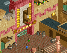
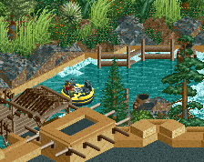
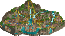
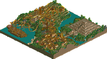
    Well, I guess I should start by saying that I don't really understand why this is a design. No coaster=no design. Just my opinion. However, this park really kicked some serious ass, so if an exception had to be made, I suppose this was the time to do it.Honestly, the actual rapids ride wasn't all too interesting (I'll let that slide, as I'm assuming this is some sort of semi-recreation?), but it looked fantastic. To me, rapids are one of the hardest rides to pull off well in the game, and you really nailed it. That last lift into the station with the rotating gears just looked so sick. You really pulled that off well. The rest of the park was filled with so many awesome ideas: the mustard bomb thing, the peeps queueing for food, the people watching the performer, etc. The best aspect of the whole map was undoubtedly the foliage, though. Don't think I've ever seen it look that good. It's like it was part of the theming, rather than filler. Awesome work man.
  • dmaxsba%s's Photo
    I really don't understand this thought that a design needs to be a coaster. If it is a tracked ride it must be designed and therefore any kind of ride that you have to build section by section should be concidered as a design. I don't care if it's a mini golf course, old fashion cars or those cool little helicopters. All should have an equal chance of winning design if they are built well and with amazing surroundings.

    Is it fast... no, exciting... no. It's what it is, a rapids ride. A very very good one with great attention to detail, functionality and surrounded by wonderful scenry. I hope with the success of Piraña more people give non coaster designs a try.

    Congratulations Liampie, this was a totally deserved win! :mantis:
  • Wanted%s's Photo
    Beautiful. Almost Emergo-esque. Congrats on the design.
  • pierrot%s's Photo

    I hope with the success of Piraña more people give non coaster designs a try.

    :mantis:
  • JDP%s's Photo
    ^no, this is bullshit. i get pissed when i see water coaster but this? is this really what the site is gonna come down to? anyone with good themeing and decent hacking skills can do something like this. either way pie, you did set a standard for future designs like this, and unless their foliage and architecture is as good as this then i wont even bother to look (no roller coasters? why look).

    nothing against you liampie, it did look fantastic overall. i personally think this should be a bronze rather then called a design though. and that bobsled looked way too good to not operate.
    -JDP