Park / Piku Playground
-
 04-January 11
- Views 10,306
- Downloads 1,608
- Fans 1
- Comments 34
-

-
 65.77%(required: 60%)
 Silver

Kumba 85% Maverix 85% Louis! 75% turbin3 75% 5dave 70% Liampie 70% Casimir 65% CedarPoint6 65% geewhzz 65% K0NG 60% posix 60% dmaxsba 55% Levis 55% Wicksteed 55% RCTNW 50% 65.77% -
1 fan
 Fans of this park
-
 Full-Size Map
-
 Download Park
1,608
-
 Objects
350
-
 Tags
Tags
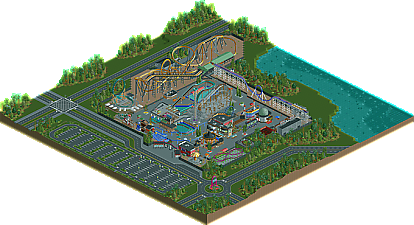
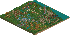

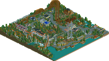
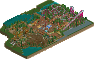
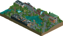
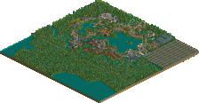
The park layout and ride selection was very realistic. The rides themselves also very well executed, just shame that the loop made you make the Intamin standup (possibly relocated?) larger than you wanted it to be; wish the game had an intermediate size. Nevertheless, the ride layout was scaled out properly and as a whole, the recreation was about as accurate as you can get in RCT. Clever ideas with the Arrow shuttle loop and the Schwartzkopf, although it would have been nice to see the Schwartzkopf stop in the station.
Really, apart from the underdeveloped surroundings, nothing in this park wasn't well thought out and well executed. As I mentioned before, you were able to achieve a high level of detail without compromising the type of park that it is. You've taken me back to some fun times I've had at boardwalk/lakeside parks and I think the ratings are a bit low from my perspective because not everybody grew up around this like I have. Personally this would be a shoe-in gold for me. It's the most well thought-out park I've seen in a while.
Prodigy, This is incredible......everything is exciting
My only problem is gloomy color, makes gloomy atmosphere as previously stated.
If you using more brilliant color in next park. It will be uber-incredible!
Get your next park bigger with a bit more content and you'll be hitting the higher votes in no time.
Colorado-Fan Offline
However, I only really have a problem with those things because this is supposed to be a fairground type park, if this kind of area was incorporated into a real park it would fit very nice. Take the architecture and custom rides for instance, both are excellent but I don't think they work in the fairground environment.
Don't get me wrong though, I really do enjoy this park, and this is a playing style that really appeals to me. This is an excellent silver.
To sum up: Great rides and architecture, but I though you could've executed the atmosphere and colors better.
(no geust
waht is the 8 coaster?? never seen it in real
The Intamin Stand-Up is the best recreation of the model I have seen in RCT as well. Loved the entrance sign as well.
Congrats Prodigy.
I disagree with you a lot on this. For one, color is there just as much as its real counterpart; I think it might not seem like it because of the path, which is showcased when looking at a park from a bird's-eye view. When you're actually at the park, you're not looking at the path as it's mostly obscured by people. The 'gloomy' atmosphere that you feel is probably because we've grown accustomed to seeing peeps in the park (whose shirts also add color to the park). I agree that I would have like to see this park with crowds of peeps though.
Some real-life examples:
http://www.rcdb.com/403.htm?p=25189
http://commondatasto...nal/2782366.jpg
http://www.rcdb.com/221.htm?p=3059
http://www.rcdb.com/475.htm?p=5531
This park is simple, but yet fails to broadcast the color of what this park should realy be. It looks a bit like a fairground, but the elements hidden in this park do not belong to a fairground. The coasters are awsome. layout is great. but still an average park. Good work, but you still could of put a bit more stuff, and color... 7/10
EDIT: forgive me.
holy crap, that was way more impressive than a park that size should be! I am actually not so surprised at the really high scores! the park oozed atmosphere (which is impressive for a realistic park) and every ride was really great, exactly what I would expect from a park like this, nothing out of place but everything just right to create a perfect, completely realistic park. My favorite bit was the entrance and that red building and the merry go round with the little eatery and stalls. Those were just beautiful, unrivalled as far as merry go rounds go too.
So yah, I totally underestimated you.
Anyone else thinking of pokemon now?
first replytime, I think:
Of course I'll start with some thanks, where I have to say a big big thanks to geewhzz and posix for releasing the park on their wonderfull website, also a big big thanks to 5dave for the logo which is 100% spot-on to the park and to BelgianGuy for the nice write-up. Also thanks to all the panelists who voted on that park. This time I have to say: Kumba I really love you, and Maverix, of course u2.
Then to the park:
- The point with the peeps: That's a big problem for me cause now it's the 2nd time (the 1st was Valium Skies), where I've made the whole park peepble but in the end when I wanted to let the peeps in, it didn't worked. In Valium Skies I didn't known the tram function and here I killed the invisible park entrance when I've built path from the parkinglots over it. I realised it just at the end, when the park was already at 100% and I felt so fucked up about it, cause I wanted to see peeps in it, too, and that so badly.
- The concept: It simply should be a urban-like low budget park with a few nice standard coasters and used fairground rides which have found a new home in this park. I think there never was a bigger concept than this behind this park. This time I wanted to put totally spot-on to the park and not to the surroundings like at Valium Skies. Here the surroundings should only build a frame for the park, cause I didn't wanted to black them out. That's why they are a bit underdeveloped.
- Why I've built that park: Cause I stucked on Violet Gardens and was close before quiting RCT2 and this park helped me to find new inspiration with an much easier concept than Violet Gardens. Violet Gardens turned to something like a never-ending project in my eyes, when I look back, and this park was viable to be finished in a few month. Now it's much easier for me to work on Violet Gardens, than any time before, so PPG was a total success for me.
- The name has nothing to do with pokemon, it's a song by the chemical brothers...
So thanks for all the comments (and hopefully the upcoming comments, too)!
Kind regards, prod (the only real tarsier here at NE)