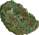
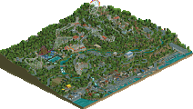
Park / North of the Border

32 Comments

  • Comment System%s's Photo
  • BelgianGuy%s's Photo
    I don't want to sound like a prick here but I really didn't see this as a bronze let alone a gold in some votes...
    I think my vote describes what I think about this, yeah the idea and landscape is cool but really?
  • Louis!%s's Photo
    Well I actually thought this was awesome. Sure some of the buildings weren't outstanding, but the atmosphere, the landscape, the ideas, the layouts, maybe not realistic, but everything was fantastic in my eyes.
    The banner certainly doesnt do the park justice.
  • JDP%s's Photo
    to all the new people who think they suck... this is what happens when you finish something
    -JDP
  • Wicksteed%s's Photo
    I loved it. This is a theme i've wanted to see for a long time. And you executed it very well, not technincally up to NE "standards" but with great atmosphere. What was so beautiful about it, was that you gave the landscaping so much space to breathe, I haven't seen that in a while cause people here tend to cut everything off the map that is not crammed with architecture or rides.
  • pierrot%s's Photo
    well done Echidna, Loving IceRink :lol:
  • Splitvision%s's Photo
    Looks cool from overview + screens, will check it out right away. Good write-up sam, one thing though... It's "The Eclectic Echidna", not "The Electric"... might wanna change that.
  • Harkonnen%s's Photo
    Looks very nice atmosphere and feels like"Original Park", especially A Lovely IceRink.
  • Liampie%s's Photo
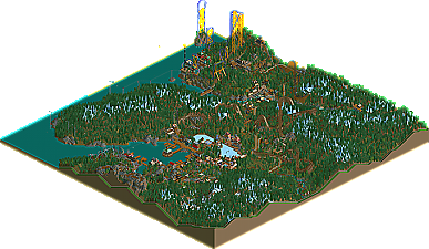
    JKay is not my favourite parkmaker, but when he uses 'muted colour schemes' he's pretty good. This park reminded me of that JKay! :mantis: Atmospheric architecture (especially in the village, also loved the grain stuff), beautiful serene colours and impressive landscaping. The big blue coaster was weird but I loved it, reminded me of Fright Nights by Phatage. Somehow the inverted coaster, which had an ugly layout, was pretty fun to watch too. Another thing I love about this park is how spacious it is. I would've liked this park much less if it was built on a 80x80 map for example. Where the fuck did you come from?

    Well done on this park! I have no idea who you are but I already like you.


    Great logo, by the way.
  • dmaxsba%s's Photo
    I shall have to download this again and see if I missed something that just about everyone else saw in this park to cause me to so far off from all the other scores.

    Either I messed up big time or you all are crazy... ;)
  • BelgianGuy%s's Photo
    Don't worry Dmax I thought I was being generous with 30...
  • tdub96%s's Photo
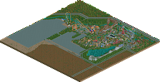
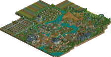
    I see both sides here. For the accolade, I thought the landscape was awesome, really reminded me of something you'd see in a scenario. The coasters were fun to watch, and the little town in the valley was cute. It was spacious and wasnt jam-packed to the brim with rides and buildings, giving it a serene feel. As for the non-accolade side, I see little arhitecture, unrealistic coasters, no peeps, etc. I see both sides, but I enjoyed it all the same. Congrats on the accolade.
  • Phatage%s's Photo
    I really liked this! The massive amount of space used while keeping the different sections of the park (like villages) separated by long distances, only connected by thin paths, really made this feel like frontier country. Aside from the obvious terrain similarities, this park is the first since Mala's Escalante River Falls that felt so tangible and lifelike even though the coasters weren't realistic. It really was one of the more delightful experiences I've had looking at RCT in a while.

    The coasters were fun too. The crossing diagonal lifts on the woodie were really cool in particular, but each ride was well crafted and very entertaining to watch. Well done!
  • robbie92%s's Photo
    Interesting... An echidna is in the same family as a platypus, and the screen name is similar to Butter's last screenname. Interesting coincidence.
  • Jaguar%s's Photo
    This park looks like something made in early 2004. I loved the atmosphere of this and I can't understand why someone would rate this low score. This park was both nostalgic and interesting, it has a good classic feel to it and if I were on the panel, I would vote silver.
  • J K%s's Photo
    Yeah I don't understand a 20% vote, thats just harsh imo. The time it takes to delve into a concept and hack those supports whilst creating a plausible atmosphere. It saddens me to think that the great spotlights of yesteryear would only garner golds now. The landscape was exciting and the park itself was very enjoyable, I don't know what the newer players saw fault with this?

    Solid Bronze in my opinion.
  • Liampie%s's Photo

    Interesting... An echidna is in the same family as a platypus, and the screen name is similar to Butter's last screenname. Interesting coincidence.


    Very interesting indeed. Persnickety and eclectic are slightly related too. I'm 75% sure this is not a coincidence...
  • Jaguar%s's Photo
    Well, RCT has mutated over the years and although it requires real skill to develop a good atmosphere, older parks do not stand a chance against all the detailing now. Imagine it as an army of knights fighting an army of tanks, as in the older parks would loose against any newer one. In fact, many of the spotlights might only get bronzes or silvers, if older parks would get the same score as many of the accolades now, it would take a lot less time to get a good accolade.
  • K0NG%s's Photo

    I shall have to download this again and see if I missed something that just about everyone else saw in this park to cause me to so far off from all the other scores.

    Either I messed up big time or you all are crazy... ;)

    I had the same feeling as dmaxbsa here...so I gave the park another look. Within 30-40 seconds I realized what had turned me off about this submission the first time around. I'd zoomed out and gone to the area which first caught my eye, "Storm". While lamenting the decision (and technique) of the custom supports (supports for a coaster are supposed to touch the ground at some point, right?), a message scrolled across the bottom...."Manicougan still hasn't been fixed...check where...." and I immediately noticed that, to my right, there was a backup of rapids boats that obviously hadn't been fixed either. As I looked around the immediate area, noticing that the architecture (the 'pole' objects in particular) left a lot to be desired, yet another message scrolled across informing me that "Axe" also hadn't been fixed. To me, part of a successful submission is paying attention to things like this. So, I undoubtedly spent less time scouring the rest of the park than I might have had these messages not occurred in rapid-fire succession. Giving it a more thorough look this time around, I'm not sure I would have voted much differently because of the lack of attention the builder paid to things like....well, operational rides and having mechanics placed where they could actually do their jobs.
    All that being said, I'm glad the creator received an accolade for his efforts as, as other have pointed out, the landscaping and spaciousness he created were fantastic and a refreshing departure from what we typically see with all of the packed creations the majority of us build nowadays. If he'd just taken the time to check simple things before he submitted this, I'm sure a number of votes (including my own)would have been higher and I'd really like to see another submission from him with these things being attended to.
  • dmaxsba%s's Photo
    ...of course below is my opinions and not meant to be rude or condescending in anyway towards you The Eclectic Echidna, any of the other judges or NE members comments about this park.

    Now that I have seen it again I have to say in my opinion the park was a mess. Broken benches and litter bins everywhere, bad coaster designs throughout the park. I remember opening this park and quickly finding path issues all over the place where guests were stuck all of which were easily fixed using hidden tunnels inside the many structures in the park. Yes I spent so much much time in the park that I fixed all the guest issues that were causing problems. This is something I do with just about every park I download. Please don't take the guest issue to harshly, this is a chronic problem with parks, something that even most Gold and Spotlight parks have. It is however something I judge very strictly. Park operations are a big part of how I judge a park. Many will argue that you can't blame the park maker for the guests bad AI. I strongly disagree. The guests AI issues are what make building a good park a challenge. It is completely possible to build large parks full of 1000's of guests and keep the park ratings high.

    The park also had some kind of glitch that would not allow Mechanics to stay in designated areas. After they were assigned a spot they would wonder off and never come back to the ride they were assigned to making it almost impossible to keep rides running smoothly.

    For the most part the structures in the park were very well done and placed very nicely but the structures could not save it from all the bad ride designs and path layout choices. I also failed to find the atmosphere that so many said they enjoyed. This is usually the kind of park I like best, simple old school-ish park building instead of the all to common sterile over hacked parks that dominate these days, but in this case it all just seemed sloppy and without direction. I do wish to congratulate you on your win and I look forward to your next submission. I hope it is this same style of park but without any of the issues that in my opinion plagued this park.