Park / Brachiosaurus
-
 25-December 10
-
 Brachiosaurus
- Views 9,921
- Downloads 1,595
- Fans 3
- Comments 25
-

-
 81.15%(required: 65%)
 Design

geewhzz 90% Liampie 90% prodigy 90% Wicksteed 90% CedarPoint6 85% Kumba 85% posix 80% RCTNW 80% robbie92 80% turbin3 80% BelgianGuy 75% Casimir 75% Louis! 75% K0NG 70% Levis 70% 81.15% -
3 fans
 Fans of this park
-
 Full-Size Map
-
 Download Park
1,595
-
 Objects
289
-
 Tags
Tags
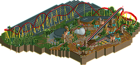
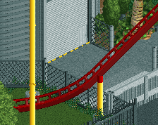
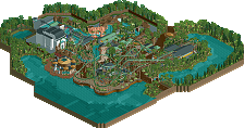
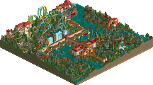
This is where things get weird though, because the actual course of the coaster borders/traverses the parking lot. With theming like what you've created, it's so hard to believe that a park would not theme the rest of the coaster or at least obscure the parking lot from view somehow. If anything, it would be cool to start out (have the ride's station) in a more carnival/cedar fair type park area and then venture into a heavily themed area for a kind of 'WTF!" experience, but the order of things in your design really baffles me.
FUCKING DUDE.
TBH You could have done without the MCBR, alot of smaller B&M's lately do without them (even if this was suppossed to be from 99"), It slowed it down way to much and made the ending very bland.
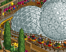
But my complaints end there, very easily. The lifthill details were awesome, something I feel like everyone will be using soon. The Architecture, Dino "eggs", trackitecture, even foliage, were all stunning, and pretty damn clever to.
Amizing design, really hope you bring more in 2011.
I loved this design. Your releases have become very rare, unfortunately. What it offers is summarised in pierrot's post eloquently. A new and just amazing way of using the monorail track. Fr3ak, was this really your idea or have you seen it somewhere else where it was used less dominantly?
._Austin55, I tried a lot of variations layout-wise and in the end I had the choice betweeen the one which's now in the design and a little bit different one without a MCBR in it - but operating with 2 trains.
I liked this one better and I love the fact that the coaster's capable of handling 3 trains at a time - that's why I went with that layout
even if the MCBR isn't perfect and slows the train down very much.
Plus I think the slowdown is okay, it just feels very heavy because the train travels trough that curve without picking up any speed.
._Fisch, thank you too! Good times back then
._Phatage, posix, Splitvision,
actually a lot of planning went into this but with a different idea in the beginning so that might be the reason why it seems a little odd now.
I'll try to explain:
This thing first started as a park about a year ago. As Phatage already realized the area is heavily inspired by Island of Adventures
(see those pics for references: http://coastersandmo...ture/ioa09g.jpg ; http://coastersandmo...ture/ioa16g.jpg) and I'm very happy that I achieved that feel and atmosphere with it!
The setting of the coaster explains itself through the fact that this started as a park.
The idea behind it was, that this would be at the border of the park's land so they had to put the layout above the parking lot
(what Europapark did with Silverstar: http://coastersandmo...ar/sista38g.jpg).
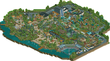
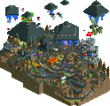
After some time I realized that I wouldn't ever finish the park so I split it up into 3 designs. Brachiosaurus is one of them.
So please regard that design as a part of a larger park.
(I tried to give that impression as well with the cut off monorail, path and fences.)
About the venture from an unthemed station into the theming:
I think when the coaster travels slow (lift hill + breaks) the riders will have a lot more time to look all around them and concentrate on all the theming they'll see but later on as the coaster picks up speed the riders will be more focused on the ride itself than on it's surroundings. In my opinion it's a better choice for the park to theme these parts where everybody can focus on and leave the parts in which the riders will be very focused on the ride itself unthemed.
Thanks again!
._posix, as someone a few weeks back mentioned geewhzz used the monorail track to give the parking garage in Lenox Mall round parts but when I used the monorail here I haven't thought of that.
I searched for a easy, good-looking way to create the back of those halls (and it doesn't uses as much object space as another solution would)
._Splitvision, I wanted to achieve the detailed look and feel without using to much color and I think it might feel a lot more unorganized and less "sorted" with more than these colors and a lot of accent colors.
Thank you too!
Thanks for the votes as well as for the great write-up Sammy!
My dislike of the layout really isn't saying anything though. I have only liked one B&M hyper on rct and that was an EPIC creation of Fatha'.
Looking forward to all your next projects. Maybe a little christmas-teaser of the black B&M inverter?
Merry Christmas and congrats on the design,
Yannik
The layout was pretty good, and the details on it were spectacular.