Park / Hyatt's Ocean Adventures
-
 13-December 10
- Views 14,739
- Downloads 2,680
- Fans 8
- Comments 35
-

-
 81.54%(required: 70%)
 Gold
Gold

Casimir 95% yes BelgianGuy 90% yes Louis! 90% yes 5dave 85% yes Kumba 85% yes prodigy 85% no robbie92 85% yes geewhzz 80% yes Liampie 80% no Maverix 80% yes SSSammy 80% yes turbin3 80% no Levis 70% no posix 70% no RMM 65% no 81.54% 60.00% -
8 fans
 Fans of this park
-
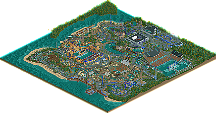
 Full-Size Map
-
 Download Park
2,680
-
 Objects
466
-
 Tags
Tags
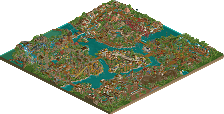
![park_4103 [H2H8 R3] E.V.I.L.](https://www.nedesigns.com/uploads/parks/4103/aerialt3847.png)
but for theme of all in the is the same thing like buildings, and coaster layout.
some people say this same thing about my parks expecially marvel, for using the block used for all or most of all theming.
RMM Offline
i figured i would've been the low score on this one and i stand by it. the park as a whole didn't come together for me. a spotlight captures a thick atmosphere and there's none of that here. why it's good from the technical standpoint, as posix said, it's very bland. the structures are lifeless and repetitive in their own areas. they almost seem like they are space fillers and lifeless. and while the coasters overall were well done, i felt that the flyer and the woodie were quite weak compared to the others, as well as their areas.
my main problems were the fences. yes, the fences. i think the fact that everything, literally everything, is fenced in really leads to the 'sterile' feeling. the park is beyond 'too clean' and that really kills the atmosphere for me. i tried to grasp some feeling, some emotion, some deep atmosphere that would bring the park together as a whole, but to no success. the fact that i have to try and grasp a feeling is what makes it a no on the spotlight vote.
now don't get me wrong, the park is far from bad. it's actually very good overall but i can't get over the 'too clean' feeling and that for me, is what separates a spotlights from all the rest.
G
tdub96 Offline
Wanted - Thanks. Orca is one of my favorites also
Fizzix - I look forward to hearing your thoughts on the park\
Miracle - Thanks
Cocoa - Point taken and I agree regarding the buildings. Part of it was the object selection process I used back then (Jan 2009). As for the Pirate area, we will have to agree to disagree as I really like that are the best in the park and happy with the end result. That said, I appreciate the feedback. Thanks
Pierrot - Thanks
Maverick - This just proves something I have known my entire RCT career in that my style is very hit or miss and the spotlight vote I think proves that point. Glad you liked it.
Turbin3 - I'm hoping NWA will not suffer room this same lack of detail however with these maps being 200x200, it's a fine balance between details and running out of objects considering I can black out tiles with this project.
Liampie - I Agree
JDP - You should have seen it before I shrunk two of them down! Thanks
Levis - Thanks again for trying to make it work.
posix - Thanks for the feedback and I really value your feedback on so many levels. I believe NWA is a step in the right direction while still staying true to my style which is very important to me. I think part of the problem is that since MWA was released, I started a couple of parks for Marriott (Universal Studios and NE2) that were not completed that did not have the stadiums. The the first park to be completed after MMW was HOA which is similar in concept to MMW. I can assure you though that NWA will not have a show stadium (perhaps a small IMAX) and Hyatt's American Adventures will not have any either.
robbie - Thanks as always for your feedback during construction. It really means a lot to me and with your help, NWA should be even better. Thanks
That Guy - I completely agree! Look forward to hearing your thoughts on the park.
djbrcace1234 - Thanks. I liked the area very much also
J K - Thanks. I fully understand the "no" votes and I hope NWA will make a difference next time.
Comet - Thanks and I'm glad you liked the park. and Yes, I hope to do a large area soon with the maps that have been released so far.
nin - Thanks and I understand. I think you'll like NWA more.
BelgianGuy - LOL - No worries. I respect the panels decision.
hulkpower25 - Thanks. I'm trying to make some tweaks to my style as we speak!
RMM - There is a very fine line between sloppy and "too clean" and I have a real hard time getting close to that line. As for the fences, I fully agree and I should have gone back and removed some however I didn't. as for the coaster, I actually liked the flyer the best and would love to ride it over and over. All that said, I appreciate the feedback and respect what you had to say. Thanks
RCTFAN - Thanks. I had a lot of fun building it. Releasing it is an added bonus!
Dotrobot - Thanks.
tdub96 - Thanks for the kind words and I'm glad you liked the park
Comet - I also agree that the park is lacking in a high capacity eatery and have made sure that is not an issue in NWA. Glad you liked the park. Thanks
As I stated in the read me file, this park would not even be the park it is without the coasters by CP6. I had an absolute blast working with Brian and it has continued to NWA as we already have three coasters in place with a fourth coming soon. One think I would like to correct though is the logo was created by HPG way back when and I want to make sure credit is given where credit is due. I do thank Louis for converting to PNG though.
Lastly, I want to thank all of you that have kept me motivated to finish this park and to keep building in RCT. This motivation comes in many forms from looking at other parks, to feedback and having a place like NE4 to showcase our work.
Thanks
James
Congrats on the park man, can't wait to see HNWA!!!
Again thanks for the write-up!
James
I like the stadium and excellent coasters very much ^^
As for these coasters:
- The floorless is taken from a Hydra inspired layout and was originally intended for another RCTNW park before finding its way over here. Like Hydra, I wanted to do a viable coaster layout without a loop. I really like what James was able to do with the path interaction on this one-- I think it looks great.
- Seahawk is Manta inspired with a little more drawn out of elements than on the real thing. I really enjoyed doing this coaster although I really wish there was a way to do a tighter pretzel loop as I feel the amount it needs to be stretched detracts from the look. But no matter-- I like the way that's partially buried. I think my favorite part was the roll above the station-- which I kind of envisioned as a giant corkscrew. I think that'd be lots of fun in real life.
- The wooden coaster is inspired by Renegade at Valleyfair with the twisitng drop and combining a sort of out and back idea with some twister. It was a little tough to still toss the station flyby in there, but it worked out to be not *too* awkward. The original location over by the entrance had the coaster following terrain much more closely, but I like what James did with the space underneath.
- Orca seems to be the one that everybody enjoys the most, and I suppose I'd probably have to agree. It was also the last one I did for the park and one that took a long while to get looking pretty ok. As is pretty easy to guess, it has a lot of I305 and Megalite in it with the first turn after the drop (sorry maintenance guys) and a blend of airtime and curves. It might be a little long, but I'm pretty pleased with how the speed is kept up and how the ride changes directions. Unfortunately my hacking didn't work out to get it doing block sections and all of that, but it's ok as James worked out the timings to run really smoothly. I do enjoy the white and black scheme even if it's a little non traditional-- that was a nice touch.
Overall I had a great time putting these coasters together and I thank James for the opportunity and for making them all look great. It's sad not to see a spotlight, but I'm sure NWA will take it!
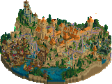
The pirate area is my favorite here, very nicely done.
Actually it wasn't an immediate no-vote from me; I expected Gold but hoped for Spotlight, so I opened the savegame with an open mind. In the end it fulfilled the expectations but didn't surpass them. This is why:
Pros:
+ The coasters were fantastic, especially the wooden coaster looked beautiful and the B&M sitdown had great interactions.
+ Composition. The park layout was great with a nice flow and lots of interactions like I mentioned above. The diagonals everywhere worked well too.
+ Peeps! They added a lot to the atmosphere. Marriott's feels dead, Hyatt's lives. Do not underestimate how valueable peeps are!
+ Size. I like big and consistent parks.
Cons:
- I wasn't a fan of the architecture; the textures and colours rarely worked well and I still don't understand why everything has to be blue. However it's a step up from Marriott's; there's more variation and the buildings look like actual buildings now!
- Foliage. Same story as the architecture. Improved, but not great. I think it will make your work a lot better if you use foliage as feature rather than filler which it mostly was here, in my experience.
- Stadiums. They were well made I guess, but they're so fucking big that they only look good when zoomed out.
- Details. Again an improvement over past work, but some areas were really void of any cool details. To me, 'little things' are what keep me interested; they are the rewardings for carefully exploring the park. It's especially important if the architecture is monotone.
I'm sorry if I sound negative. Despite these quite big flaws, the park worked really well as a whole and therefore I voted a 80%. Again, congratulations!
Hyatt's Ocean Adventures is one of the most memorable parks of the year and your best park yet. Judging from the screens, your next park is going to be even better! Work on the foliage and architecture and you will get that Spotlight!
Good job on this and good luck on your future projects!
Cp6 - It's funny how the different opinions on coaster go. I remember you and I talking about which were our fav in the park and we both agreed that Seahawk was #1 on our list however it seems Orca is the crowd favorite. I do admit though that Orca is indeed a great coaster. As I have said many times, thanks for the great layouts
Guy Smiley - Thanks buddy!
Liampie - Thanks for the great feedback and by no means did I take it as negative. I fully agree with all your points and I am trying to incorporate these changes while still trying to stay true to my style. NWA has a much better object selection base with room to grow in the "?" tab. That was the biggest problem with HOA is that I could not add any more objects as I didn't have a tab I could put them in. NWA will allow me to get those extra "little" things that we all like to see. Again thanks!
Thanks everyone
James