Park / Blackbeards Revenge
-
 07-December 10
- Views 2,443
- Downloads 638
- Fans 0
- Comments 11
-
 55.00%(required: 65%)
 Design Submission

dmaxsba 70% prodigy 70% K0NG 65% Louis! 65% Maverix 65% RCTNW 65% Levis 60% turbin3 60% BelgianGuy 55% Liampie 50% nin 45% Wicksteed 45% 5dave 40% posix 30% RMM 20% 55.00% -
 No fans of this park
-
 Download Park
638
-
 Objects
213
-
 Tags
Tags
![park_3803 [NEDC4 11/15] Colonial Dreams](https://www.nedesigns.com/uploads/parks/3803/aerialt3440.png)
Dont call me offensive, but who rated this 20%??
We´ll work on the foliage and as we said in the comment: There will come more from our side this/next year (with a better foliage:D )...
Thanks at the voters too. Would be nice if someone of you can tell us how/where to improve. IMO it´s much bigger than my last releases (that was one of the big critism there).
Mit freundlichen Grüßen
MCI
I liked the entry for some parts.
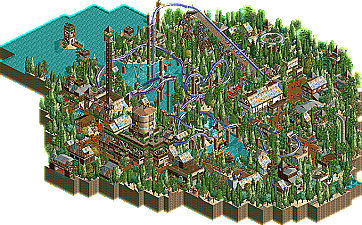
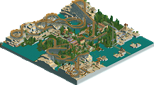
As said before the foilage could use some work. also I didn't like the first part of the lay-out of the coaster that much. The theming was quite nice but sometimes it didn't feel as a whole thing. something things just didn't fit or looked out of place. for example the "round" tower just seems to be placed random. Also the coloring lacked something. The colors where al nicely chosen but there wasn't a highlight. and imo such a park needs something to draw your eyes to. so next time try to use a highlight color in your architecture at some points to get the attention.
Also a point which I personally felt a bit weak was where the water meets the land. when I think of pirates I think of beaches. and here there wasn't any. I think one or two beaches and maybe a creek and some rocks would have helped to get the atmosphere better. Also that could give some more interaction with the surrounds and the coaster. cause now there wasn't that much interaction, and I like it when a coaster interacts with the surroundings.
What?
don't get down, its really some nice work, and if you time-travelled back to the early days of rct2 and submitted it you would have got design
@cocoa: While building this I looked three or four times into your "curse" and thought: This got 68% so were able to get this too. This was the only reason we released it here! Our first mind was to release it on our "homebase" www.rct-world.com to get the guys up there more active. That maybe could have been the better decision but now it´s to late to do it the other way^^ Thanks to you too!
My only complaint besides the banked turn is you used a non-working train track instead of a trolley. I think you missed an opportunity to add even more action to your design with that decision. In this case a single station trolley hack would have been great.
I also really like how (in my eyes) the area was so full. Everywhere I looked it was a feast for the eyes. Great use of NCS all over the place. The place had a charm about that I haven't seen in quite some time.
I know you didn't win but congratulations anyway. I really enjoyed this entry.
It was really important for me to do the track without hacking. I thought about a station hack, but in the End I kicked that out. The "alternative pretzel" was one of the mainreasons we choose this Layout. On the Turn you´re absolutly right, just not enough speed there.
So thank you for your comment/your vote.