Park / Six Feet Under
-
 30-November 10
- Views 1,628
- Downloads 552
- Fans 0
- Comments 7
-
 26.92%(required: 65%)
 Design Submission

Kumba 45% John 40% RCTNW 40% SSSammy 40% BelgianGuy 35% Louis! 30% prodigy 30% 5dave 20% CedarPoint6 20% Liampie 20% nin 20% posix 20% Wicksteed 20% Maverix 15% turbin3 15% 26.92% -
 No fans of this park
-
 Download Park
552
-
 Objects
65
-
 Tags
Tags
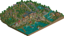
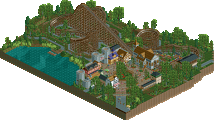
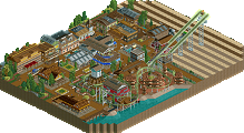
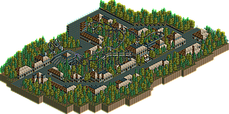
The foliage is just 2 types of trees. Add 2 or 3 more. And add shrubs and grass. Amount of shrubs and grass > amount of trees.
The buildings are too repetetive. All same colors, textures, details. Try to give each building its own idenity, while not making it a stand out eyesore in the park.
All these suggestions are easy to fix.
And try to make the park peepable next time. It really helps with the atmosphere of a park
Wicksteed Offline
The theme wasn't bad, it just got very repetetive.
Keep going, listen to what Dotrobot said, and you'll get there.