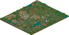
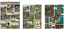
Park / Cheetaka

20 Comments

  • Comment System%s's Photo
  • tdub96%s's Photo
    Nice, NE live! Ill be back later after i open it. Congrats mav!

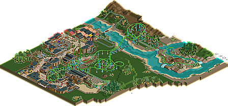
    Superb. Every sense of the word, this was great. Although the layout wasnt a copy of Cheetah Hunt, I believe thats what you were going for (not a copy), it was well paced and executed fantastically. I loved the tight surns and graceful swoops on the outskirts of the design. Just an all-around great layout for an Intamin accelerator.

    The foliage was good everywhere cept around the station where it looked like rushed, filler jungle foliage. Coulda been better there, but not a big deal.

    Archy was sweet, atmosphere was great too.

    Excellent design, mav. I woulda given it an 85, as it was hard to spot anything wrong with this. Congrats on another accolade! :)
  • Goliath123%s's Photo
    I hate the foliage
    Everything else is good
  • Cocoa%s's Photo
    so, the layout was really good.

    but I still felt the architecture was way too monotonous. the landscaping and foliage were dreadful too, and all that green grass was just ugly. I also felt you extended the map well beyond where you should have- it was just way too big and empty for its own good.

    the actual detailing stuff was ok, though, but try and look at actual parks and buildings I guess?
  • Xsquad67%s's Photo
    Hey man good ass job on this bro i give you all the props but when my next park central heights comes out ill give you a run for your money lol.
  • BelgianGuy%s's Photo
    I also thought some stuff ooked a little samey, but look at a real park and you'll see an entire area mostly looking in a certain style so I didn't mind it as much.

    I'd just like to say congrats and you seem to be on a roll
  • That Guy%s's Photo
    Cocoa said it. The huge blank grass and dirt expanse seemed quite lazy wether it was intended or not, much like Boomtown. The foliage was definitely not my favorite, nor the architecture.

    The layout was really cool, I especially liked the section after the brake run. But the layout in general LOOKED great too.

    It was a good coaster, but the surroundings were disappointing, I really hope you can develop those skills because that's really all you need.
  • prodigy%s's Photo
    Oh, looks like this time I'm the asshole who gave the lowest vote. Sorry, but I've looked close to it and I'm still standing to my vote.
    What I defenitely like is the layout, the supporting and the landscaping.
    What I don't like is the theming, the foliage and the atmosphere.
    The marketplace and the frisbee are very nice, but most of the houses are too simple in the cladding or structure, or you've used very strange objects for the claddings at some houses imo.
    But as I see, the others like it very much and so it must have something very special that I couldn't see, just I.
    So congrats to this design, you're definitely talented!

    Kind regards, prod
  • Kumba%s's Photo
    Looks like I was the high vote :p

    Loved it. Hell of a ride with just the right themeing. Not the most detailed or creative design, just for me everything really worked well.

    Great work!
  • posix%s's Photo
    What I found so special about this was that he managed to create a new specific type of aesthetic I haven't felt in quite the same way in recent creations. Maverix, if you build on this, I'm rather excited to see new stuff from you.
  • J K%s's Photo
    Yeah I was looking at your page and you're improving rapidly (a lot like Belgian Guy). I can't wait to check this out.
  • Dotrobot%s's Photo
    I'm sorry. I loved the foliage around the station. But i hated with a passion the foliage surrounding the coaster. It was just not my type of foliage. But other than that. I can't seem to see all these problems that people are having. The rest of the design just distracts from that. Maybe it's just me. Which it probably is.
  • pierrot%s's Photo
    This is one of My FAVORITE design EVER :nod:

    Really impressive and love that 'whole' coloring

    congrats Maverix :lol:
  • Fizzix%s's Photo
    Congrats on the win, Maverix!

    I really love how this was put together, the layout, colors, etc. Speaking of, the layout was so much fun to watch. A very well done layout, and I loved the custom magnetic brakes. Congrats again, and let's hope these small screens from Fiesta and the Dump turn out just as well!! :mantis:
  • BelgianGuy%s's Photo
    Also 5Dave that logo is just SOOOOOO cool...
  • Croustibapt%s's Photo
    I enjoyed it A LOT!

    Congrats on the win, it's very beautiful and amazing! ;)
  • GigaG%s's Photo
    I don't usually see quality Intamin loopers here, so I am glad this is happening, along with the other intamins I've seen recently (Mysterium Adventures, Boomtown). Although half the layout is over blank grass, the rest of the park makes up big-time.
  • Splitvision%s's Photo
    My opinion is similar to the majority of those expressed here. The layout was really, really nice, interesting, unique and above all had a nice flow. I'm not as impressed by the architecture and surroundings. My biggest issue was that somehow, there appeared to be too much roofing. I believe this was due to the fact that nearly all roofs were black, which made them stand out and appear more massive. This in turn made much of the spaces feel quite cramped and boxed-in, which sometimes can be good if you also manage to make it feel cozy and atmopheric, but I felt this lacked that. There were a few really nice facades and details that stood out from the rest, but overall I feel this is what you need to improve. As for the landscaping, I found it quite interesting since it was so different, with the large, open spaces dotted with dense tropical trees and shrubbery, along with the river/delta system which felt sufficiently convincing. But as others have said, the open spaces were a bit too much and made it feel a bit unfinished which subtracted from the overall atmosphere. So, all in all, very good layout, work on your atmosphere and ideas and you'll be among the top players here.
  • Dotrobot%s's Photo
    just noticed you have your name 2 times mentioned on the banner. That's a nice accomplishment.

    I need another full sized scale park from you. i crave your work.
  • highroll3r%s's Photo
    congrats on the design but i see no supports on the top hat like bit in the first screen. :(