Park / Evergreen Park

Park_1732 Evergreen Park

8 Comments

  • Comment System%s's Photo
  • Coupon%s's Photo
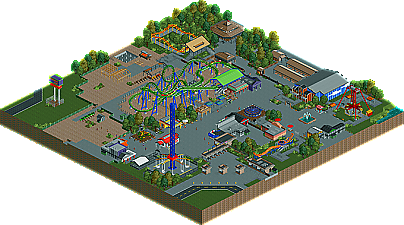
    I cant believe this got more then my other park :o This was really fun to build, maybe my next park will win :) Im still shocked from the score :X
  • geewhzz%s's Photo
    this was nice....it's clear your style and skills are coming together more and more nowadays
  • prodigy%s's Photo
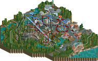
    I really like this park and I thought it deserves bronze. It's clear to see that you have skill and you're still getting better, so I think your next park will be a certain win. I love your clean and realistic building style and am looking foreward for your next project.

    prod
  • Coupon%s's Photo
    Thanks prod, those words make me happy. :)
  • Dotrobot%s's Photo
    This park was really nice when I looked at it Coupon. I loved everything!

    Making this park bigger with just a well done parking lot or out of the park filler. Or just by expanding a park just a little bit. I truly believe this would've got bronze. I'm not surprised that this got a higher score. This was very very enjoyable to look at.
  • djbrcace1234%s's Photo
    The reason it got a better score was it showed more refinement, but, I still feel your buildings somewhat are in the semi transition stage because I still see the reminisince of your old style in there too. I wish I got my feedback in sooner before you sent it because I had a feeling this one was not going to make it.

    My problem with the park was not the size, but what was there. Your buildings I'm afriad put this aside because they were so...basic in my mind. Yeah, they do the job and all as filler and provide the needs of the guest, but it just felt too small for actual food service buildings.

    I mean it is an improvement, but I feel the one thing you need to work on is the overall composure of what you build because like I said, your scale seems off to me.

    In my mind, Work on a bigger project because I think that will get you over the hump.
  • Maverix%s's Photo
    For some reason, I really really liked this. There was something about the simplicity of it that I thought brought the whole park together really well. The only thing I didn't like was how dull the what I assumed was the kids area was. Other than that I thought it was very well done. Good job man.
  • BelgianGuy%s's Photo
    to explain my vote I'll simply say the size and how it was used, first there isn't really much there to look at, I know you have some cool buildings and your style is improving but of the small map you had more than half of it was path or filler foliage, the coaster wasn't wowing to me aswell and the buildings although pretty good are lacking imo, I think this could've worked on a bigger map with more ideas and more content to look at and you'll have a winner...