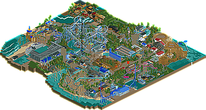
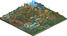
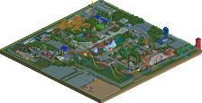
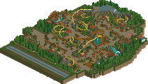
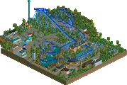
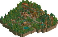
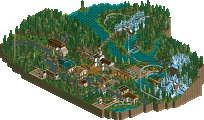
Park / Seaworld Adventure Bay

17 Comments

  • Comment System%s's Photo
  • Cocoa%s's Photo
    nice little park you got there! There were definitely some nice elements, but it did feel a little unfinished around the edges, eg the empty spaces under JtA and around the park in general. I felt the foliage and architecture could have been a little more "tropical" but whatever. Good work!
  • Dotrobot%s's Photo
    Sick banner. That is awesome
  • Austin55%s's Photo
    Dude, this is pretty bad compared to what your doing now. There were some pretty nice parts, especcially the prtzel on the flyer. It's pretty cool to see a fantasy based seaworld though, it reminded me of San Adreas Seaworld.
  • BelgianGuy%s's Photo
    haha thanks I guess^^. I'll try to wow you a little more with me next prject though, the reason this park is bad compared to what I build now is that except for Spout! and a few little touch-ups everything in this park dates back to february - april...

    and to answer to the write-up this isn't the last you've seen from me by far^^
  • dmaxsba%s's Photo
    This park may not be up to BG's current building abilities but it sure is one fun and interesting park to look around in. I enjoyed spending time looking for all the little things all over the park. The amazing back drop for Starsky & Hutch sea lion show is a perfect example of the details that you just have to love in this park. Thanks for taking an old idea that was left to die and not only finishing it off but doing so beautifully. Also thank you for giving me the privilege to preview this. Congratulations on your newest win and hope your next one brings in the Gold for you!
  • Chillsons%s's Photo
    Call me crazy, but this is one of my favourite parks ever. REALLY Good job. :D
  • djbrcace1234%s's Photo
    If you used 8 cars to actually open the park, I think it would have been a lot better just to help out with the overall atmosphere. The one thing I did not like was how compact the park was, but for what is there, I think it is very well done. Sure, it may not be up to your new standards now, but it shows your potential to be one hell of a park maker.

    I give you my sincere congrats on this park, for I enjoyed the park very much.
  • In:Cities%s's Photo
    i would have loved to see some more exhibits and custom animals and such.
    but otherwise, it was a very nice park. a little small, but nice.
  • pierrot%s's Photo
    :drool:
    'water dragon' is fantastic!
  • highroll3r%s's Photo
    the floorless and flyer look fantastic but nothing els seems to grab my eye. lt looks a bit bare in areas and the architecture is nothing special. one again i must say i like the look of the floorless and flyer but im not going to download this park because of those. congrats on the silver. hope to see your true rct colours in your next project.
  • Kumba%s's Photo
    Nice monster wings :mantis:

    The park is pretty damn good too :)
  • Dotrobot%s's Photo
    So I downloaded the park yesterday. I enjoyed it alot. Although journey to atlantis could've done with some more theming. And peeps would help this park DRASTICALLY. Some of the archy was brilliant especially the white building sitting below the flyer. While some archy let me down a lot.

    But overall it was very nice and enjoyable..
  • BelgianGuy%s's Photo
    I think Dmax made this park peepable after I gave him the park when I submitted, maybe this could be posted and let people see how this would've looked with peeps...
  • dmaxsba%s's Photo
    Sorry BG I thought you were going to post it, my bad. :(
    If you want to see this park with about 2000 happy guests in it click HERE.
  • rK_%s's Photo
    the pretzel loop on the flyer is a work of art, quite beautiful. the water dragon over the woodie was also well done with very nice detail. Overall it seemed a little simple and alot of bare areas that could have used even some sparse foliage. I enjoyed it though, i think a little more detail in your areas wont hurt anything, really enjoyed your style throughout.
  • Fizzix%s's Photo
    Nice park! I agree with rK that it needs more foliage, but the layouts were flawless, especially the flyer. That's definitely a strong spot in your building. Nice original ideas that fit in their environment well. Great job!
  • BelgianGuy%s's Photo
    Reply time:

    @Cocoa, thanks and I can imagine people thinking it was a little unfinished around the edges. Also about the tropical archy I didn't want to do this because I wanted a more generic, coaster based park that realy was about the layouts and theming of the rides themselves.

    @Dotrobot, thank geewhzz for the crazy cool banner, and I agree it looks awesome^^

    @Dmaxsba, thanks and I can imagine you followed this from the start and even in the stages it was with Dbru over at TPR, I know the park isn't up to my current standards but Imagine I started this park about 10-11months ago so it makes sense that not everything is as good as I can build now. I'm glad you enjoyed this and thanks for posting your peepable version of the park.

    @Chillsons, thanks but take a look at a few spotlights and this will look like shit I'm sure...

    @DJ, look at Dmaxsba his version he posted and you'll see how the park looks when there are 2000 happy guests in the park...

    @In:Cities, like I've said before I didn't want this to be typical Seaworld in the sense of the exhibits but really a marine themed park that focussed on the coasters, and also thanks for liking what's there

    @Pierrot, thanks and its one my favourite parts of the park so yeah I love that and the whale wall of Spout!.

    @highroller, how can you know the flyer and floorless are good coasters when you haven't viewed them in-game? The pacing could be horrible for instance, I still suggest you look at the park in-game and even the one with the peeps because in my opinion the park has a good vibe and you might want to check that out...

    @Kumba, yeah I figured you would recognise them^^. you can claim ownership. and thanks for liking the park, when its comming from you that really means something...

    @Dotrobot, if you're missing the peeps, check it out with them it does make a difference and thanks.

    @Dmaxsba, no problem and thank you for making the effort to make this peepable.

    @rK_, thanks and I'm glad you enjoyed the park and the pretzel loop, that one took a few head scratches

    @Fizzix, thanks

    Also I'd like to inform everyone that I'm working on some new stuff recently that i think will wow you guys for sure...

    BelgianGuy