Park / Isole Calabria
-
 22-July 05
- Views 18,270
- Downloads 4,114
- Fans 8
- Comments 111
-

-
 90.63%(required: none)
 Spotlight

Jonny93 95% no Poke 95% no robbie92 95% no Cocoa 90% no csw 90% no inthemanual 90% no MCI 90% no Xeccah 90% no Liampie 85% no ][ntamin22 80% no 90.63% 0.00% -
8 fans
 Fans of this park
-
 Full-Size Map
-
 Download Park
4,114
-
 Objects
392
-
 Tags
Tags
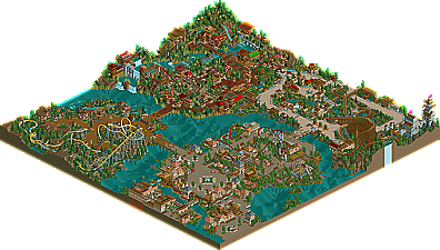
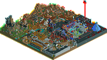
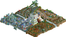
![park_3230 [MM2014 Final] The Time Traveler](https://www.nedesigns.com/uploads/parks/3230/aerialt2951.png)
Take skateboarding/snowboarding;
Some people ride 'normal', some people ride 'goofy'.
At the end of the day though, they both do the same tricks.
I dont believe more effort instantly means better. Im actually more a fan of spontaneous improvisation. Most of my work is like that.
I like the park however it somehow seems inaccessible to me. The Japanese (not chinese) area is certainly excellent and Steve's contribution didn't hurt the flow of the park nearly as much as some people here are crying. The only coaster I didn't really like was the woodie due to the overabondence (sp?) of brakes towards the end of the course. The enterence area was rather nice too, some of the buildings there are highly interesting and enjoyible.
As a whole I found a few defects around the park; lack of food/drink stalls in "resturants" seemed to be an issue and 3 of the coasters had some amusing layout issues. Steve's B&M was my favorite ride in the park yet it's MCBR isn't higher then the ending turn, meaning if it ever did emergency stop there it would stall on the rest of the course. The Arrow-corkscrew type coaster in the enterence area had interlocking corkscrews, if you're not worried about realism that's fine but Arrow and Vecoma (the two companies that build that type of ride) both use double corkscrews. I already mentioned the brakes so that covers that.
Basically I enjoyed the park due to it's high quality and large amount of thought and effort layed into it, yet I see a park that stylistically is becoming to average. Maybe we've finally discovered the "NE style" for rct2? None the less I still love the Japanese area because it just has that magic something, and it's different than everything else, both in this park and in any other.
ride6
Metro
PBJ Offline
i have seen the park and this is the second best you have shown to me...
Bijou Magique is beter IMO.. but this comes very close behind it.
the idea for the shops as roofs worked well. i loved the Japan area of the park. the roofs makes it great to look at.
yhe coasters where great. loved the woody. nice layout. also the water coaster was great...
hope to see more of your work..
-PBJ
Rhynos Offline
[font="Impact"]JUST FUCKING KIDDING!![/font]
Altough, the names come up this time, which it didn't before.
-X-
Rhynos Offline
I'm remembering how much I loved this park when i first downloaded it in 2012. For the typical "make every single building the same style in a themed area" approach of that time, this feels so much better and inspired. Literally one look of the entrance proves this to me. Though some things in this park lack especially with the standards of today (e.g. the wooden layout), it's still extremely enjoyable and up there with RoB as far as influencing the way we play the game today.
can we please get this completely voted on? turtle deserves more than just stock parkmaker