Park / Isole Calabria
-
 22-July 05
- Views 18,276
- Downloads 4,114
- Fans 8
- Comments 111
-

-
 90.63%(required: none)
 Spotlight

Jonny93 95% no Poke 95% no robbie92 95% no Cocoa 90% no csw 90% no inthemanual 90% no MCI 90% no Xeccah 90% no Liampie 85% no ][ntamin22 80% no 90.63% 0.00% -
8 fans
 Fans of this park
-
 Full-Size Map
-
 Download Park
4,114
-
 Objects
392
-
 Tags
Tags
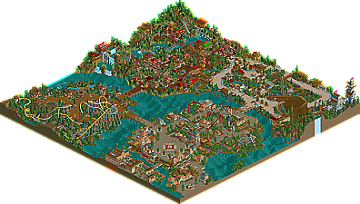
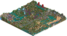
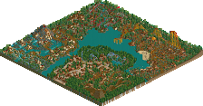
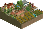
but fucking hell: That Chinese Area is
The shops as roofing is such a great idea man. Ill comment more later.
Fatha' Offline
= China/Japanese/Asian Area =
Stunning theming here, and interesting use of the coaster track. I would have figured that with the Shogi rooves in RCT2 that coaster roofing would have been neglected....but you did it well here. Nice job making a new inventive way of making coaster pagodas. The rides in this area are nice, but neither the watercoaster or the kiddie ride stand out really. The Kiddie coaster is too close to the edge of the map, but I dont see that as being your fault but moreso the lack of space on that side (which in reality IS your fault cuz u could have picked a slightly bigger map....but I take off for that). Great area here, best in the park.
= Entrance Area =
It has a nice classical feel....with the best building being the large one to the left of the pathway entrance of the park. SOme nice touches like the elevated miniture pathways and such. The speedboats are neat and a nice little ride. The Coaster is decent, but isnt spectacular. The first drop combo with the dive loop is cool and a nice way to start the ride. Other than that the ride seems to slow for my tastes....Yea its suppose to be an Arrow and Arrows are slow...but still it doesnt make it an incredible ride. The Interlocking Corkscrews are too close together as well....and why put interlocking corks on an Arrow? They dont do that....All in all nice section but it falls short of the Asian area. Oh BTW nice flatride using monorail trains.
= Beemer / Little Buildings Area =
I take it this is a guest appearance by Steve (I think) and it shows. Unfortunately, this area doesnt do it for me. The little building looks like they are put their to look 'cute' and not serve a ultimate purpose. The large size of the coaster only complicates matters, as it FURTHER dominates the already tiny structures. The thheming here is modest, nice touches with the earthen land and windows...thats neat. As for the coaster itself, its nice. The Beemer should ALWAYS have a pre drop, which isnt here. The pacing is good with one slow spot that kinda bores...Nice land interaction and good support work. Unfortunately this area just doesnt do it for me.
= Woodie area =
Theming here is nice and classic with the medieval feeling going well. The large structure near the woodie (grey and on a cliff) is cool...nice job there especially with the gates on the water. The theming here is classic and not as detailed as the rest of the area....which is GOOD. It has a nice SAC-esque feel to it and does a nice job of envoking atmosphere. Now....for the coaster. It realllly, reaaaaaaaaaaaaaaaaly dissapoints me. First off, the screens you showed earlier indicated that this woodie looked phenomenal....and it turns out to be slow and have terrible pacing. The first drop is decent, and the start is really fast paced and intense.....then it CRAWLS to the top of that cliff....Please dont ever do that with a coaster again. This needs to have speed coming into that second drop (at least 35 mph or so...not 15mph). After the second drop, which is kinda neat actually, it hits a nice airtime hill....then gets KILLED by brakes. Next, it does a twisty drop and negotiates a helix, and then its OVER! This coaster has possibly the worst ending I have ever seen on a ride....its absurd. Sorry if I sound harsh, but woodies need to be done right and this was done all wrong. Aside from the dissapointing coaster, the area was nice and refreshing.
Overall, id say its the closest thing to topping ROB thats been made in RCT2. The theming was stellar especially in the asian area and the entrance area. The Little buildings in the Beemer area kinda irked me, but it wasnt so bad that it brought the rest of the park down. The castle area was cool but unforunately it housed a horrid coaster. The only reason it doesnt top ROB is because SACoasterFreak is a masterful coaster designer and a brilliant themer (as are you). The 7th Wonder to Valda Morengo, Eversio Lemuria to Solestallo, Kuxxan Sun to Schori's Flight....you get my drift....add to the fact that ROB has two more stellar rides in the suspended and the Flyer. You needed one more big time, and I mean BIG time ride to make up for the three that you have (ESPECIALLY that woodie). Work on your coasters and youll become the greatest RCT2er.
Schori's Flight - 4/10
Valda Morengo - 7/10
Solestallo - 8/10
Kumma Jii - 9.4/10 (NICE theming here)
= Woodie area = 8.8/10
= Beemer / Little Buildings Area = 7.9/10
= Entrance Area = 8.6/10
= China/Japanese/Asian Area =9.6/10 (Great job here)
Overall - 9.1/10
Still falls right behind ROB, but its the closest anyone has come.
As for ranking this park overall it gets 4th on my list, could be #1 if it had one more theme and you did not let steve help
Just didn't float my boat, ya know.
Grats on the 2nd win now though, I'm sure it means alot.
-Tom_Dj
GuestGRIDE Offline
Corkscrewed Offline
Will comment on the park probably in a day or two after it sinks in.
My only problem though, so nice job. Lovely architecture, and your coasters have gotten to be quite good.
But on a positive note. Solestallo = amazing coaster. I loved it. A park for me is good or bad based on the coasters. The wooden coaster...what's the deal with the "mid"course that slows the ride down for a helix and that's it?
And still no runner-ups; I live for runner-ups.........
I was looking at the park, and looking at the magnificent entrance area, but the game froze and my computer decided to have a seizure. I need to go to sleep now, and we had a house party all day, so comments later.
From the spotlight page, this looks amazing - turtle standards. Wonderful stuff.
inVersed Offline
The name doesnt bother me one bit either, I quite like it, to be honest.
http://www.rctd.ft6....oads/isole3.PNG
http://www.rctd.ft6....oads/isole2.PNG
(sorry for screwing with your coaster Turtle, I couldn't help it
The Asian area is simply incredible. The water coaster is easily one of the best I have ever seen.