Park / Isole Calabria
-
 22-July 05
- Views 17,994
- Downloads 4,093
- Fans 8
- Comments 111
-

-
 90.63%(required: none)
 Spotlight

Jonny93 95% no Poke 95% no robbie92 95% no Cocoa 90% no csw 90% no inthemanual 90% no MCI 90% no Xeccah 90% no Liampie 85% no ][ntamin22 80% no 90.63% 0.00% -
8 fans
 Fans of this park
-
 Full-Size Map
-
 Download Park
4,093
-
 Objects
392
-
 Tags
Tags
--------------------------------------------------------------------------------
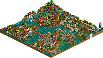
After almost a month of waiting for my computer to return, it finally has. To give everyone a chance to join in my celebration, I decided to usher in this event by posting a new spotlight, one of the strongest we've had in the modern era. A huge ovation is deserved for Isole Calabria by Turtle, in my opinion what is the best RCT2 park we've seen since SA's legendary Rivers of Babylon. Not to knock anything done by Meretrix, Artist, or Corkscrewed, but Turtle has surpassed them all in my opinion, and is now thrusted into the best of the best company in terms of RCT2 parkmaking.
Corkscrewed Offline
All kidding aside, MAN! There's no way anyone can say this shouldn't be spotlight. From the atmosphere to the rides to the little architectural details... this is now my favorite park of all time.
I've been waiting since RoB for a park that puts it all together and blazes my eyes out in amazement. Well, Turtle's done it. This as close to "Elite Spotlight" as you can get. Amazingly strong in every area... and all this from NE's resident free runner/supercrazy gymnist/guy named Jem.
Congratu-f'ing-lations, Turtle. This is an amazing Spotlight and well, well, well deserved.
Argh... it appears that Iris did not export the objects and then resave the .zip file like I told him... and I can't load the park cuz I recently cleared out my custom object data. I'm gonna try to resolve this, but Iris, if you see this... export the objects! Just open IC, check the export scenery tab, resave. Then delete the original park file from the .zip, and ADD the one you just saved. Thanks!
EDIT #2: Should be fixed. File should have exported scenery. Thanks to Kumba for sending me a full copy.
ride6
Great work Turtle!
Corkscrewed Offline
When I moved a bit further to the east of the park… OMG a custom ride!1!1!
Props to Richie for building this Kamikaze-like ride, although I think you’ll need some pretty forceful engines to make those ships invert (another option would be making the arms longer and attaching a weight to the pendulums, like they do in real life). Some extra details to refine the ride would’ve been nice aswell…
The rest of the area was good aswell, nice corkscrew coaster.
The woodie was ok, but you’ve made better ones if you ask me. It was missing something, something I appreciate the most in woodies and what I find in Testudo’s Seneca Streak… getting the feeling of being very small compared to the ride.
Well, I guess that it’s quite hard to do with twisty terrain coasters.
Also, the ride knew how to keep me interested during the first half of the ride (crazy stuff!), but the second was quite disappointing, I think it’s because of the overload of brakes.
Some nice theming in this area by the way.
The Japanese/Chinese/whatever area was very refreshing and something completely different. I sometimes had the feeling that I was looking at a park of JKay; busy athmosphere, lots of colours(unlike the entrance area, these were more my kind of thing)… Very pretty, although Lotus flower uses one of my least liked colour combos there are in RCT.
Oh, great use of food stalls too!
The last area had an awesome B&M (great job Steve) and it was nicely decorated. It didn’t amaze me, but it was great quality work.
Congrats with the win, Turtle!
one of my favorite parks ever!
entrance area:
I don`t like the house which calls "Inovational Cousine" .
china area:
My fav. area in the park. I love the "Studio Max" building. best building in the park imo.
Steve`s area:
i don`t like the coaster layout. the bildings are ok but to small.
the last area:
yeah great castle! I love the archy in this area but the woody is a lil' bit to high imo.
---
last words:
the park has a very great atmosphere and really cool coasters.
turtle for parkmaker ^^^^,
I gotta run, but you know I'll post a review later Turtle.
I have just got up and will be posting my review later on.
congrats!!
Edit: nvm, I didn't look and see the name of the person and just looked at the park and assumed that with its entrance and I guess hotel, castle area, asian area, and guest spot area that it was another one of those sptlghts that everybody would complain about because its so similar to so many other things, but I guess not because the artist's name of this one is different.
The asian area was nice where it wasn't congested, the places in asia that are that congested are more modern because places like china didn't have a billion members in ancient times. Also take note that sections are allowed to have more than one major coaster, even if it doesn't follow the ioa criterion. I don't know I'm sorry if this sounds harsh, but I read somewhere on the page about rob and whatnot and I guess I got my hopes up?
I guess all these parks gives motivation to make something different in the end though.
Actual Edit: Oh yeah, and I thought you said you didn't want another mountain woodie??
then on opening the park, the welcoming message was already there. i like it better when people pause the game, send the message, save game, because then, on open, there's the beep and the message appears.
i kinda liked the entrance plaza. it was wide and relaxing. bit too much music from everywhere.
richie's custom ride was nice. funny to see how these things get in fashion again.
"guests can't get to the entrance of on-ride photos". bleh.
jem, i think i've given you my opinion on the park more than enough on aim. overall, i didn't find myself dive into the park. so it wasn't really for me in the end. still a great and well-deserved achievement
I didn't enjoy Neuchatel or Steve's area as much as the other two in the park. From the screens, Neuchatel looked like a lovely area but I was somewhat disappointed when I looked at it. It didn't seem Swiss IMO. If Steve's area had been in a Steve park, it would have been brilliant but it just didn't fit in too well with the larger architecture in the rest of the park.
Again, Jem, a wonderful park with an extremely rich atmosphere throughout. Congrats on the spotlight too.
I'll agree with you on the fact that naming throughout could use some work.
About the welcome message. The version I sent to Iris did exactly what you said there. Open park. BEEP. Message appears. However, whoever opened the park to export scenery and resaved it took a couple of seconds to do it. It's a bit annoying, but eh...
Thankyou everyone for the comments. I'll respond to the ones I think need responding to.
Phatage -
Firstly, don't drag me into the same-old-shit row. Second, who said anything about it being a hotel? "Casa di Aqua" - literally "The House of Water" - a spa. My aim with this park, as i've hinted at in the readme, was to create a "traditional" park, with "traditional" themes. I did however want to expand on these themes in ways that not many had done before, and add lots of my own little details. I think I achieved this, and maybe the park will grow on you, if you stop looking at the themes themselves, and look at the details.
I like building like this. I've built a number of radically different things in my RCT career (so to speak), but this way gives me the most pleasure. I don't happen to be blessed with a massive amount of imagination, like yourself, and so would struggle to create something as fantastic as Epica. I prefer to add the little differences in my parks, rather than the large fuck-off in your face ones. Some may see this as a lack of skill, a lack of ability to transfer my thoughts into RCT, but frankly, I only have so much time to play the game. My life's pretty damn full, and I play as a release to make somewhere beautiful come alive.
Thankyou again for everybody's comments.
Kevin Offline
This is the best RCT2 park I've seen in a while! Congrats Turtle!
Simply wonderful.
Congrats, dude. You know my thoughts on basically everything, since I was with you in this from the beginning. Good job. Can't wait to see what you dish out next.
inVersed Offline
Great park. It was full of great atmostphere and the details, well they were jaw-dropping. This is just truely outstanding work, i dont know what more to say. Well, congrats turtle, on a definitely deserving Spotlight!