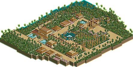
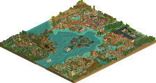
Park / The Hawk
-
 17-October 10
- Views 1,371
- Downloads 454
- Fans 0
- Comments 3
-
 No fans of this park
-
 Download Park
454
-
 Objects
69
-
 Tags
Tags
![park_2812 [PT4 R1] Unnamed Entry](https://www.nedesigns.com/uploads/parks/2812/aerialt2475.png)
![park_2614 [NEDC2 #1] Winter is Coming](https://www.nedesigns.com/uploads/parks/2614/aerialt2316.png)
Only problem is THe buildings lack shape and color