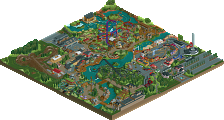
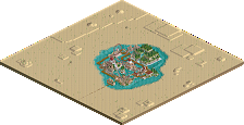
Park / The Hawk

Park_1704 The Hawk

3 Comments

  • Comment System%s's Photo
  • Dotrobot%s's Photo
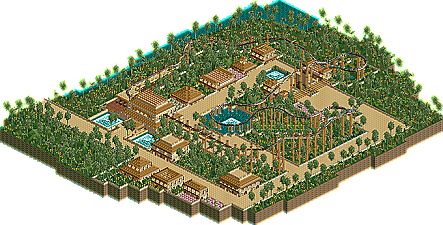
    This is real good! An improvement over last time. You could've submitted it and got a decent score.
    Only problem is THe buildings lack shape and color
  • Hex%s's Photo
    Yes, I just noticed that they are all square and aren't as colorful as they could have been. But, thank you for the comment. :)
  • K0NG%s's Photo
    Yeah, there's a fine line between going for a theme and endlessly repeating everything. This really isn't bad...but, everything is square. The path layout, the buildings, the verticals under the launch...even the whitewater in both ponds are square. Again, not bad but take what you have here and work on some diverse elements and you'll have yourself a winner.