Park / DJINN
-
 08-November 10
- Views 15,158
- Downloads 1,746
- Fans 10
- Comments 34
-

-
 86.54%(required: 65%)
 Design

BelgianGuy 95% robbie92 95% turbin3 95% 5dave 90% nin 90% SSSammy 90% Wicksteed 90% Casimir 85% Kumba 85% Liampie 85% RCTNW 85% geewhzz 80% Roomie 80% CedarPoint6 75% John 60% 86.54% -
10 fans
 Fans of this park
-
 Full-Size Map
-
 Download Park
1,746
-
 Objects
275
-
 Tags
Tags
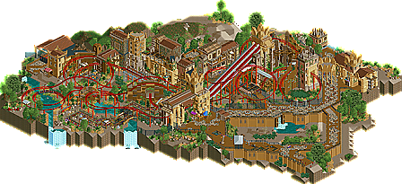

RRP - Yeah I agree it was a huge improvement, I think I was trying to reinvent the standard mine train which was just too abstract. I was talking to CedarPoint and he suggested the dual launched lift to spice things up. Thanks for all your feedback, the second part of the ride is in fact more extreme than the first like we discussed. Glad you also like the surroundings, I'm sure I'll catch you on msn pretty soon.
Belgian Guy - It'll be interesting to see the ratio of semi-realistic lovers and the realism fans but I think Kumba has it in the bag to be honest. Glad you enjoyed the design and I'm excited for a few up and coming projects, one of them you know pretty well.
Turtle - Firstly massive compliment, RCTFAN did things with the game I'd hope to achieve with any release of mine. A lot of work was put into that first drop to make sure it was themed right and to achieve the wow factor. Glad you enjoyed it and I hope to get better from here.
rK_ Glad you enjoyed the layout as I’ve always wanted to create a densely themed coaster. Glad you like it so much but I think I can improve on this
Turbin3 - Lol cheers, I was curious too.
Disneylandian192 - Glad you enjoyed the textures; I knew I could pull them off if I added more RCT textures around the more diverse objects. It seemed to work and I think I've achieved something pretty special with this. Glad you think it's one of the best designs we've seen, that’s pretty big.
Splitvision - Dreamport will top this with it being a larger project but I believe this work is more current for how the game is heading, either way you'll be wowed by it. Glad you liked the park for the majority of things. The hexagonal structure was something I was thinking about taking out but I stuck with it, as I didn't really think I'd do this kind of theme again. I think it looks ok yet I wish I'd figured out something that would look better than the flimsy brick supports, I’d know for next time. I must say I do love the path and it was a conscious decision of mine to tone it down from ILMENITE and integrate that difficult texture into the park more. I really like the results; I think it's just a love it/hate it object.
tdub96 - Well I have Robbie and Liam to compete with but I'm very happy with how my architecture turns out with all the different themes I go for. I think Kumba and DJINN are different however in terms of concept, all the ideas for this were in my head so I'm happy with the finished piece.
MCI - Another architecture fan! Thanks very much dude!
Sssammy - I knew this might be the rides main critique. A while ago I started a mine train discussion topic to see how I should go about nailing this ride type. I've always been quite curious to build a mine train but I really didn't get into building the wooden type so I turned to a more up-to-date model. I chose Vekoma as the steel layouts such as Colorado Adventure inspired me quite a bit. I was more impressed by the in depth theme and how the ride raced through the layout so I went with that for my inspiration. I wouldn't say the layout itself is the main event but the design is in its entirety. I don't think the layout necessarily needs to be the most dynamic mine train we've ever seen but I built it to put my stamp on it and cross it off the list if that makes any sense. Also I noticed a mine train hadn't been built lately so that was another thing that inspired me to build this. Glad you enjoyed it though and you scored it higher than ILMENITE, which is always a Brucey bonus!
Steve - Steve blown away? I'm shocked! I think the textures work well, and I do like the look of the objects I've chosen. I haven't placed them on the map to try and make a bold statement, but new objects really inspire me and I'm slightly tired of my parks using the same objects every time. I think it's just to keep my mind somewhere else; it's more exciting if I have a separate project with a different bench and new objects to try and integrate into the game. New objects are the future for RCT2 imo so I'm going to keep pushing the lesser-used objects to try and make them exciting. That’s the plan anyway; really glad you enjoyed the park!
Fizzix - Yeah I wanted a strong intense layout. I think the theme really enhances that so I'm glad you enjoyed it, hopefully more than Kumba
Cocoa – It wasn’t an animal enclosure, although I thought of putting a few hippos in there. It was just an elevation change in the end to spice the landscape up. Glad you enjoyed the theme and I agree that it took a step up from ILMENITE. I told you I was rusty!
Overall thanks for the great positive feedback! New screens of up and coming projects will be sent out via personal message to the people who took time to comment on DJINN. Any more comments would be awesome.
EDIT - Didn't realise other people commented. I'll reply again soon.
But again I didnt like the path-textures. And the waterfalls at the map's edge were unnecessary imo.
But the rest was superb, looking forward to your next project!
I mean for me this just sums up what I look for in RCT2, great coasters, I mean its not because it isn't a B&M that it isn't a good coaster, its not 20stories high but it stands out in originality and beauty from your average coaster used in designs these days. just the fact that you used a mine train and made it the 2nd best design ever to grace the site is a legendary achievement that comes close to Kumba's rec in being awesome if not being better imo, Imean the coaster has beautiful turns, helixes and everything flows so well, the theme is really all over the place and I mean that in the best possible way ever, I mean from the moment you open this you're inside the world you've created here JK. I think the use of colour and texture is near perfect and I'm still trying to figure out how you did all of that in such a short period of time. I mean the detailing is incredible throughout the entire design, the landscape is damn right awesome and again your use of path is very intruiging. I like the elevation changes here and the bridges and the trenches and stuff. Also the smart use of diagonals really gives this an edge.
All in all I really thought this design was one the best pieces of rct I've seen in a long time and maybe that's because its right down my alley of loving semi-realism but there's just so much to look at and search for and to explore over and over again. I mostly judge a design by reviewability and this has me looking back at it almost every time I open RCT so that's a real good sign of this being quality.
I also think this showed in my vote, and I regret not giving this 20...
Highroll3r - The Wife - 85% Thanks for your comment dude.
Turbin3 - Thanks lol it's coming up to three years in February :/
Roomie - Hopefully thats a good thing as both coasters look pretty cool. Are those pictures from RCDB?
Milo - Ah critique! I love it! I can see your point about ILMENITE looking similar to this as they were built in such short spaces of time from each other. With ILMENITE I wasn't too happy about it's overall finish so I wanted to improve on my new found style with DJINN. I think it worked but I also take on board your comment about not falling into a certain style. I'll be looking to change that in future projects, whilst my architecture is always different I have tried with both designs to vary the foliage and make the paths seem different but I can see both aspects looking the same in both designs. I'm really obsessed with my diagonal paths at the minute so I'll need to find another way to create those lines without looking too similar to the past designs. Glad you liked the design but I am very grateful for this in depth crit. A signature style sounds very flattering so thank you but I can also see the negative side of that. It's comments like yours which I love as I took on board a lot of Liam's comments from ILMENITE and it really helped me when building on DJINN. Thanks again!
Turbin3 - I'm glad you enjoyed it. It's an honour to have the websites best scoring design so I'm pretty pleased about that. I also noticed that ILMENITE is number 10 overall too! I liked the waterfalls as otherwise I couldn't incorporate the hippo splash aspect to the ride which I think would be really impressive for guests.
Robbie - Ah the paths again! lol marmite or what. Thanks for the layout comment, I told you I was working hard on them
Splitvision - Ah Kestral, thats awesome that you still hold it up there in terms of aesthetics. Whilst unconventional in layout I feel it does have a certain charm about it. Thanks a lot for such a great comment!
BelgianGuy - I'm glad you've understood what I wanted to do. I didn't want to produce a huge dominant layout in terms of brand but I wanted to create a decent layout and theme it well. I just wanted to improve my ride design. I feel because of the nature of the mine train it suits that "all over the place" style you've talked about and I agree thats a great term to describe this ride. Thanks for the high vote, I didn't believe this design would do well as my style isn't the most popular here. I mean I'm not fully realistic and I'm not fantasy. I think I've done semi-realism proud with this and you'll be seeing a lot more work from me with awesome rides themed well.
Keep the comments coming please for advanced screens of up and coming projects sent to you via personal message.
I agree with him. I think the reason why it's so hard is because the balance between making it look real, like actual theming, and just merely cluttering everything with buildings and foliage is minimal. The different effect in quality is very well noticeable though, of course.
I feel that in this design, you demonstrate you are capable of doing it exactly right, of creating believable, authentic and just very very good looking theming. It is full of ideas and extremly artfully created. It has a huge impression on me.
_GREAT_ job!!!
Everytime I view this, it gets better. I do not regret voting 85% though. For the additional 15%, there should've been more 'little things' and a stronger coaster. Don't get me wrong, the coaster was flawless and the interactions were fantastic, but it lacked a unique element. If you delete all the theming it would be 'just another minetrain'. Not voting higher may also be a matter of taste of course.
Again congratulations, and now finish Dreamport!
sheesh.
First off, this pretty much blows everything you've ever made away in my eyes, the theming, layouts, and overall atmosphere are amazing compared to your older work and really, much of the work we see today. Everything just works together so well, nothing really tries to stand out in a bad way.
Granted, the coaster obviously stands out as it's the defining feature in the design, and while im no expert in coaster design, I certainly enjoyed it, especially the dueling lift segment, always enjoy seeing that element pulled off. As for the rest, the endless turns and helices round out the ride (no pun..)
Now theming-wise, this was just fantastic. Some are going to hate me for this, but this imo is the best African theme pulled off yet. If you ever feel like doing it again, let me give you my zoo first so you can make that as great, aha. The way you've used certain objects to create the structures and ruins, as well as 'bad' scenery that people usually cringe when they see. Very innovative stuff here. Fantastic job.
So my reply is finally here, sorry for the delay!
I must say that since I first saw the teaser screen for this project I was very excited having already seen what you can acomplish with a similar theme in your solo. This however was a step above & beyond.
The atmosphere is rich with the dust and sand that it rests on, the foliage is subtle and the architecture is believable at best and curious enough at worst. Particular stand out points are the station and the raised path near the entrance, particularly the grates.
I really love how the station simultaneously stand-out and blend-in with the surroundings, as all good stations should!
The coaster itself flows beautifully although, from a viewing perspective, its too fast for my liking......but I wouldn't be saying that if I was at the back of the train! I think the queue line is a little short and monotonus for the length of the ride and quality of the surroundings but that is a minor point.
Lastly I don't think the custom objects ruin anything. If you feel that a certain object adds something to an area for whatever reason, whether its to create awareness or to attract/divert attention, then I don't see what the problem is.
Overall i'd give it an 8/10 and judging by the teasers in the recent fiesta I would say that the best is yet to come.....and that I need to get involved in the Alton Towers insipred park
Cheers,
Gareth
I was hoping this would get bumped, probably one of my favourite designs of all time, if not my absolute favourite. Everything is just composed so well, not to mention the general theming of it all.
Agreed one of the best designs ever. Is this really 5 years old ?!
I remember thinking this release was going to have a big influence on textures and things, and it sure