Park / DJINN
-
 08-November 10
- Views 12,003
- Downloads 1,627
- Fans 10
- Comments 34
-

-
 86.54%(required: 65%)
 Design

BelgianGuy 95% robbie92 95% turbin3 95% 5dave 90% nin 90% SSSammy 90% Wicksteed 90% Casimir 85% Kumba 85% Liampie 85% RCTNW 85% geewhzz 80% Roomie 80% CedarPoint6 75% John 60% 86.54% -
10 fans
 Fans of this park
-
 Full-Size Map
-
 Download Park
1,627
-
 Objects
275
-
 Tags
Tags
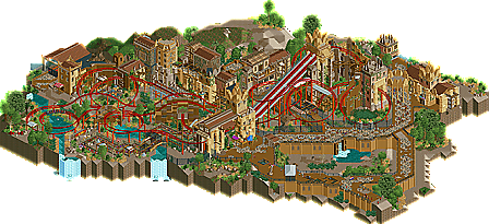
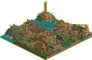
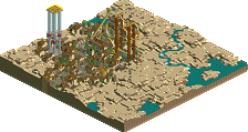
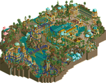
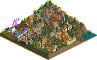
The textures are for the most part fantastic, a couple of things I would have done differently, but since when does anyone want to hear about that on a release!? The layout was brilliant, really nice use of diagonals, which are incredibly hard to theme properly, but you did a really good job. The land textures and foliage are so perfect, exactly what the place needed to calm things down a bit next to the intricate architecture and bright red coaster. Really great work on the paths, I liked them a lot.. The fencing was also fantastic. Often glossed over, but this supports the area perfectly.. giving a sense of theme park realism to an otherwise fantastical land.
The area around the first drop really reminded me of Indiana Jones at Disneyland Paris, excellent job there. The architecture will be as close as we get to x-sector in RCT2, in my opinion.
tdub96 Offline
^^idk, i think Kumba is still the #1 of the year, but this is a close second. I loved everything here JK, if I were a panelist, an easy 95% vote at least from me. The layout is uber-sweet, the idea is awesome too and executed perfectly. It has a great atmosphere and I swear your archy is the best in the community. Great work.
I really like that!
The architecture is freaking awesome and I really like the Layout.
Great Work!
I thought that the layout was a bit too simple and sub-par compared to all of the detail given to the surroundings. Combining that with a level of architectural detail which sometimes descended into clutter is how I arrived at my score. As a part of a park, I'd say it is great. But as a stand-alone design the coaster is too simple and there is too much going on everywhere else for my taste.
Fortunately I'm not the only panelist and seem to be in the minority here. No hard feelings, it just wasn't my cup of tea. Congrats, JK!
I'm going to give you a back-handed compliment: Your architecture skills are amazing, but some of your textures BLOW. Sorry, I just see such great forms and detail only to be ruined, in my opinion, by textures that look like they don't even belong in this game. The stones in the dirt path (although a nice idea) look like they are from Zoo Tycoon. The diagonals are used so well here but I feel like a lot of the textures they come in tend look awful when used in bulk, although I guess you can't be penalized for that.
I also agree with John that I was not blown away by the coaster layout, which is what should happen when you earn a Design award. I feel like this won simply because it just happened to be an okay coaster in an incredible area of a theme park.
However, that double lift hill is sick. First thing that caught my eye and for good reason.
what was that one big ditch for though? was it an animal enclosure?
This looks like the twisted love child of these 2 coasters
Nitro - Dennlys Park in France
Gran Monserrat - Parque Espana in Japan
we have a us a winner right here
Anyway, I found this enjoyable but unfortunately I feel you're starting to fall into a stylistic rut. While the architecture and landscaping was fantastic and the coaster was pretty good too (tbh what more could you expect from a ride like this? The layout did it's job just fine imo) I felt that, on the whole, the atmosphere was quite a bit like ILMENITE's. It's much like the feeling I get when viewing 5dave's work. No matter what theme he is doing there is always this '5dave style' feeling that almost whitewashes the whole thing. Is it necessarily a problem? Probably not, having signature style is not a bad thing after all.
The main issue I have with this is that when this is compared to ILMENITE there are several key components that can be shared between the two. Large custom paths with various textures added and circular layouts, pits/trenches sectioned off by the paths, fairly compact coaster layout, station that is stands alone from the rest of the architecture, similar clumping foliage with the large trees and brown grass. I realize if you boil it down far enough just about any rct park is made from the same components but your last couple projects have felt like they follow a checklist. And something inside me is just screaming for some ground hugging paths
Bleh, tl;dr is that this was a solid Design. Nice work JK.