If iris wants to post the #13 one at midnight thats fine by me, I have gotten more feedback then I had hopped for.
Lol. Well, here comes somemore.
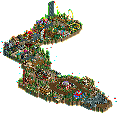
Despite the size, I actually mostly enjoyed what was there. It may not be the most asthetically pleasing park ever, but it drips with creativity imo. I loved "The Recollector" zipping around the park at warp speeds. And yes, it does make a sinister sound that almost sounds like a vacuum in space. The other highlight was your "mesh" coaster. Truly a unique coaster specimen if I've ever seen one. It fits you to a tee too. Again, not pretty, but oozing with creativity and perfectly demonstrates what kind of hacking skills you've got. The rest of the park was pretty cool, but didn't really hold my attention for too long. I did get kick out of a lot of the banners, in particular "i like it, so fuck off" and "lol, na, never gona happen"
A nice little creation Kumba, even though I still think you coulda owned this contest if you had put your mind to it. Ah well, theres always h2h4, right?
Yeah, it was definitely a creative idea and a great way to kick off the Pro Tour. I wish you could have spent more time and effort developing your idea though...I think you would have had some awesome results if you did, but we all understand time constraints, or whatever. All the hacking added a lot to the park, solidifying this as definitely "a Kumba park." Despite the extreme shrinkage in map size, I really enjoyed going down the whole park.
It also gives more time for the entrants to get more comments for their hard work that they've put in. I don't mind and as someone else has said it will last longer. Which is great imo.
Brilliant entry - if this is only the 14th best park, I'm very, very frightened about the quality of the other 13 (although I often disagree with the judges, of course).
Loved the park. The risky downsizing worked great, I think; having the park any bigger would just have been redundant. I like this very compressed form of parkmaking. You have basically summed up years of work in a very limited space, which is something that takes great skill, being able to recognise the essential elements of everything. It is also a testament of your ability to choose and execute original themes well, as each theme is instantly recognisable even from a small building or detail. Very consequent, in that way.
I wasn't a big fan of the idea of revisiting older themes at first, but the way you did it here made me reconsider. It does offer a new perspective of your RCT history, and encourages further viewing - it is in no way self-contained, and requires a lot from the watcher to be fully appreciated, but with all the fun little throw-away ideas and details and general niceness, it's still easily accessible.
Now I have to stop myself, because I haven't slept properly for 30 hours. Very good park, and it's great to see the PT2 going so well.
well, it is interesting. some of the architecture and landscaping i really loved, but most was rather haphazard, and the vast majority of rides, hacks, etc, just sort of seemed to be there to fill space, and you didn't even manage to succeed at filling space! the sound of the incredibly fast rollercoaster is probably the most awesome thing in the history of rct, though.
The more important thing is that you set up a goal for this park (to reminisce and entertain), and you met it. It gives me hope that if you set a goal for greatness, you can achieve it. But it also pleases me to see that you're not afraid to build for yourself. As long as you're having fun, honestly, who cares if it wins Spotlight or not?
That sums it up for me. You either loathe Kumba or you marvel at his enthusiasm for the game. Whether Iris likes him or not, he still has his following here. I like his parks for the reasons you say Cork; he doesn't think about 'what everybody will like'...like so many people do here (same ole pretty parks) and he obviously gets an idea and plans it out. He may not pull it off all the time, but its always something different and that is what I appreciate when I see his parks.
PS - Kumba, that SIG looks Awful....its not meant to be a sig you know
Edited by Buckeye Becky, 20 February 2006 - 10:04 AM.
51 Comments
JKay Offline
Lol. Well, here comes somemore.
Despite the size, I actually mostly enjoyed what was there. It may not be the most asthetically pleasing park ever, but it drips with creativity imo. I loved "The Recollector" zipping around the park at warp speeds. And yes, it does make a sinister sound that almost sounds like a vacuum in space. The other highlight was your "mesh" coaster. Truly a unique coaster specimen if I've ever seen one. It fits you to a tee too. Again, not pretty, but oozing with creativity and perfectly demonstrates what kind of hacking skills you've got. The rest of the park was pretty cool, but didn't really hold my attention for too long. I did get kick out of a lot of the banners, in particular "i like it, so fuck off" and "lol, na, never gona happen"
A nice little creation Kumba, even though I still think you coulda owned this contest if you had put your mind to it. Ah well, theres always h2h4, right?
Steve Offline
I hope you're not serious? Wasn't it every day last time?
I really liked the park, Kumba, although I was surprised at how you barely even filled half the map.
CoasterForce Offline
Looking forward to the other entries!
Geoff Offline
tracidEdge Offline
it's better than releasing them every day, if you ask me. builds up anticipation, too, especially with the later parks.
Ride6 Offline
ride6
Corkscrewed Offline
J K Offline
Edited by J K, 18 February 2006 - 07:18 AM.
Magnus Offline
apart from that i think every second day is just fine.
have a look at the winning park if you didn't try already:
http://www.nedesigns.com/?ne=tour2&e=1
Edited by Magnus, 18 February 2006 - 08:51 AM.
Janus Offline
Loved the park. The risky downsizing worked great, I think; having the park any bigger would just have been redundant. I like this very compressed form of parkmaking. You have basically summed up years of work in a very limited space, which is something that takes great skill, being able to recognise the essential elements of everything. It is also a testament of your ability to choose and execute original themes well, as each theme is instantly recognisable even from a small building or detail. Very consequent, in that way.
I wasn't a big fan of the idea of revisiting older themes at first, but the way you did it here made me reconsider. It does offer a new perspective of your RCT history, and encourages further viewing - it is in no way self-contained, and requires a lot from the watcher to be fully appreciated, but with all the fun little throw-away ideas and details and general niceness, it's still easily accessible.
Now I have to stop myself, because I haven't slept properly for 30 hours. Very good park, and it's great to see the PT2 going so well.
cg? Offline
Buckeye Becky Offline
That sums it up for me. You either loathe Kumba or you marvel at his enthusiasm for the game. Whether Iris likes him or not, he still has his following here. I like his parks for the reasons you say Cork; he doesn't think about 'what everybody will like'...like so many people do here (same ole pretty parks) and he obviously gets an idea and plans it out. He may not pull it off all the time, but its always something different and that is what I appreciate when I see his parks.
PS - Kumba, that SIG looks Awful....its not meant to be a sig you know
Edited by Buckeye Becky, 20 February 2006 - 10:04 AM.